How to Use API V3 to Customize, Enhance, and Beautify your Google Map Mashups

With Google Maps API V3, you can customize Google Maps’s styling in three new ways:
- You can selectively remove map elements
- You can “simplify” certain map elements
- You can modify the coloring of most map elements

There are many reasons for creating custom map styles, including:
- Matching the coloring of a website or corporate logo
- Matching the coloring of your mashup’s map markers
- Removing or simplifying map elements so that your data stands out more
- Removing map elements that have no relevance to your data
- Making your mashup more attractive and memorable
The goal of this post is to give you an overview of how you can use Google Maps API V3 to create unique map styles. I’ll begin by detailing how your mashups can be improved by removing select map elements, and then I’ll go on to detail how you can “simplify” other map elements. After that, I’ll discuss some of the ways in which you can modify the coloring of existing map elements in order to create visually striking map styles. Finally, I’ll discuss some practices to avoid when styling your mashups.
With each topic, I’ll provide numerous examples you can use in making your own mashups. I’ll also provide the .json files for each example so you can easily retrace my steps.
Let’s begin by looking at how you can use API V3 to remove select map elements…

REMOVING SELECT MAP ELEMENTS
Perhaps the best feature of Google Maps API V3 is that you can now remove select map elements. Why is this API V3’s best feature, you ask? Well, because it allows you to remove map elements that are not particularly relevant to your mashup. And in removing these unnecessary elements, you’ll not only simplify your mashups, but you’ll also reduce the chance of having your mashup overwhelm its audience.
Let me show you some examples of how you can use API V3 to simplify your mashups…

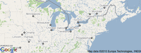
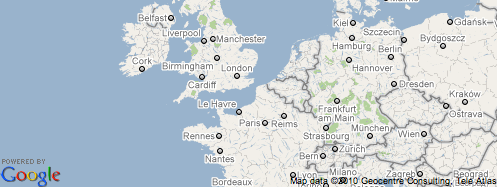
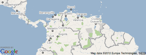
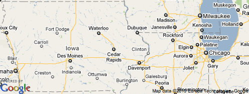
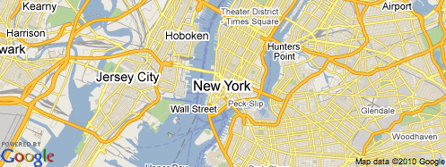
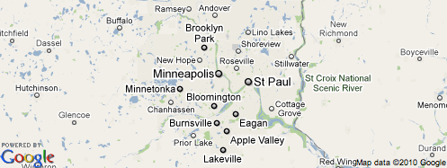
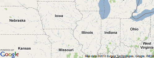
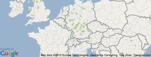
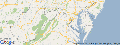
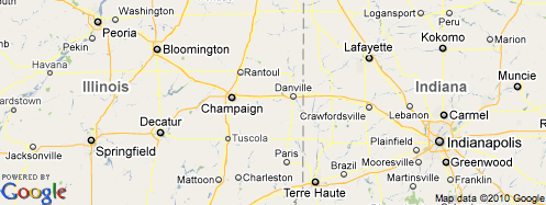
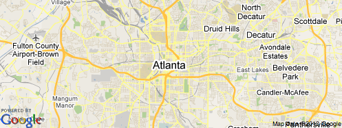
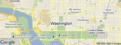
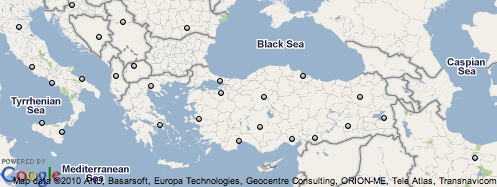
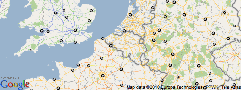
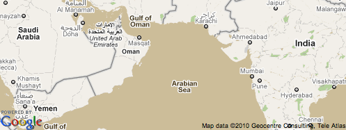
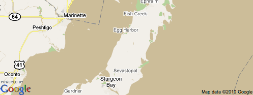
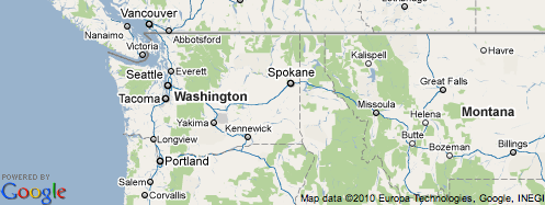
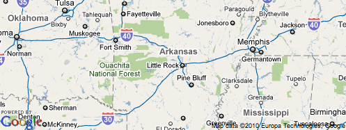
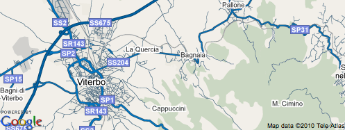
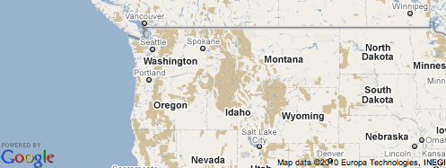
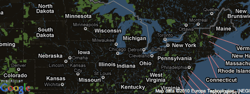
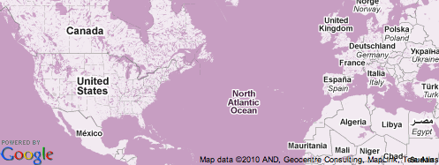
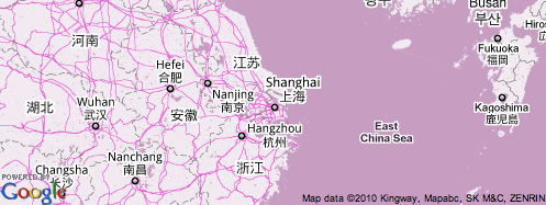
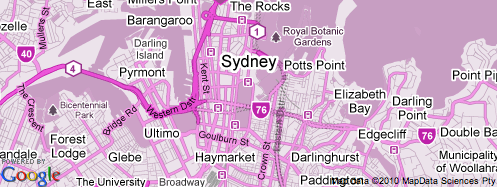
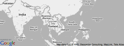
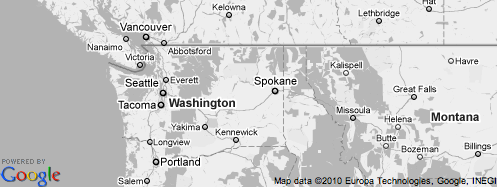
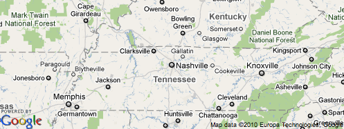
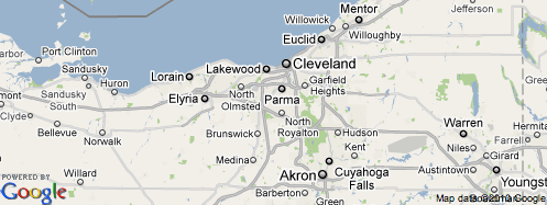
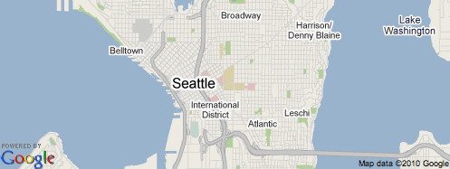
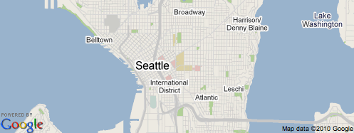
Example 1: No Country/Province Labels
One way you can simplify Google Maps using API V3 is by removing state and country labels. This is good for mashups involving data that’s limited to single country, state, or province. Suggested uses: flight planning, weather radar, election maps, etc.
Some examples:
(JSON code for this map style)

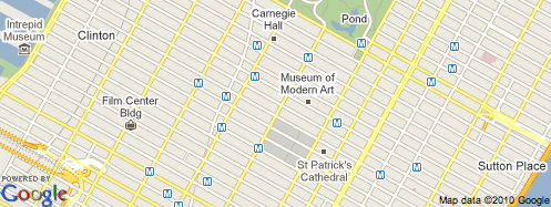
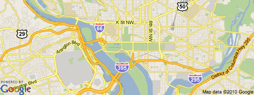
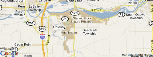
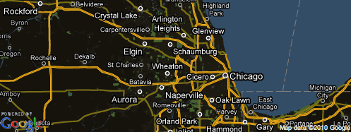
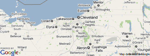
Example 2: No Road Labels (i.e., No Highway Shields)
If you’re making a mashup in which road labels aren’t important or particularly relevant, but you’d still like to show roads on the maps, consider removing the maps’ road labels. Some suggested uses: marathons, area code boundaries, sales & marketing territories, etc.
Some examples:
(JSON code for this map style)

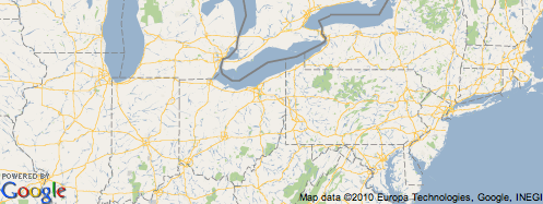
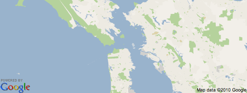
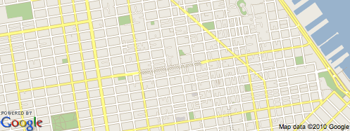
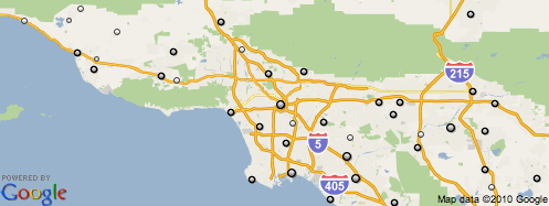
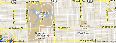
Example 3: No Roads
Perhaps you’d you like to make a mashup that has nothing to do with road information. In this case, it may be a good idea to remove Google Maps’s road and road labels all together. Some suggested uses include: election maps, animal migrations, flu patterns, hurricane tracking, unemployment maps, etc.
Some examples:
(JSON code for this map style)

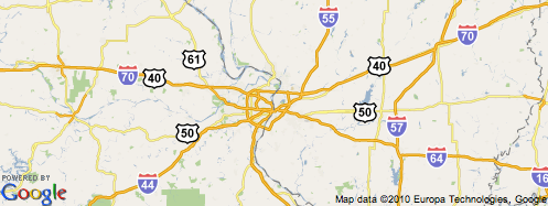
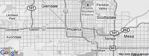
Example 4: Road Map
Suppose you’d like to make a mashup that emphasizes road information. In this case, it may be a good idea to remove other map elements, such as state and city labels. Suggested uses: accident statistics, scenic routes, roadside picnic or rest areas, pothole reporting, etc.
Some examples:
(JSON code for this map style)

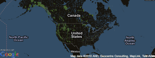
Example 5: Plain Map
If you have mashup data that shades different states or countries, consider using this style. Suggested uses: economic data, political data, election data by state, country statistics, etc.
Some examples:
(JSON code for this map style)

Example 6: No Text Labels
If your mashup’s data adds a lot of text to the maps, it may be a good idea to remove all of Google Maps’s text labels. This, in turn, will help make your mashup’s data much more readable. Suggested uses: text-heavy mashups, country statistics & comparisons, etc.
Some examples:
(JSON code for this map style)

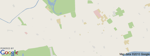
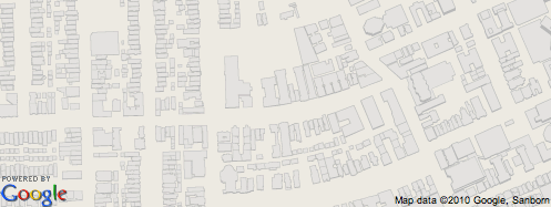
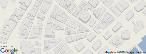
Example 7: Buildings
Perhaps you’d like to make a mashup involving a specific city’s buildings. If so, then consider using this style, which showcases cities as if they’re architectural models. Suggested uses: real estate mashups, architecture maps, land use maps, etc.
Some examples:
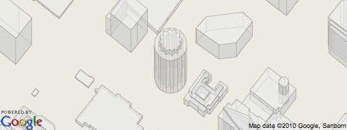
(JSON code for this map style)

“SIMPLIFYING” THE APPEARANCE OF CERTAIN MAP ELEMENTS
In addition to selectively removing different map elements, you can also “simplify” certain map elements. (This option is limited to the maps’ roads and cities.)

Example 8: “Simplified” Roads
If you want to show roads on your mashup, but you don’t want them to be as prominent, a good option is to “simplify” them. This makes the maps’ roads much thinner and removes their dark borders, reducing their overall footprint on the maps.
Here are a few animated images illustrating the differences between “regular” and “simplified” roads:
As you can see, “simplified” roads stand out far less than “regular” roads. Here’s how they look on a few more map samples:
(JSON code for this map style)

Example 9: “Simplified” City Labels — Only The “Dots”
Similar to roads, city labels can also be simplified. Doing so removes their text labels—but not their “dots”.
Suggested uses: air temperature maps, aviation maps, etc.
(JSON code for this map style)

MODIFYING THE COLORING OF DIFFERENT MAP ELEMENTS
In addition to removing and simplifying select map elements, you can also change the coloring of many map elements. This is good for giving your maps an overall theme—perhaps to match the coloring of website or a company’s corporate colors. It’s also good for muting or enhancing certain map elements. Let’s look at some examples…

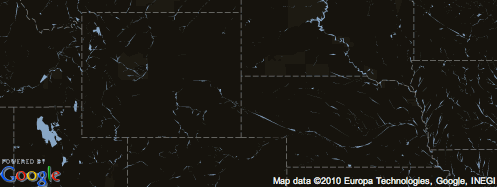
Modifying the Coloring of the Maps’ “Landscape”
One way to make your mashups really stand out is to change the color of Google Maps’s “landscape” (i.e., Google Maps’s land areas). This delivers some really striking results.
Here are four examples, showing black, green, brown, and tan “landscapes”:
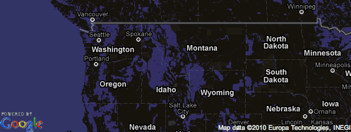
Example 10: Simplified Dark Maps
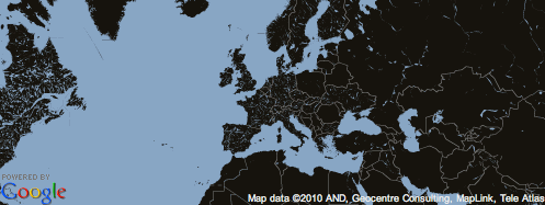

(JSON code for this map style)

Example 11: Green Maps
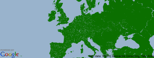

(JSON code for this map style)

Example 12: Brown Maps
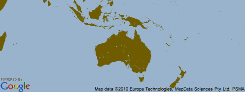
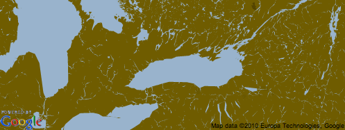
(JSON code for this map style)

Example 13: Tan Maps
(JSON code for this map style)

Modifying the Coloring of the Maps’ Water
Another way to create distinctive mashups is to change the coloring of the maps’ water features. Here are two examples showing the maps’ water as green and brown:
Example 14: Green Seas
(JSON code for this map style)

Example 15: Brown Seas
(JSON code for this map style)

Modifying the Coloring of Map Elements
In addition to modifying the coloring of the maps’ landscape and water features, you can also modify the coloring of many individual map elements. Here are three examples:
Example 16: Blue Highways
In this example, I’ve changed the coloring of the maps’ highways from yellow to blue. The highways now look similar to those appearing in paper road atlases.
(JSON code for this map style)

Example 17: Urbanized Areas
In this example, I’ve made the coloring of the maps’ “manmade landscape” (i.e., urbanized areas) much more prominent. (I changed the coloring from light gray to yellow.) The maps’ urbanized areas now resemble the ones that appear in paper road atlases.
(JSON code for this map style)

Example 18: Brown Parks
In this example, I’ve changed the coloring of the maps’ parks (as well as their labels) from green to brown.
(JSON code for this map style)

Modifying Both the Maps’ Background Coloring & the Coloring of Map Elements
Example 19: Inverted Coloring (aka Dark Maps)
This is a very easy style to make: you simply invert the “lightness” of each map element.
Suggested uses: night-themed mashups, aviation-related mashups, military-themed mashups, mashups that display cloud data, etc.
(JSON code for this map style)

Example 20: Midnight Maps (Dark Background, with Blue Roads & Features)
Here’s a scheme that’s very similar to the “Inverted Coloring” example above. Instead of inverting all the maps’ colors, however, this scheme makes heavy use of blacks and blues—yielding an equally attractive result.
Suggested uses: maps involving nighttime data sets, taxi locators, lunar eclipse paths, meteor shower viewing areas, weather radar, night club locations, jazz venues, etc.
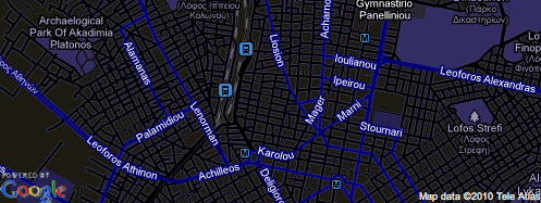
(JSON code for this map style)

Example 21: Sepia Maps
A historical-looking color scheme.
Suggested uses: historical maps, nature maps, or maps involving tea, explorers, pirates or the East India Company.
(JSON code for this map style)

Example 22: Pink (Or Any Other Color) Maps — Good for Matching Maps with Websites
You can also create mashups that fit a certain color theme (i.e., everything green, everything blue, etc.). In this case, I’ve shaded all of the map elements pink—but you can, of course, choose any color.
This style is good for matching maps with map markers, the coloring of a specific website, or a company’s corporate colors.
(JSON code for this map style)

Muting the Maps’ Coloring
Example 23: Grayscale Maps
One easy way to modify Google Maps’s color scheme is to simply mute all of its colors, creating a grayscale map.
Grayscale maps are excellent for mashups that use a lot of colored data. Suggested uses: grayscale websites, newspaper sites, academic/scholarly uses, historical mashups, transit maps, etc.
(JSON code for this map style)

Example 24: Muted Maps
Inspired in part by Google’s “Terrain” maps, I created a scheme that mutes certain map elements: I made all of the roads gray, removed all of the road labels, darkened the text labels (i.e., they’re not as bright), and removed all of the maps’ “transit” information. The result: a very toned-down, subdued basemap.
With its muted coloring, this is an excellent style for a wide variety of mashup data. Suggested uses: pretty much everything.
(JSON code for this map style)

Example 25: Muted Maps (Simplified Highways)
This scheme is the same as the previous one, with one exception: its “highways” have been “simplified” (i.e., made thinner). Use this style if you want your maps’ roads to be even less prominent.

(JSON code for this map style)

DISCOURAGED PRACTICES
Abusing Colors
It’s important to be very careful when modifying the maps’ coloring. If your changes are too drastic, you risk creating usability issues. (In extreme cases, users may not even realize that they’re using a Google Maps mashup.) Try to avoid making changes that might confuse or overwhelm your users.
Here are some examples of maps that are difficult to read due to radical and inappropriate color choices. Unless you have a very specific purpose in mind, try to refrain from making maps like these:
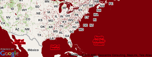
A. Bright Red Maps
B. Bright Blue Maps
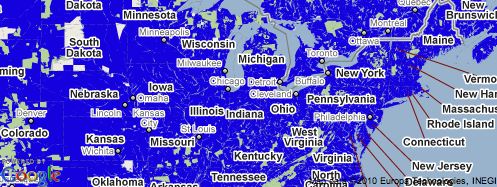
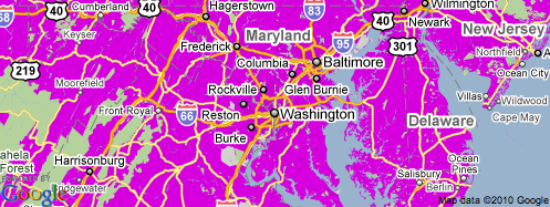
C. Magenta Maps
D. Red Seas (Inappropriate Coloring)
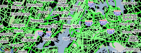
E. Neon Roads
F. Inaccurately-Colored Highway Labels

Removing Too Much Map Information
Don’t remove data to the point that users would be disorientated or confused when using your mashup.
G. Road Labels—But No Roads
Removing your maps’ roads—but not its road labels—might confuse your users.
H. Missing Borders
Due to its unique perspective, this borderless map went viral across the web. But unless you have a very specific purpose in mind, you should avoid stripping your maps of this much detail.

ADDITIONAL INFORMATION
For more information on making styled maps, please see: Google Map Javascript API V3 – Map Types (Google Code)
Google has created a tool that you can use to experiment with different map styles: “Google Maps API Styled Map Wizard”

Notable & Innovative Uses of Styled Maps
- “The Mood of Our Cities” (NBC Local Media Labs)
- “Going the Distance: Comparing Marathons” (The Wall Street Journal)
- “London at Night” (Mapnificent London)
- “Tour de France — Live Tracker” (Ubilabs)
- “Retail Locations” (Aquila Shoes)
(by 41latitude.com)