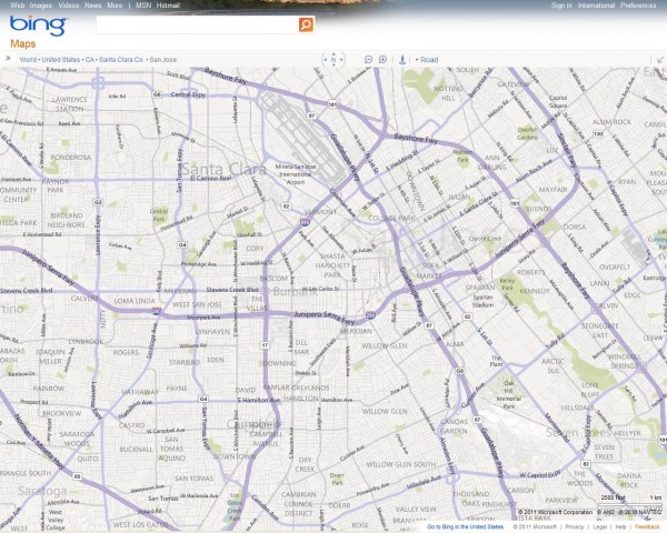
I love the new look for Bing Maps. I think they have made their background map perfect for basemaps. Nice and subtle. But their new look had some drawbacks. Well Microsoft has addressed some of those and has a new version up and running.
We’ve updated our map style to reflect user feedback so it’s even easier for people to find where to go, how to get there, and what to expect along the way. Key changes are:
A. Increased city density while preserving a clean, visually appealing map
B. Clearer differentiation between major and minor city streets
C. Greater color contrast at the city-level so streets “pop” out more
D. Altered font sizes and contrast for crisper, less cluttered map labels
E. Improved highway shields for US and added new shields for 7 countries
Two thoughts come to mind here. First off the changes all seem to really improve Bing Maps for the better and the second is my amazement at how agile Microsoft Bing Maps team is. Could 2011 be the year of Bing Maps?
Bing it baby!
Update: Justin has a great overview of what’s new.
