The fact that the rise of alternative energy and the rise of Google Earth are happening at the same time has let to a lot of great Google Earth visualizations of potential alternative energy use, particular with solar power. We’ve seen a 3D rendering of the solar panels at the Googleplex and the US Solar Jobs Map, which shows the potential for hundreds of thousands of new solar-related jobs in the next few years.
We also showed you the Berlin Solar Atlas Project, which allows you to view the “solar potential” for over 14,000 roofs in the city. Today’s story is very similar, but on a much wider (though less detailed) scale.
Coming from the University of California – San Diego is the “California Solar Irradiance Map“, which shows the entire state of California and the amount of energy a horizontally oriented solar panel could expect to receive over the course of a year.
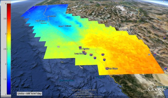
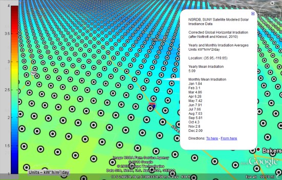
Beyond the overview map that you see above, you can zoom down and get specific data for thousands of individual points on the map, the most important of which is likely the “monthly mean irradiation” that shows how much energy could be generated at different times of the year.
To try it for yourself, download their KMZ file and give it a shot. To see the individual placemarks, be sure to turn on the “Placemark Data” folder inside of the KMZ.