Correlation is a statistical technique very often used in data analysis. It can show whether and how strongly pairs of variables are related. It normally involves lots of mathematical calculations but a quick insight into the phenomenon under investigation can be gained by simply superimposing the data on a map, if both datasets have a common spatial component (eg. location).
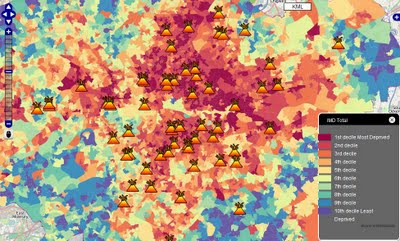
Take, for example, a case of recent London riots, mapped on MapTube. Overlaying locations of civil commotions with Index of Deprivation (ie. a measure of poverty) allows drawing a hypothesis that poverty and propensity to violent demonstrations are related. The correlation may not necessary be obvious when analysing each dataset in isolation and in a numerical form.
A point to note however is that, if the two variables are said to be correlated they may or may not be the cause of one another. In other words, correlation does not imply causality. The correlation phenomena could be caused by a third, previously unconsidered phenomenon, called a lurking variable or confounding variable. For this reason, there is no way to immediately infer the existence of a causal relationship between the two variables. Hence, one should not jump to the conclusion that “poverty is a major factor contributing to London riots” without examining the phenomenon in more detail.
As a side note, I am very surprised to see so much “red” on the London map, implying that the majority of central suburbs are poverty stricken areas – with only a few pockets of wealth on the city fringes. This picture is in big contrast to Sydney where underprivileged areas are concentrated mainly in the south-western part of the city and, most importantly, account only for roughly a quarter of the overall metropolitan area. Australia indeed seems to be a very lucky country…
London Riots Map first spotted on Google Maps Mania
