Seattle Food Inspection Map
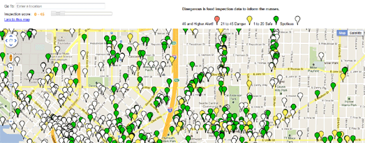
The Seattle Food Inspection Map lets you examine the food inspection ratings for Seattle restaurants.
The map includes a nice slider function that allows you to search for restaurants in Seattle based on the inspection score. For example, you can set the slider to show only restaurants that have a score between 0-45 (a score of over 45 indicating a poor inspection).
Alternatively you could search for restaurants that you might want to avoid by setting the slider to only show restaurants with a score over 45.
NYC BigMaps
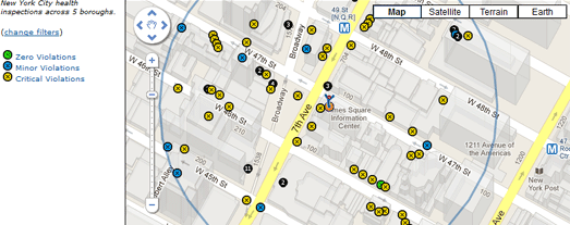
NYC BigMaps have used the Your Mapper map creation tool to map restaurant inspections and 311 service calls in New York City.
The restaurant inspections map displays New York City Department of Health inspections across 5 boroughs since Jan 2008 (22,440 restaurants). You can search the map by category, date range, keyword, and location. The map then displays restaurants on the map at the location you searched.
Track Maps using Google Analytics
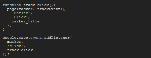
Ubilabs has written up a very cool explanation of how you can track users’ interactions with Google Maps using Google Analytics.
The trick involves using Google Analytics event tracking on your map. For example you can add a tracking event to map markers to see how many times users click on different markers.
Ubilabs say that they regularly use Google Analytics on their created maps to track map types used (‘map’, ‘satellite’, ‘hybrid’ etc), location search (geocoding requests) and map marker and drag events.
Web 2 Map
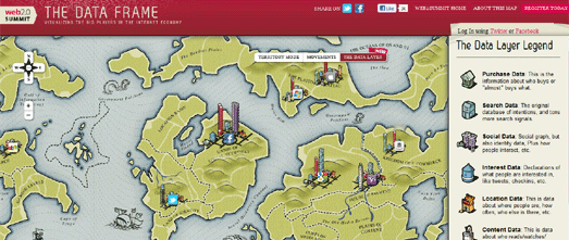
The Web 2 Map is a metaphor of the internet, as seen by the organisers of the Web 2.0 Summit. The map assigns territories or ‘countries’ to different sectors of the internet, for example ‘social networks’, ‘search’ ‘e-commerce’ etc.
This year the map also includes a data layer. The data layer adds what might be seen as capital cities to the map. The buildings or skyscrapers in the city act as a metaphor for the different data segments within the dominant player in that sector.
For example, the Union of Social Networks includes a Facebook capital city. The Facebook city is dominated by a ‘social’ skyscraper but also includes a smaller ‘location’ building to reflect that Facebook also now includes check-ins etc.
findmark.org
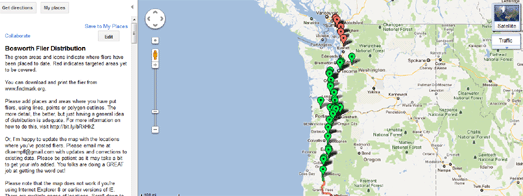
Mark Bosworth, a GIS Analyst at Metro in Portland, has been missing since Friday September 16, 2011.
Mark is a cycle Oregon volunteer and was last seen walking to his tent in Riddle, Oregon. Mark’s family think that he may have had a recurrence of cancer that has caused him to become confused and possibly lose his memory.
There have been several sightings of someone fitting Mark’s description hitch-hiking near I-5. Therefore Mark’s family and friends have been distributing flyers up and down the I-5 corridor. This Google Map is being used to help plan where the flyers have been and need to be distributed.
If you are able to help with distributing flyers you can print them out from the website launched by Mark’s family – findmark.org. You can then use the map to see the areas where flyers still need to be distributed.
The Bambuser
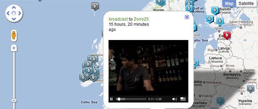
One of my favourite smartphone apps is live broadcasting application Bambuser. The application lets you broadcast live video straight from you mobile phone or a webcam.
The only bugbear that I used to have with Bambuser is that it didn’t have a map of broadcasts happening right now, so that users could select from the currently live broadcasts geographically. Well, now it does!
The live Bambuser Google Map shows the location of live broadcasts, those recorded in the last 24 hours and even older recorded broadcasts. You can even watch the live streams directly from the map.
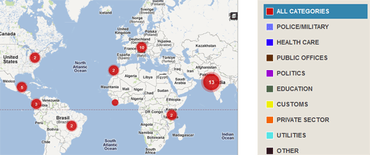
The Corruption Tracker Google Map
Having come across the concept of baksheesh more than a few times in my travels around the world I know how frustrating it can be to have to pay bribes to officials just to get them to do their jobs properly. It often seems that the practice is officially encouraged and that there is no point in reporting the incident.
In these situations it would be at least satisfying to be able to warn the rest of the world about the corruption.
The Corruption Tracker uses Ushahidi’s map reporting system to allow users to report and map any corruption that they witness or are subject to.
Users can report corruption by sending an email, by sending a tweet with the hashtags ‘#corruption’, ‘#bribe’, ‘#anti-corruption’ or ‘#theft’, or by filling out a short form. Submitted reports of corruption then appear on the Corruption Tracker Google Map.
London Bus Waiting
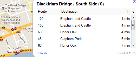
Transport for London recently started beta testing a new Countdown API to provide real-time departure information for all buses at every bus stop throughout London.
Next Bus London has quickly released a Google Map that shows the location of London bus stops and informs you how long you will have to wait to catch a bus.
To find out exactly how long you will have to wait you simply need to click on a map marker and an information window opens displaying the bus number, destinations and waiting times for the next few scheduled buses at that stop.
The University of Montana
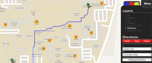
I came across this beta campus map of The University of Montana today. The map includes a couple of nice features to help students and visitors find their way around the campus.
The Google Map includes a transparent overlay that adds interactivity to the buildings on the map. Users can click on individual buildings and get links to the building’s page on the university website and to printouts of floor plans of the building.
The map also includes a nice directions feature that allows users to quickly select and find walking, driving and bus directions between different locations at the university.
Other layers allow users to view photos, art exhibitions, bus-stops, parking spots, places to eat and wi-fi locations.
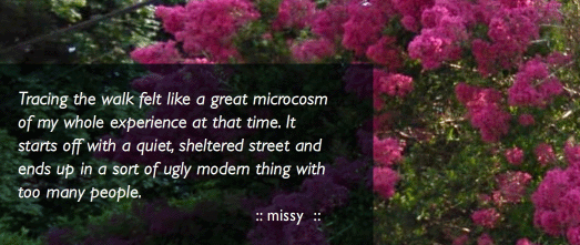
timespentalone.com
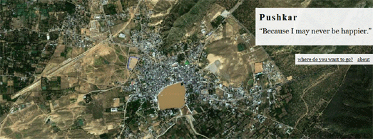
Where Do You Want To Go? is a great idea to get people to share the places they want to go and why they want to go there.
To submit a desired location users simply need to enter a destination and some brief thoughts about why they want to visit. Whenever a user submits a destination, the destination is Tweeted by timespentalone with a link to the user’s Google Map.
The best submissions are added to the Where Do You Want To Go? main map. The main map rotates through the submissions to the site, showing a Google Map satellite view of the location and the submitter’s thoughts.
My only complaint with the application is that the map is a little slow. I’d like the application to move onto the next submission after about ten seconds or maybe add a button so users can manually move to the next map.
The application reminds me a little of ZeFrank’s A Childhood Walk
For his project Ze asked people to recreate a childhood walk in Google Maps Street View. He then put together a collection of the responses superimposed on top of the appropriate Street View image.
Google Maps based photo album
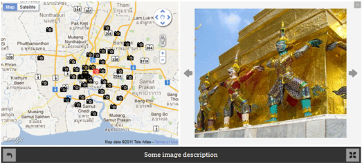
Codrops has created a very nice template and tutorial for a Google Maps based photo album.
This multi-level map and image gallery displays images related to their location. The first level of the map shows the location of places that have a set of images. If you click on a marker on the first level the map will zoom in and also display thumbnails of the photos at this location.
Clicking on a marker in the second level will result in the photo being displayed next to the map. The images can also be viewed in a lightbox and the map can be viewed in full-screen.
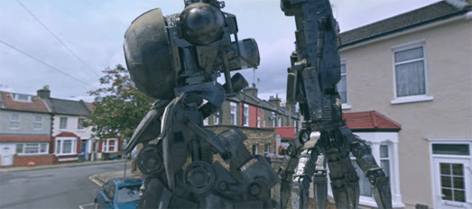
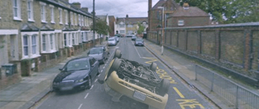
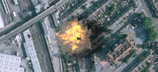
The Robot’s chaosinyourtown.com

Robots from the year 2029 have been sent back in time to destroy you and your home!
Yes – the robots are here to get YOU!
Chaos in Your Town lets you create a blockbuster robot film featuring your very own street and house. Using Google Maps Street View as the background to the scenes Chaos in Your Town creates an incredible Flash based movie that shows robots walking down your street, targeting your house and blowing it to kingdom come.
This is the best thing you will see this week. Don’t believe me? Then just have a look at the screenshots below – and then go and create your own movie.
A heat map of Somalia
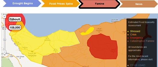
Voice of America has used a series of Google Maps and over 10,000 separate data points on rainfall, food prices and refugee movement to explain How Somalia Descended into Famine.
The visualisation explains over a series of Google Maps how the non-occurence of last year’s rain season in Somalia has led to crop failure, this year’s spike in food prices and then widespread famine.
The rainfall map lets the user view rainfall levels throughout Somalia. If you click on one of the rainfall markers you can view a graph of rainfall at that location comparing 2010’s rainfall with rainfall in 2009.
The food prices map allows the user to select different towns in Somalia and view graphs showing the sharp rise in price of a number of different crops and other essential commodities.
Finally the famine map provides a heat map of Somalia showing the scale of the famine at different locations in the country.
Driving Directions
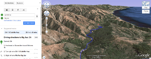
Google Maps has added the option to preview driving directions in 3D using the Google Earth plugin.
Now when you use Google Maps for driving directions you will see a 3D button next to your directions.

When you click on the 3D button the map will switch to the Google Earth view. An animated fly-through of your route will then be shown.
You can pause the flight at any time by clicking anywhere in the 3D view or on the pause button. It is also possible to jump to different stages in your directions by clicking on a step in the left hand panel.
The GitHub – Masked Polygons
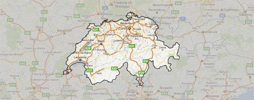
Swiss Trains have open-sourced the code for a very cool masking effect on Google Maps.
The effect transforms a KML polygon into a mask that effectively highlights the polygon on the map by shading the rest of the world. You can see a demo of the effect on this Swiss Administrative Boundaries Map.
When you select a region on the Administrative Boundaries Map the chosen area is highlighted and the rest of the map shaded out.
The mask is a very effective tool. If you want to use the effect in your own Google Maps then grab the code from GitHub – Masked Polygons.
Via Googlemapsmania