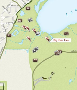
A few months back, we partnered with the UW Cart Lab to build a map for the University of Wisconsin Arboretum. The map itself is relatively accessible so I’ll let you explore it on your own as most of the functionality is immediately apparent when you use it. However, I did want to talk a little bit about a major piece of functionality that is completely transparent to the end-user. First, a little background…
The University of Wisconsin Arboretum is easily the fourth best thing about living in Madison, WI after the Memorial Union Terrace, The Farmer’s Market, and being able to bike to anywhere (coming in fifth: that bonkers taxidermy museum). It’s a relatively vast piece of natural land on the near-West side of town. In just a 5-minute bike ride from downtown, you can feel like you are in the middle of the wilderness. Residents and researchers alike use the Arboretum for everything from running and biking to invasive species research, from snow-shoeing and hiking to painting and nature writing. This piece of land is very meaningful in many different ways to many different people.

Credit: University of Wisconsin Arboretum
That diversity of experience was the main challenge we faced coming into this project. There were lots of voices that wanted to be heard and have their perspective on the Arboretum reflected on the map. How do we engage these researchers, volunteers and nature enthusiasts without having to train each of them on the minutiae of collecting and preparing geographic data?
After looking around for a service that was already doing something similar, we landed on Google My Maps (since it was Google, we didn’t have to look very far). We had already planned on using Flickr to allow users to place their own photos on the map so this didn’t seem like to far of a conceptual jump. My Maps is a simple way for users to edit maps, adding vector points, lines and polygons just by drawing on a Google Map. Best of all, it outputs to KML, the format of the data already included in the map.
After adding their feature and attribute data to My Maps, all the user would need to do is send the URL of the KML file to the map administrator and it would be added to the map. Done? Nope. This is where things get cool.
While the input methods for Google My Maps are fantastically easy and well done, the symbology needed some work to fit in with our map. We didn’t want to have to sacrifice our cartography just for ease of input. We wanted to have full control over the colors and the point icons used by this incoming data.
Changing point styles is relatively simple. There is a lengthy XML file that the map administrator uses to configure the map. Through this file, the administrator has a large amount of control over the data included in the map and can change it to instantly meet the Arboretum’s needs. It allows the admin to specify:
- The location and title of each layer
- Where the layers appear within the categories of the map
- What control users have over the layers (which show up in the legend, which start visible, which remain on)
- The available basemaps for each category
- All text content in the map
- If a layer’s feature contains photos or a slideshow
- Which layers are grouped into map animations and their corresponding date
The last thing the admin can do, is override the default point style by defining the URL to a PNG stored on the server. This icon will replace the default Google pushpin. We’ve designed a few of the default icons currently shown but with a little Photoshop work, any image can be used as a point symbol.
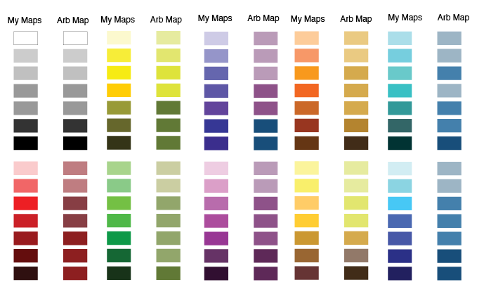
Changing the stroke and fill color of a line or area symbol was a little trickier. Google offers a choice of 70 different colors for use on My Maps. Not every single one of those colors is going to look good on our basemaps, displayed with the other layers. To solve this, we created a color compatibility chart. Every single color on the Google My Maps selection corresponds to a color deemed compatible with our map. When a My Maps KML is loaded into the map, it automatically adjusts the colors based on the chart below. It is not a 1:1 relationship, as we’ve had to limit our palette to less than 70 colors. However, it gives the user the expected control over color and makes the finished product more visually pleasing.

This solution is not 100% perfect and there were some sacrifices that had to be made to get this compatibility. Firstly, the data-model we used for each feature was limited. Google allows just one name and one description per feature. This eliminated the possibility of doing quantitative mapping and classification on the fly. (For data created outside of Google My Maps, we enabled categorical mapping using standard KML styles and including the name of the category as the name of the style).
Secondly, KML is not known for its friendly file sizes and the data used in this map is HUGE. We’ve tried to optimize it as much as possible but have resorted to inserting loading screens with informational content about the Arboretum to make those download times seem much shorter.
Hopefully this gives you a clear picture of what’s going on behind the scenes of the Arboretum map. The flexibility we’ve given to the map administrator to configure the map as well as the power we’ve given to the stakeholders to add their own data was new for us at the time, but is something we’ve continued to add to our more recent projects, albeit to a lesser degree. The UW Arboretum map still feels young and in its infancy. As more Arboretum volunteers and researchers get involved and add their considerable expertise to the map, we’re looking forward to watching it grow into something great.
 Credit: University of Wisconsin Arboretum
