Become an OpenSocial Board Member! Nominations are open!

As President of OpenSocial, I’m pleased to announce that the nominations for the Community Elected Board seat are now Open! The nomination period will run from December 6, 2010 through Jan 9, 2011, when voting will commence.

Anyone OpenSocial member is able to serve on the board. The only requirement to nominate or hold the position is that you must be a member of the OpenSocial Foundation. There are no membership fees to join OpenSocial. All you need to do is fill out a simple on-line membership application.

Posted by Mark Weitzel, President, OpenSocial Foundation

MapIconMaker 1.0: The Easy Way to Make Your Markers Meaningful

Posted by Pamela Fox, Maps API Team

In the talk I gave last fall about Maps Mashups Usability, I mentioned that one way to make your map more informative at first glance is to use the color and size of a marker to indicate categorical or density information. Previously, that would mean using an image editing program or server-side image generation script to create all the various marker icons needed. Now, with the introduction of MapIconMaker v1.0 into the open-source utility library, all that’s needed is a Javascript include and a bit of code. For example, the simple demo shows how the following line of code creates a GIcon that’s 64 by 64 pixels and has a green fill.

var newIcon = MapIconMaker.createMarkerIcon({width: 64, height: 64, primaryColor: "#00ff00"});

Behind the scenes, that line of code constructs the URLs for the various GIcon properties by using a special output of the Chart API to generate marker icon images. But don’t worry about that – just use our nifty MarkerIconOptions wizard to preview various settings, and then copy the generated code into your own mashup.

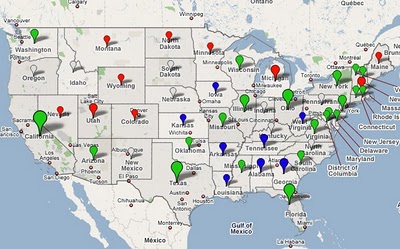
We loved the dynamic icons so much that we couldn’t wait to start using them – so some of you might have already seen them in use for Google’s Decision 2008 mapplet/map (screenshot below). At the zoomed out view, the map contains dynamically sized and colored markers for each state. The color represents the candidate that got the most votes, and the size represents the relative number of votes that candidate received. When you zoom into the state, the map then contains markers for each voting precinct representing the same data. It’s a great way to quickly understand the population density and voting habits of a region.

We hope you enjoy MapIconMaker as much as we do. Please look through the reference and examples, and let us know if you have any questions in the forum.

Google Earth Tours in Geog. Teaching III

This is a 3rd of a 3 part series. Part 1 was introduction and started the ‘rules of flight’. Part 2 finished off the rules of flight. This post covers audio, annotations, testing, use of layers and a literature review that covers all three posts.

3. Audio:
Research shows that an audio commentary is much easier to understand than a narrative delivered via on screen text. Labels identifying major sections of the animation also add value. However, adding background music has been shown to be valueless – it’s just a distraction in an educational situation.

Audio and visual elements should match in a GET because you shouldn’t make users interpret two different presentations at the same time. A critique of a GET which did not follow this advice can be found in an earlier blog post of mine under the heading; “Talk about what’s on Screen”

Audio Practicalities: I describe how to produce an audio GET in this tutorial

4. Annotations:
If the GET audio track has a descriptive line like ‘and here you can see the extent of the Scottish Highlands’ use an on screen marker such as a polygon to draw the viewers eye to the location concerned. Annotations like this should be used throughout tours, its easy to learn about a study area by doing a tour and forget that your users haven’t formed a cognitive map. Annotating what you’re discussing is a solution to this.

5. Testing:
Despite the best intentions, and having created a GET that you think looks and sounds excellent, often users miss elements that you thought you had made obvious or they misinterpret the message of the tour in ways that the author had not considered. The only solution is to test 2 or 3 typical users before releasing your GET, fortunately, this is much quicker, simpler and cheaper than you would imagine following Hallway testing guidelines.

6. Use of Layers:
A layer refers to a set of data, examples include: a thematic map showing voting by region in an election or a set of placemarks showing locations of pizza restaurants. If you wish to explain a complex map which is made up of a combination of layers e.g. showing that right wing voter States in the USA have more pizza restaurants in them, you will need to use multiple layers. It helps your users if you turn the layers on one by one in your tour explaining what the screen is showing as you go. Showing them all the layers at once and trying to explain what they are seeing is less clear.

Sometimes layers are complex enough to require annotations themselves (e.g. circling an area of particularly dense concentration of pizza restaurants)

Layers Practicalities: In running through a tour to record an audio it can often help to collect separate layers into a folder. When running through the tour you can then select a camera view for the folder and turn all the elements in it on and off at the same time. For example, you could put the pizza restaurants layer and a polygon annotation mentioned above in one folder.

Literature Review: In writing this series I did a literature review which the academics amongst you may find useful. I’ve expanded it since writing this.