The “what do you do?” exchange is always fun for me when meeting new people. When I tell people I’m a cartographer, two reactions usually occur. The first is something like “wow, that’s so cool! I’ve never met a cartographer!” (Lesson: maps make you popular at parties.) Then follows something along the lines of “so what does that mean, like Google Maps?” I then attempt to explain succinctly that yes, sometimes it is kind of like that, but no, it really isn’t.
It’s a little amazing that it’s only taken six or so years for the popular conception of a map—or at least a web map—to become so strongly tied to one type of map, and one exemplar at that. It’s both a blessing and a curse for a practice like ours at Axis Maps, in ways that I hope will be evident as I summarize the way we approach interactive web cartography.
THOROUGHLY DELIBERATE, PURPOSEFUL DESIGN
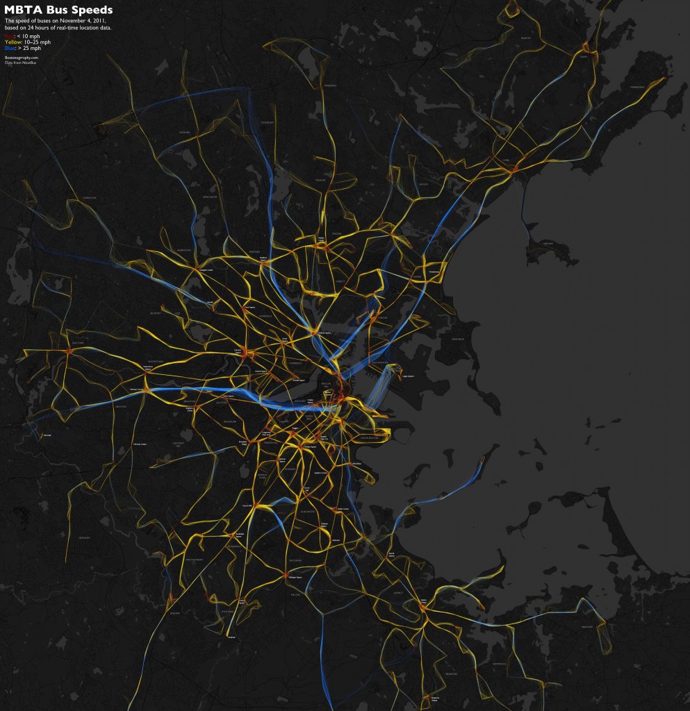
I made a bad map a couple of weeks ago. It showed 24 hours of bus GPS tracks in Boston, colored according to speed.
Cartographers, trained in their science, would tell me it’s a bad map. It’s a totally inappropriate color scheme for numerical data. It doesn’t generate any clear insights. But the map’s intended audience—the people for whom it was designed—speak differently. It’s eye-catching and novel, it’s reasonably popular, and most importantly it prompts interest and discussion on the state of transit in Boston. Rules and conventions shouldn’t be ignored to the point of misleading or misinforming map users, but just as with wholly “correct” and “useful” maps (which we also try to make!), this particular map successfully accomplished its purpose.
The point is something that seems to define our work and, I think, modern web cartography beyond the general practice of “making maps”: it’s all about purposeful design. Cartographic design is more than visuals and aesthetics; there’s room for the cartographer’s design decisions at every step between the initial earthly phenomenon and the end map user’s behavior.
Daniel Huffman has argued for the human element in cartography with regard to the discipline’s artistic side, and the more I think about it, the more it seems that this is not just about art in cartography; it’s part of what makes a Cartographer something more than a mapmaker. Cartography is about the careful thought behind the design of a map, not just any work (automated or otherwise) that results in a map.
DATA → DESIGN → CODE
So how does cartographic design play out at Axis Maps? We like to think of a project as three-stage process. We begin by finding out what the client wants mapped and for whom, and then assessing and obtaining the necessary data. Next we develop designs for the map, user interface, and interaction based on the known goals, assets, and restrictions. Finally, in a stage that is labor-intensive but conceptually trivial, we write code to build the map as designed. Without getting too far into the boring details of how we work, I want to mention a few notes on each stage.
Data
Anyone who has tried to make a map, chart, or anything like that will know that working with data is an easily underestimated task. Data come in a million formats and are often messy. Jeremy White, graphics editor and cartographer at the New York Times, has said that when people ask his advice on what software to know for his line of work, to their surprise he answers Excel. It takes at least passing familiarity with a variety of formats and scripts and tools to be prepared. And getting data onto a map isn’t just a matter of using ArcGIS anymore. I haven’t used ArcGIS even once in the past four years.
I’ll say two specific things about data. First, we always take care to obtain a data inventory from the client and to develop a data model early on. The data inventory (a list of everything that needs to be shown on the map) is an important first step before we begin designing anything, because obviously we need to have complete knowledge of the requirements in order to come up with a good design. Similarly, the data model (the way the data are organized, basically) will be necessary to know how to write code that loads and processes the data later on.
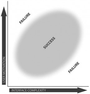
Second, all of that matters because complexity of the data and map can vary a lot, and it can’t be unknown when we go to design an interface. The chart below, from a paper by Robert Roth and Mark Harrower (PDF), explains why complexity matters. (It’s talking about interface complexity rather than data complexity, but we find them to be related.) We need to know about complexity and the map’s audience in order to execute a successful design.
Design
If there is one clear thing I can say about our design process, it’s that it works like this: mock up EVERYTHING. Everything! We try not to leave anything to imagination. We generate mockups for every interface state, every map view, and every interaction. This usually means a couple dozen screens in the end, showing a step-by-step simulation of a user interacting with the map. We think that locking down all these designs before writing a single line of code is crucial to smooth development and good design. Otherwise we run the risk of cobbling together designs on the fly while writing code, resulting in a messier product.
We’ll always miss a few things, but with enough thinking and discussion we manage to identify most problems before encountering them during development. Our design process, like most I’m sure, is very iterative and involves a lot of attempts and review. Ben, our main Design Guy, draws on experience, conventions, constraints, user feedback, a keen sense of aesthetics, and, I assume, magic to turn ideas into great-looking and smoothly functioning designs. (Maybe he’ll have a chance to describe his methods here sometime.) He notes that there are always a zillion ways to attack a design problem, and for every alternative there is always a better one. We discuss to death possibilities for every little detail until the optimal solution is achieved. Ben’s idea of improvement in design skill is being quicker and requiring fewer attempts to arrive at the best solution to a problem.

Code
Writing code takes up the bulk of our time, but in concept it’s almost a formality to us. It’s all about choosing the right tools for the job (Flash, OpenLayers, Polymaps, jQuery, and so on) and then building what we’ve already so carefully designed. We don’t do this work in order to do interesting or novel technological things; we do it to make good maps. If cool technological developments come out of it, all the better, but it’s almost never the main purpose. In my own invented definition of cartography, cartographers are not the ones whose drive is to develop mapmaking technologies. Another related community does that, spending less energy on designing actual maps. It all works well as long as the groups exchange knowledge and each knows what the other is doing.
Our coding process goes something like this. 1) Load the data. 2) Make things work. 3) Make things pretty. Like I mentioned before, having everything designed ahead of time is vital. We can start with something rough but functional without worrying about design, because we already know how it will look and behave in the end. It also lets us know when we’re finished; interactive projects have a way of never ending if there are no clear goals at the outset.

After hearing from enough of my cartography peers whose hatred of programming burns with the fire of a thousand suns, I must say this: yes, coding sucks. I write code all the time, and it often makes me want to punch the computer in the face. But it’s worth it. Totally worth it. It only takes a little skill to produce awesome things. A willingness to write some code opens a lot of doors, and it doesn’t require devoting a lifetime to becoming a master programmer. It doesn’t even require being a good programmer. It’s just another skill, not so different from, say, drawing Bézier curves in Illustrator for static work. Nathan Yau’s tale (and his Visualize This book) is a good one to learn from for those who have resisted getting into programming.
WHERE DOES DESIGN BEGIN?
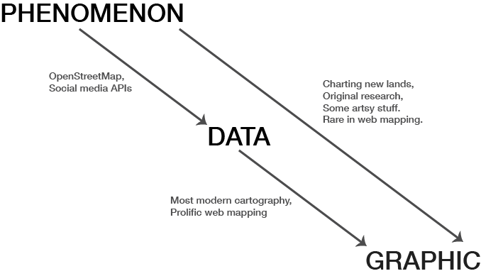
After describing the design we do, it’s worth noting that visuals and user experience design are only one part of the overall process of designing a map. Kirk Goldsberry, visiting scholar at Harvard and professor at Michigan State University, recently impressed upon me that design in a cartographic context—broadly meaning the decisions that go into map—is not merely figuring out the visuals, but rather exists in the entire mapping process, something I touched on earlier. Leaving out map use for now, consider the progression from phenomenon to graphic. At one end is the actual thing that is happening, at the other end is the map that represents it. In the middle are data, meaningless in isolation and not to be confused with the phenomenon itself.
Above are some activities that exemplify the progressions from phenomenon to data, from data to graphic, and the whole thing from phenomenon to graphic. Ideally a cartographer designs the entire process: what data are collected, how they are collected, how they’re organized, how they’re represented, how the map looks, how interaction works, &c. Dr. Goldsberry gave the example of old-timey explorers. They went places, recorded the data themselves for the purpose of making a map, and then they crafted the map itself. They designed everything. Sometimes a cartographer can still own the whole processes, but it’s rare these days, especially in web mapping. Realistically I think most activity falls either between phenomenon-to-data or data-to-graphic, with most of us who call ourselves cartographers existing in the latter category. We work with the data we have, but it’s worth bearing in mind that we’re doing something (i.e., making a map) that the data may not have been meant for, and this can affect our user experience design decisions.
WEB MAPPING, or PUTTING THINGS ON TOP OF OTHER THINGS
Returning to Google Maps, it has defined not only the layperson’s idea of a web map but also the web mapper’s idea of a web map, it seems. Ever since the early days of Google Maps mashups, the trend in web maps has been basemap + stuff on top. There’s almost always this strict separation of layers—layers that often were not designed to go together, although that part is gradually on the decline. We’ve advanced to the point where pretty good cartography is possible and easy in this framework (thanks to tools like TileMill), but it remains the case that web cartography usually means designing around the tiled Mercator slippy map system, and often using someone else’s tiles, instead of seeking the ideal solution. We all do what’s feasible within technological and time constraints, of course. At Axis Maps we take advantage of the built-in capabilities and user familiarity with standard tiled web maps all the time. But I do sense a risk that “web map” is coming to mean only one type of map, the “things on top of other things” map.
So perhaps my purpose today is to remind us all that there’s more than one kind of web map. Cartography is not Google Maps. It’s not OpenStreetMap. It’s not mashing up geotagged data from various APIs. It’s not rendering tiles. It’s not “geo” (“geo” is a stupid non-word and I wish it would die). It’s not GIS. Cartography is in the thoughtful design of maps, no matter how they are built or delivered. via:axismaps.com


