The evolution of sitelinks

When you’re searching, you often have a specific task in mind, like figuring out which exhibits are showing at a nearby museum. Despite this narrow goal, people often start with a broad query, like [metropolitan museum of art], with no mention of exhibits. For these searches, the first result may include a list of links to specific sections of the site, which are called “sitelinks.” Today, we’re launching several improvements to sitelinks, including the way they look and are organized in search results.


Sitelinks before today’s changes


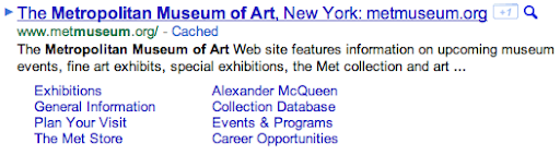
Sitelinks have been around for a while, but when we first launched them years ago, they were much more limited—a single row of just four links:


It turns out that sitelinks are quite useful because they can help predict which sections of the site you want to visit. Even if you didn’t specify your task in the query, sitelinks help you quickly navigate to the most relevant part of the site, which is particularly handy for large and complex websites. Sitelinks can also give you a good overview of a website’s content, and let webmasters expose areas of the site that visitors may not know about.

As it became clear how valuable sitelinks were, we continued to improve their appearance and quality. We rearranged them into a column of links to make them easier to read. We doubled the number of links, creating direct access to more of the site. We started showing sitelinks for more results and we continuously made improvements to the algorithms that generate and rank the links. With each of these changes, people used sitelinks more and more.

That brings us to today’s launch. Sitelinks will now be full-size links with a URL and one line of snippet text—similar to regular results—making it even easier to find the section of the site you want. We’re also increasing the maximum number of sitelinks per query from eight to 12.

Improved sitelinks with URLs and snippet text

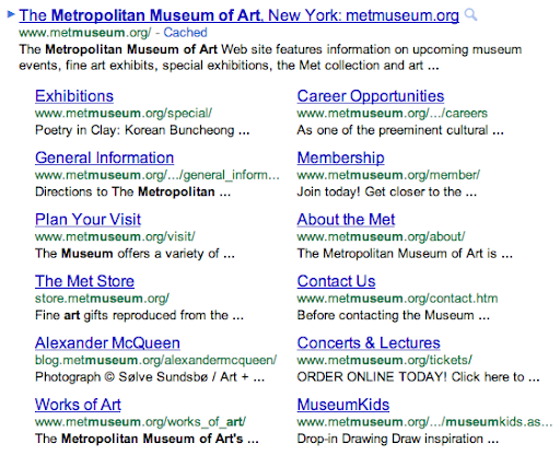
In addition, we’re making a significant improvement to our algorithms by combining sitelink ranking with regular result ranking to yield a higher-quality list of links. This reduces link duplication and creates a better organized search results page. Now, all results from the top-ranked site will be nested within the first result as sitelinks, and all results from other sites will appear below them. The number of sitelinks will also vary based on your query—for example, [museum of art nyc] shows more sitelinks than [the met] because we’re more certain you want results from www.metmuseum.org.

(Via the Inside Search blog)

Designing Maps Applications for Usability on Mobile and Desktop

Maps API applications are accessed on desktop and mobile devices of many shapes and sizes with each application having unique goals for conveying information effectively and for facilitating user interactions.

In this session, we wanted to address some common usability problems that many maps developers run into and to suggest possible solutions that could correct the behaviour. We hoped developers would utilize and build upon these suggestions as they encounter problems in their own projects.

Here is an overview of what was discussed in the talk:

  • Why is usability important and why you should care.
  • What are the differences between mobile and desktop and how do they relate to map applications.
  • Techniques for changing the way data is represented on the map and how can change the experience.
  • Ideas for improving user interaction with the map.
  • Techniques for storing geospatial data.
  • Why incorporating sharing into your application improves usage and user happiness.
  • How changing the appearance of the map can dramatically change the user’s understanding and interpretation of the data.

Justin O’Beirne joined us onstage to talk about map styling and how even the most subtle changes to the map can drastically change the user’s experience. Below is an example of what can be achieved by using styled maps. The two maps are at the same location and have the same data points but the map on the left has had a custom style applied.

By removing the map labels and decreasing the saturation and lightness we are able to emphasise the importance of the data, make it more visually appealing and build a application that is truly our own. If you would like to play more with map styling check out the styled map wizard.

Vector Shapes on Bing Maps

In addition to their obvious functional purpose, maps can be objects of great aesthetic beauty. On my bookshelf I have a book (The Map Book, by Peter Barber) full of beautiful illustrations of maps throughout history, such as these:

image image
image image

Perhaps it is unreasonable to compare a simple web-mapping tool such as Bing Maps to the art of a master cartographer, but one thing is certain; namely, this is not beautiful:

image

I try to convince myself that Microsoft chose these horrible default colours so that people would look at them, think “My God – those colours are awful – I must change them!”, and then look up how to set the FillColor, StrokeColor, and StrokeThickness properties of the Microsoft.Maps.Polygon object, but in practice this doesn’t always happen. Every time I see a default-coloured polygon like that above, I’m sure Marinus of Tyre must turn in his grave.

But it doesn’t have to be like this. Applying some simple style rules to change the fill and stroke properties can have a dramatic improvement on the appearance of your map. As an example, I took around 3,000 features from the OS Vector Map dataset in an area around Norwich and plotted them on Bing Maps as polylines and polygons. Every element contained an additional feature code property, which described the type of feature using the same numbering system as with the Ordnance Survey’s own dataset. For example, feature code 25710 is a motorway; code 25999 is an area of woodland, and 25301 is a single-track railway.

Then I created a set of “stylesheets” – simple arrays of different Microsoft.Maps.Color values that should be applied to features based on their type. For example:

[php]
var style1 = {
// Building
25014: {
strokeColour: new Microsoft.Maps.Color(alpha, 126, 119, 98),
strokeWidth: 1,
fillColour: new Microsoft.Maps.Color(alpha, 232, 214, 176)
},
// Glasshouse
25013: {
strokeColour: new Microsoft.Maps.Color(alpha, 232, 214, 176),
strokeWidth: 1,
fillColour: new Microsoft.Maps.Color(alpha, 255, 255, 255)
},
// Electricity Transmission Line
25102: {
strokeColour: new Microsoft.Maps.Color(alpha, 158, 170, 158),
strokeWidth: 1
},

}

[/php]

And finally, a simple function that looped through the elements on the map and applied the correct “style” to each element based on its feature code, using the setOptions() method. The results are shown below, or you can try a live demo here.

image
Default
image
Style 1
image
Style 2
image
Black and White
image
Random (very Mondrian-esque, I think!)