Cartographic mis-representation?
update [20/09/2011] from HaperCollins Publishers at the bottom
update [20/09/2011] from HaperCollins Publishers at the bottom
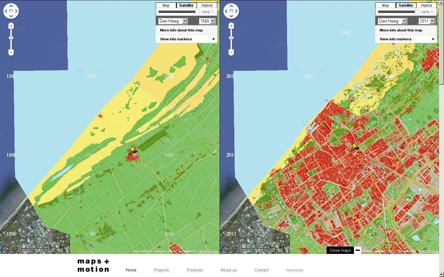
Most maps lie, they are only a representation of what is out in the real world, simplified, distorted and can be mis-leading.
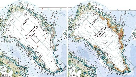
The Map of Greenland by the Times Atlas is a cause of concern left is the 12 year old representation of Greenland, the right is the revised current 2011 representation – side by side can be very clear they are representing less ice than before by a huge margin.
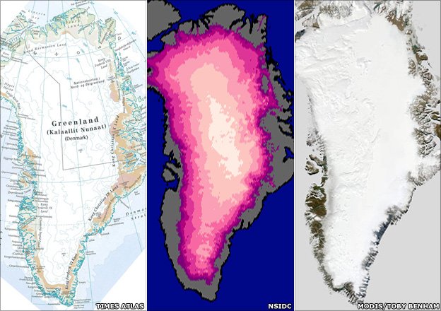
Image from BBC News (updated)
Image against a recent satellite imagery – the out-skirting coastline and more noticeable is the difference in colour representation. (There is also seasonal change that is difficult to represent in one snapshot of the cartographic map.)
Though a lighter (grey) would of be wiser to graduate the contrast.
“Publicity for the latest edition of the atlas, launched last week,
said warming had turned 15% of Greenland’s former ice-covered land
“green and ice-free”.
said warming had turned 15% of Greenland’s former ice-covered land
“green and ice-free”.
Via Mapperz