Google Earth: Tracking the Hurtigruten along the coast of Norway


In what’s becoming quite a popular event, the cruise liner Hurtigruten has been live broadcasting its position as it travels along the coast of Norway. The cruise line has been operating for well over 100 years, and this event has been apparently drawing large crowds at its stops, and is becoming quite the event in Norway.

The site itself is very well built. You can follow of a map of the journey, view various live cameras from the ship, and even view a live 3D model of the ship’s location: just click on the 3D tab in the lower right, then click the resulting image to see the ship in 3D.


hutigruten.jpg 

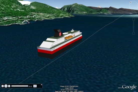
As pointed out by Google Maps Mania, you can click the red icons on the map to view a replay of that section of the journey. The scenery in Norway is stunning, and this is a great way to view it all.

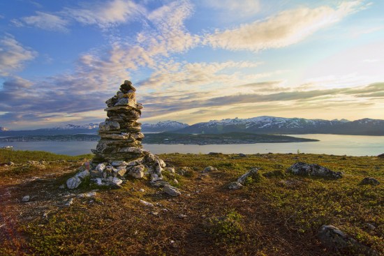
There are also other elements that can be added to the map, such as Flickr photos, archived video, and the location of other boats in the area. Some of the photographs in there are simply amazing, as shown here:

hurtigruten-flickr.jpg 

To see it for yourself, simply head over to their site and you’ll be streaming the live feed almost immediately.

(via GMM and Ogle Earth)

The OnTerra New Heat Map Creator app

Bing Maps offers the capability to visualize data in various manners. Viewers are, of course, always looking for ways to better understand their data. Showing data on a map alone—customer locations for monthly sales, for example—provides quick and easy insights. However, it doesn’t allow you to see trends, like volume of sales. Advanced map-based visualizations like thematic and heat maps allow for greater extrapolation of such data. The focus of this blog is on heat maps, specifically a new heat map app that we recently released.


The Heat Map Creator allows you to easily create heat maps that can be cut and pasted into a presentation or report. As a reminder, heat maps (or density maps) are maps that use color gradients to show data/attribute density. Heat maps are becoming quite popular because they provide compelling visualization without requiring geographic region data (polygons) to be acquired and maintained. Check out the app to see some examples of just how useful and informative heat maps can be.

Figure 1 – OnTerra Heat Map Creator app showing sample data.

Heatmapper1

The Heat Map Creator allows you to produce a heat map by importing up to 25,000 locations (latitude and longitude) and an optional numeric value from your data, like monthly sales (imported via a CSV file). From there, you can easily print screen and capture the image for a presentation or document.