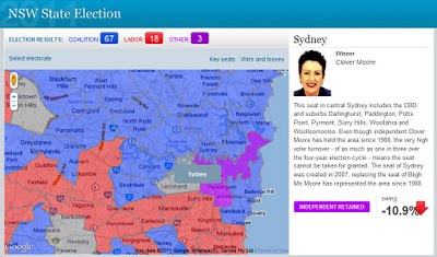
Last weekend NSW voters went to the polls to choose the new State government. As was widely anticipated, coalition parties – Liberals and Nationals have won overwhelming majority of seats. The extent of Labor’s defeat can be best gauged by looking at a map which shows electorates coloured according to a winning party. Blue, traditional colour associated with the Coalition, covers almost the entire State of NSW, with only a few islands of red depicting Labor held electorates. The map was created by Sydney Morning Herald to report on the progress of election results.
The map is quite intuitive to use – just move the mouse over the polygon to reveal electorate name and click on a polygon to bring additional information about the electorate in a side panel. As polygons are created from point data they can be highlighted on mouse over. The downside of this approach is that, because of the limit on how many points browsers can handle, developers had to sacrifice the quality of boundary outlines, keeping points to a minimum. The effects are gaps and overlaps in individual polygons when you zoom too close.
As noted in GIS related media, this was the only map used in reporting election results in NSW. Why this lack of interest to commit resources and present “the battlefield” spatially? I suspect that it may have something to do with the availability of State electoral boundary data – a quick search on the Internet did not yield any results. Creating such boundaries from secondary information sources may have proven too big of a task.