Google Environment: Integrated Mobile Apps


The Google Apps Marketplace is a storefront for Google Apps customers to discover, purchase, deploy and manage web applications which are integrated with Google Apps. These applications are typically used from desktops and laptops, but many vendors on the Apps Marketplace have also optimized the experience for their users who are on-the-go. There are several different strategies for enabling a mobile workforce, and each requires a different approach to authentication and authorization.

Lightweight: Synchronize Contacts, Calendars and Docs with Google Apps

Google has written applications and synchronization clients to help ensure that the core Google Apps data is available to users on their mobile devices, whether they’re on their mobile phones or tablets. By storing contacts, dates and documents from your application in Google Apps using the application APIs, you can leverage these features to provide a mobile view for your users.

Since you’re only accessing the application APIs on your web application’s server, and the user has already linked up their mobile device to their Google account, there are no special techniques for authentication and authorization when using this lightweight approach.

Standards-based: Build a mobile-optimized web application

With the latest advances in HTML5 web technologies such as offline and local storage, it’s possible to build mobile interfaces for business apps which are full-featured and accessible to users on many devices. The primary goal in building the mobile web application is to optimize the user experience for different input devices, form factors and limitations in network availability and bandwidth.

Because the application is in a web browser, most of the changes to implement are in the frontend– HTML, JavaScript and CSS. User authentication and data authorization continue to use the same OpenID and OAuth technologies as are used for the desktop/laptop version of the application.

Device-custom: Build native companion apps for mobile devices

Does your application need access to hardware-specific APIs which are not available in a web browser, or do you feel a great user experience can only be achieved using native code? Several Apps Marketplace vendors have built native applications for popular mobile platforms like Android and iOS. Although it takes considerably more effort to build multiple native applications to cover the major platforms, these vendors can also take advantage of the additional distribution channels offered by mobile stores.

Authentication and authorization are often challenging for developers building native mobile applications because they cannot simply ask users for a password if their app supports single-sign on to Google with OpenID. We recently published an article describing a technique using an embedded webview for accomplishing OpenID authentication in mobile apps. This article includes references to sample code for Android and iOS.

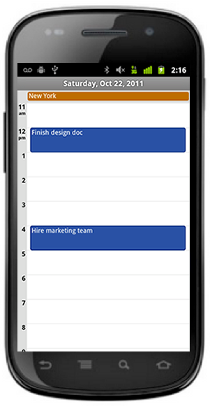
Many Project Management applications, like Manymoon, store important dates on Google Calendar. These dates are then available on mobile devices.

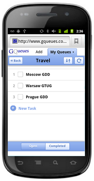
GQueues has a HTML5 mobile app. Their founder has written about why they used this technique.


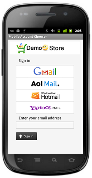
Native applications, such as the OpenID Sample Store displayed, can use an embedded webview to authenticate users.

GoogleCodeNews

High resolution in Static Google Maps API

The Static Maps API is a great service for when you need to quickly generate a static, lightweight map. Following the updates to the Maps API/Earth API Terms of Service earlier this year, mobile application developers are now free to use the Static Maps API in native mobile apps, providing the map links to the Google Maps app or website for the same location. However the high pixel density of some mobile screens can make the labels and icons on such a static map unreadably small.

For this reason, we’re introducing a new feature of the Static Maps API that smoothly doubles the size of the whole image including labels, icons, and overlays, to suit high resolution screens. To apply this upscaling to an existing Static Maps API image, simply append &scale=2 to the URL.

The image returned will contain the same level of detail, but be twice as wide and tall without the stepping or blurring that results from upscaling an existing image:

scale=1
(default)
scale=2

Note that when using the scale parameter the pixel size of the returned image is the product of the size and scale values given in the URL. The size parameter therefore now specifies the size of the required image in Density-independent pixels or Points, as they are known in the Android SDK and iOS SDK respectively.

Web based apps can also benefit from higher resolution Static Maps by adding a scale=2 image to the page with a CSS width and height that matches the size parameter. By default, the browser on many mobile devices upscales images in web pages by a device specific factor based on the pixel density of the screen. However these devices will preserve additional detail in the image if the image pixel : CSS pixel ratio matches or exceeds the scaling factor, which can be found by querying window.devicePixelRatio in JavaScript.

For example, below are the above two maps side-by-side with the same CSS size. On a desktop screen with a window.devicePixelRatio of 1.0 these will look almost indistinguishable. However open this blog post on a device with a high resolution screen, such as a Samsung Nexus S or Apple iPhone 4, and the image on the right will look significantly sharper.

scale=1 scale=2

As an added benefit, Maps API Premier developers can also request maps with a scale factor of 4. Although this exceeds the maximum window.devicePixelRatio of current mobile devices it does facilitate generating maps for printing at high quality:

scale=4

Note however that the largest image pixel size that the Static Maps API can generate for Premier customers, regardless of the value of the scale parameter, is 2048×2048. Consequently at scale=4 the largest available value for the size parameter is 512×512. Note also that any use of the Static Maps API for generating maps to print must comply with the Permission Guidelines for Google Maps and Earth, which apply equally to Maps API Premier customers.

For more information on the scale parameter, and the other great Static Maps features, check out the Static Maps API documentation. We hope this feature helps your apps enjoy the full benefit of the high resolution screens that are increasingly popular, and makes them just that little bit easier on the eye!

Modular plug-in for customizable infobox control

As many of you know, the Bing Maps Locator Wizard is a portal that allows you to generate a Bing Maps Locator in minutes, and then have it hosted in Windows Azure for free. One of the steps in the wizard allows you to customize the style of various elements of the locator.
I was recently working on the wizard and required a highly customizable infobox control that would likely be put in an iframe. This article highlights some of the key features of the modular plug-in we created to allow for this requirement. The result far exceeded our expectations and InKnowledge has since released the code to the Bing Maps community so you can use it in your own applications. Feel free to download the complete source code, with sample implementations and documentation.


Modular Design The Bing Maps 7.0 Control was released last fall and is a complete rebuild from the ground up when compared to previous versions of Bing Maps. We have seen huge improvements in API performance and the size of the control. One feature of the map control was to use a modular framework; this allows you to register and load modules as they are needed. One result of this is faster loading speeds. Those interested in creating your own reusable modular plug-ins for Bing Maps should have a look at the documentation.
Custom Infoboxes When the 7.0 Control was originally released there were no infoboxes. The infobox control that Microsoft soon added was a bit different from past versions and was designed to be more flexible. While this is a great improvement, there are a couple of caveats to using this infobox control. The first is that the infobox always points up and to the right and does not reposition itself. This means that infoboxes that are anchored near the top are displayed outside of the map. This can be an issue if the map is being put in an iframe or the map is placed at the end of a webpage. The second caveat is that using custom HTML requires you to also generate the infobox arrow and content area, in addition to the content you want to display. Ideally we would be able to put custom HTML into the frame of the built-in infobox.
Positioning Our goal was to have the content positioned in the center of the map to ensure users can see the infobox. The solution: break the map into quadrants and modify the layout of the infobox such that the content is positioned in the middle of the map. For example, if the anchor point of an infobox is in the lower-left part of the map we want the infobox to be positioned to the right of the anchor point and pushed up. The easiest way to figure out what quadrant the anchor is located in is to convert the anchor coordinate to a pixel coordinate relative to the upper-left corner of the map. To determine if the anchor is to the left or right of the center of the map, simply check to see if the x-pixel coordinate is more or less than half the width of the map. Similar logic can be used to figure out if the anchor is above or below the middle of the map. Once we know if it is left or right of the center and above or below the center, we simply need to place the infobox so that it is in the opposite direction.
The Infobox Arrow One common issue that developers run into when trying to create customizable infoboxes is with the infobox arrow. In the past, these were almost always images that required edits if you wanted to change something as simple as the color. After a lot of research and experimenting, I found an ingenious solution: CSS borders. Years ago, when the web was young, webpages used to use really big borders to make things look like they were in a frame. As time went on the borders got smaller and smaller to the point where they are either not used or only 1 or 2 pixels wide. So where am I going with this? Well, if you look at a picture frame you might notice that the sides of the frame are connected in the corner at a 45-degree angle. This angle also occurs with CSS borders. If we take this and use a bit of fancy styling, we can modify the color and width of four edges of the border CSS class and generate an arrow. Not only can we generate an arrow, but with a little bit of logic and CSS styling, we can control the width, length. and color of the arrow. Check out this good article on creating angled shapes using the border style.
Additional Features The API for this custom infobox control is pretty basic. There are only four public methods that are exposed: hide, show, getOptions, and setOptions. The show method is pretty straightforward; it takes in a coordinate and content (either text or HTML). The content will be placed inside the infobox frame, rather than replacing it. By making the input generic we are able to use this infobox with pushpins, polylines, polygons, or on its own. As for options, not only can you set the dimensions and color of the arrow, you can also:
•    Set the background color of the content area of the infobox.
•    Set the color of the border on the infobox.
•    Specify minimum width and height for the content area.
•    Specify an offset distance from the anchor point.
•    Hide the arrow.
•    Hide the default close button.
•    Tether the infobox. The tether option allows one of two user experiences. When enabled the infobox will stay open and reposition itself as you move the map around until you close it. When disabled, the infobox will close when the map moves.
Implementing the Plug-in Implementing the custom infobox is easy. The first thing you must do is register the plug-in with the map control. You can do this using code similar to the following:
var map, customInfobox;
function GetMap() {
map = new Microsoft.Maps.Map(document.getElementById(“myMap”), { credentials: “Your_Bing_Maps_Key” });
//Register and load the Custom Infobox Module
Microsoft.Maps.registerModule(“CustomInfoboxModule”, “scripts/V7CustomInfobox.min.js”);
Microsoft.Maps.loadModule(“CustomInfoboxModule”, { callback: function () {
//Create an instance of the custom infobox control
customInfobox = new CustomInfobox(map);
}
});
}
To display an infobox, specify a coordinate and some content like the following:
customInfobox.show(map.getCenter(), “<b>Hello World</b>”);
We hope you find the plug-in helpful.