3 Crime Maps: Point collation


Quick update of the Placemark Clustering project: we’ll be doing user tests using the uk police crime map later this summer (discussed below) comparing it to a chloropleth grid (translation = head map based on grid, I explain further here)
In thinking about this I’ve hunted down some examples and I thought it would be interesting to name check 3.


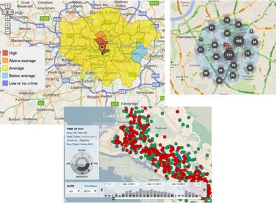
No Collation: The first map is Oakland Crime Spotting (bottom inset in figure) that is very similar to San Francisco Crime mapping, reviewed here. Unlike the other two maps it attempts no point collation at all, I image the authors would argue that they deal with the problem by providing sophisticated filtering tools to reduce the point density. However, it doesn’t help if the user wants to get an overview picture of crime across the area the map covers.
Traditional Choropleth: Switching to the the UK, the Metropolitan Police (=London for non UK readers) offer a choropleth map based on wards and subwards (top left insert). I regard this as the traditional approach. Notably it doesn’t show actual figures for postcodes, only sub wards – a sub ward is a collection of postcodes. My problem with this is that almost no one knows the boundaries of wards and sub wards so its a strange way to split the city up. (Aside: in my experience, Londoners tend to split London up based on tube stations)
Point Collation: The UK police offer a national map which uses point collation (top right insert). This is the main one we’re planning to test as IMHO it isn’t an effective way to visualise the data (related post). It offers a finer grain of data – you don’t actually see the true location of the crime but it is collated down to the postcode level. In London, a postcode is roughly equal to a single street.


Google Earth Tours

Looking at the examples of GE tours out on the web I’m struck that they often use flashy attention grabbing effects but fail to communicate their content well. However, watching this video made me pause and rethink


Intangible Value: In a very entertaining talk Rory advocates the importance of ‘intangible value’: its not anything real but its absolutely worth something. An example he doesn’t discuss is the placebo effect, results show you can put a patient in an operating theatre, slice open their knee, wiggle some tools around inside achieving precisely nothing and the patient is likely to report a real reduction in knee pain after the un-operation. Amazing isn’t it?

Chart Junk: I’ve always advocated the Edward Tufte approach to graphic communication, he regards anything that is not directly contributing to communication as ‘Chart Junk’ – anything that is there to make the tour look flash or just as decoration is getting in the way of the message and should be removed. Richard Mayer has empirical evidence showing that chart junk in educational animations (which are very similar to GE tours) has a negative effect on teaching efficiency which he calls the coherence principle.
Context is All: So is chart junk fluff that should be removed or does it add a professional feel and grab attention in a useful way? My view is that in formal education (taught classes in schools or Unis) producing intangible value should be low priority, any clever effects in GE tours fail to grab attention by the 2nd or 3rd lecture of a course. However, in an outreach context, particularly in a setting like a kiosk in a museum, a GE tour would be vying for attention against other exhibits so special effects represent intangible value that is worth having. These two contexts are extreme points on the end of a scale and there are all sorts of other contexts inbetween them for which decisions need to be made. The key question in making such design decisions is ‘do I need to grab users attention?’.
Content First, Flash Presentation Second: Despite the context discussion above I would add that even in a context where flash presentation is important authors need to be careful that the message still gets through. Its no use grabbing someones attention if you fail to then do anything with the time they then give you. Juggling this need to both attract attention and also tell a good story is not easy but Hallway Testing is the solution.

Google Earth: Tours User Testing

Earlier this year I did some user testing on Tours in Google Earth investigating my thoughts on best practices for producing tours in a more detailed fashion. Volunteers watched simple tours which flew them from one placemark to another via a variety of paths. The placemarks were then switched off and, from a high view, users were asked to identify where the markers were.

Preliminary results show some interesting outcomes that should be bourne in mind when producing Google Earth Tours (GETs):

Speed: Double click a placemark in Google Earth and you will be flown into a closer view at the default speed. We flew students around at that speed, twice as fast and half as slow but to little effect, students across the 3 speeds performed similarly whatever speed was used.
I’ve often worried that I’m flying students too fast for them to follow where they’re flying from or to within a GET. It seems for simple paths, students can be flown surprisingly fast and still follow what’s happening.
Overview: The paths used flew students from placemark to placemark at a high altitude with both placemarks clearly in view at the same time and also along the same route but at a lower altitude without being able to see both placemarks at the same time. Not having an overview dramatic reduced students abilities to recall placemark locations.
In terms of best practices this leads us to suggest that unless you have good reason not to, virtual flight segments within a GET should always include a mid point overview showing both placemarks in view if this does not naturally occur.
Distance vs Direction: Students proved good at tracking the direction they were following but were less good at guessing the overall distance between placemarks. Evidence for this is less clear but it may be worthwhile reminding students of scale when they are at overview points so they can get a sense of overall distances between map elements.

(Cross-posted from google earth design)