Over the past week, we’ve worked hard to bring you the latest imagery and applications related to the Japanese earthquake and tsunami. Last week we showed you a list of various resources, then some fresh imagery that was released on Saturday, and then another update earlier this week with even more useful resources. Today we have a few new ones that you may find to be valuable.
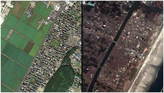
The best use of imagery is probably ABC News and their impressive before and after maps. Just slide your mouse across a map to see the before/after shots compared, and you’ll be stunned by the differences.
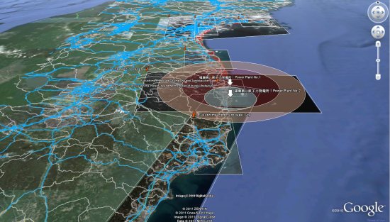
Next we have a useful map that is powered by the Google Earth Plug-in to show available roads in Japan, along with other information about flooded regions, power plant locations, etc. Data comes from HONDA, GeoEye and other sources.
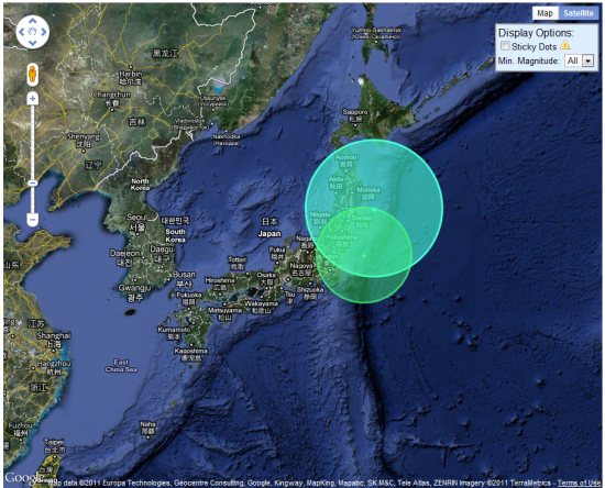
Google Maps Mania points us to the Japan Quake Map, which shows a timeline of the earthquakes around the country. This is by Paul Nicholls, who also brought us the Christchurch Quake Map back in February after the major earthquake in New Zealand.
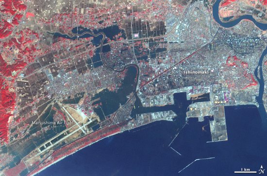
For a bit more imagery, NASA has released some fresh images of Ishinomaki, which you can view here or see in Google Earth using this KML file.
They also released a nice before/after view of Rikuzentakata, which you can view here.
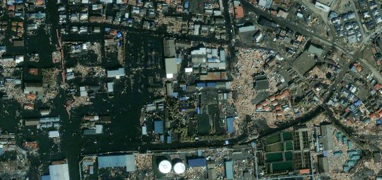
GeoEye, in addition to releasing a ton of imagery as we’ve already seen, also released a stunning photo of Ishinomaki yesterday, which you can find here in their gallery.
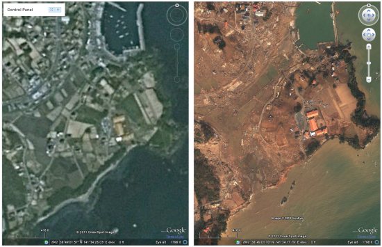
Last fall, we showed you the cool “AnotherEarth” site that allows you to view two Google Earth plug-in windows side-by-side to compare various features as you zoom around, and the windows stay in sync with each other. Now John has created a new version of the system that has the base (pre-earthquake) Japan imagery on one side, and the fresh imagery from various sources on the other side, giving you a great tool to see the before/after differences for much of the country.
The digital resources regarding Japan are pouring in, so hopefully the financial resources are as well. Many ways to give are listed on the Google Crisis Response page and we encourage you to consider donating to the cause. You can also view this post on the Official Google Blog for additional resources.