While putting together a demo SketchUp file to use in our booth at the AIA National Convention last month, I worked out a nifty little technique that I think is worth sharing. Here’s hoping you think it’s nifty, too.
The problem I was trying to solve was this: SketchUp’s Section Plane Tool cuts away parts of a model to show sectional views, but it doesn’t “fill in” the spaces between wall surfaces, floor slabs and other areas that are intended to be solid in a design. Often, architects will blacken or hatch these interstitial areas to help their drawings read better. This filling-in is called poché, and SketchUp simply doesn’t offer an automatic way to do it.
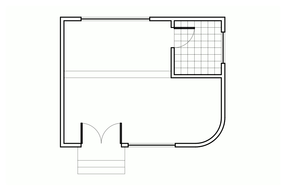
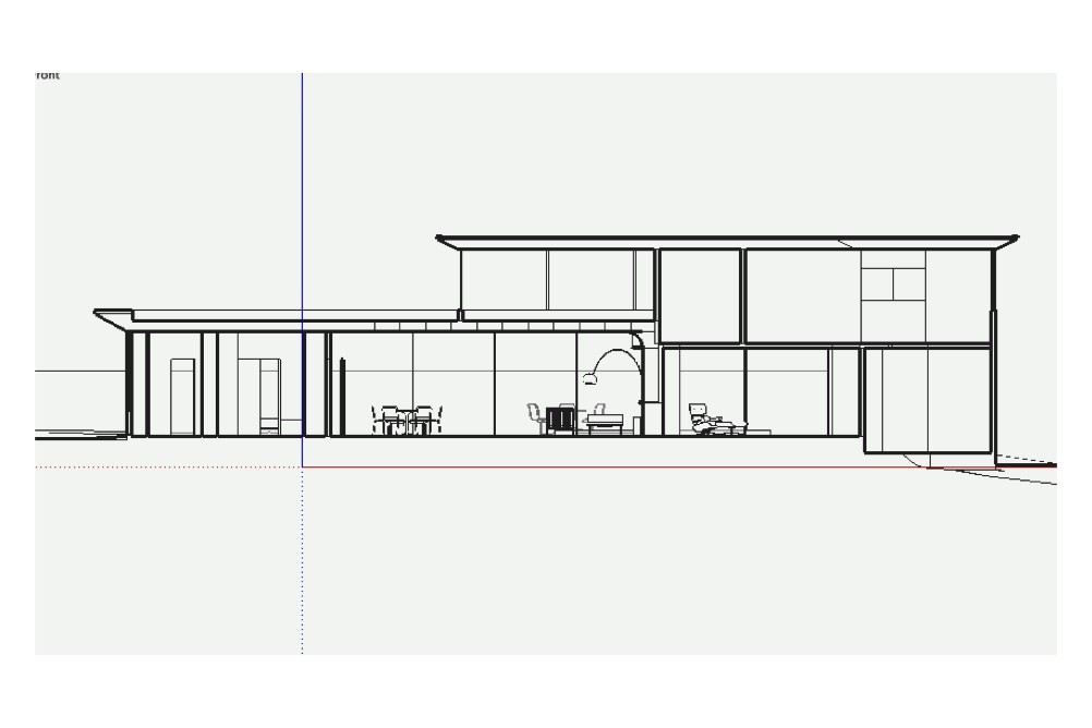
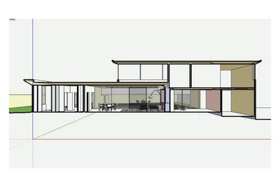
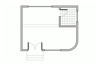 By default, SketchUp thickens section cut lines, but the spaces between the faces aren’t filled in (above).
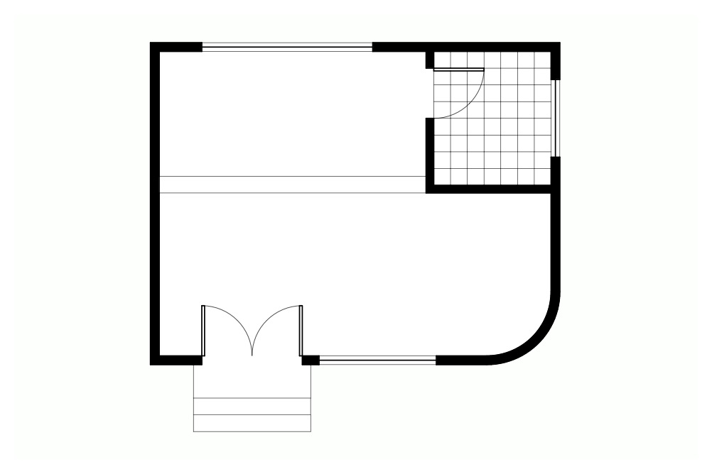
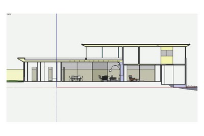
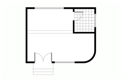 Sometimes, it’s useful to show section cuts with solid shading.
I wanted the SketchUp file I was preparing to look “pochéd” no matter where it was sliced. Furthermore, I wanted that poché to carry over when the model was inserted into LayOut.
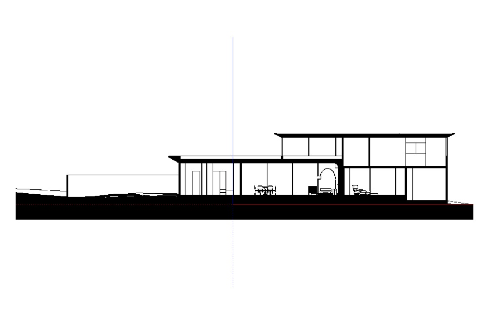
I started by using the Section Plane Tool to cut a section through the model (as seen below). I oriented my view to be perpendicular to the section cut by right-clicking the section plane object and choosing Align View. Since I wanted this to be a true, scalable orthographic view, I turned off perspective (Camera > Parallel Projection). Finally, I created a new scene; doing so made navigation easier, and was necessary for creating a viewport in LayOut later on.
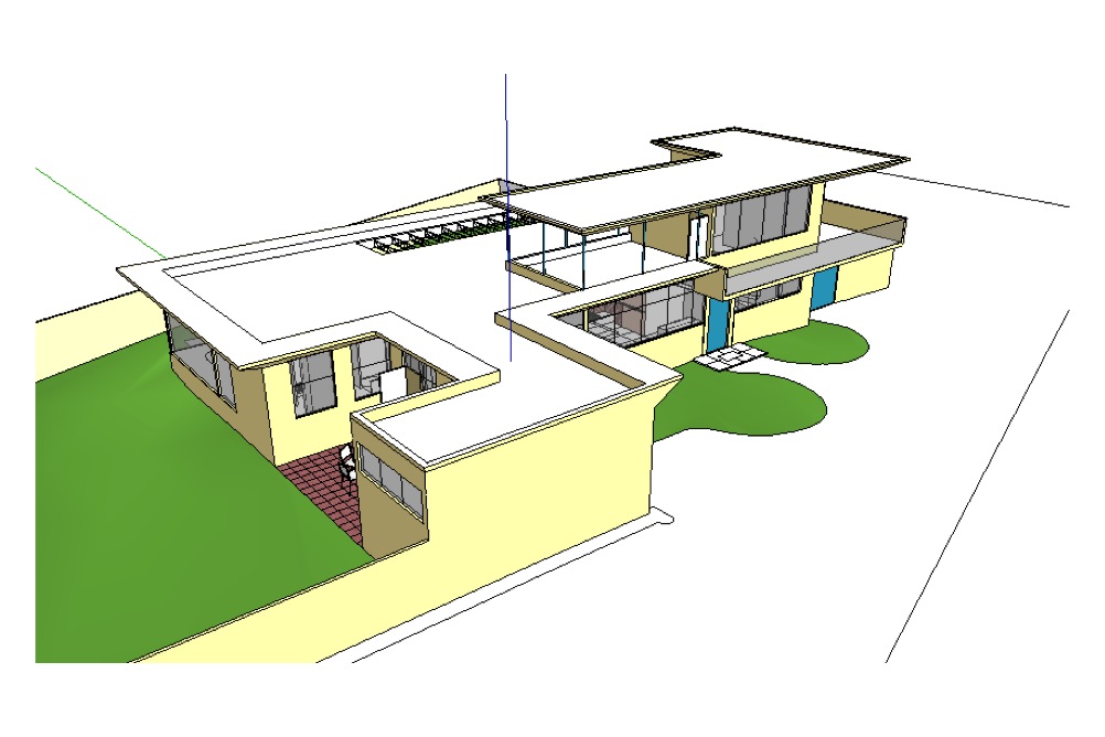
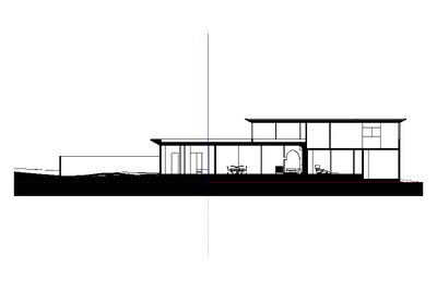
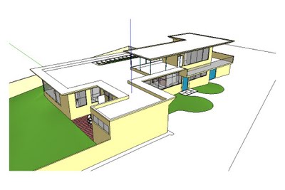 An overall view of the model
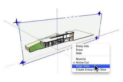 After adding a Section Plane, I right-clicked and chose Align View.
 This is the right view of the model (above), but true orthographic projections don’t include perspective.
 Choosing Camera > Parallel Projection from the menu bar turned off the perspective.
Now for some work with Styles: As this would be a black and white, sectional view, I chose to apply the HiddenLine style from the “Default Styles” collection that ships with every copy of SketchUp. This style uses thickened edges to indicate cut-through faces, but (as I mentioned earlier) it doesn’t fill in the areas between them. Perhaps more annoyingly, edges which exist beyond the section cut still show up in cut-through areas (see below). This is visually distracting and not at all acceptable for professional work. If I’d turned in drawings that looked like this in architecture school, my professor would’ve made me run laps around the studio.
 Applying the HiddenLine style turns the model black and white, but there are problems.
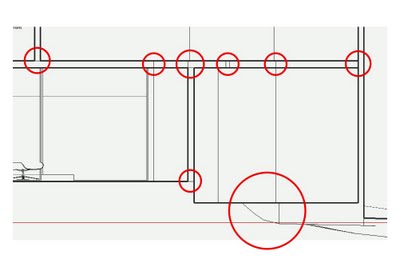 Edges which exist beyond the plane of the section cut are plainly visible. This isn’t desirable.
Revelation #1: Monochrome is the answer
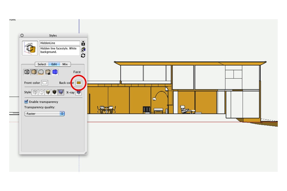
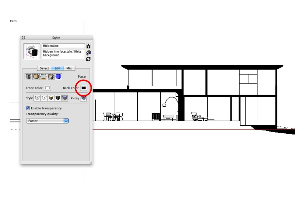
This helpful post from last year gave me the idea to use the Monochrome face style to automatically turn the “fronts” of my faces white and the “backs”, black. See the following image for a visual explanation of what I did.
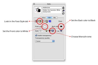 I selected the Monochrome face style and chose white and black for the default front and back face colors.
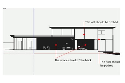 The above settings work well, except where faces are “inside-out”.
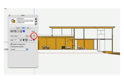
Hmm. It was clear that I had a little cleanup work to do; some of my faces were oriented so that the back-side was facing out (above). To make it easier to see what I was doing, I changed the Back Color to something lighter than black, then spent a few minutes turning the offending faces right-side-out by right-clicking them and choosing Reverse Faces. I ended up turning off Section Plane object visibility (View > Section Planes) to make faces easier to select.
 Temporarily changing the default Back color to yellow made it easier to see what I was doing.
 I spent a few minutes reversing the offending faces.
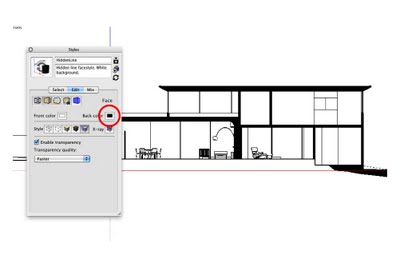 When I was done, I set the Back color back to black.
Revelation #2: Slim down section cuts
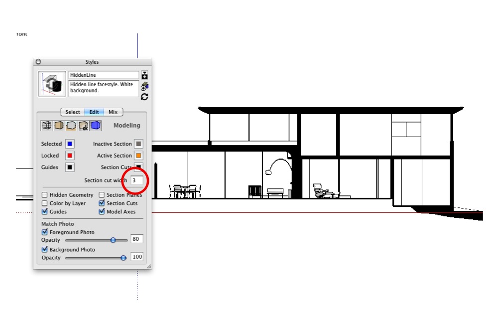
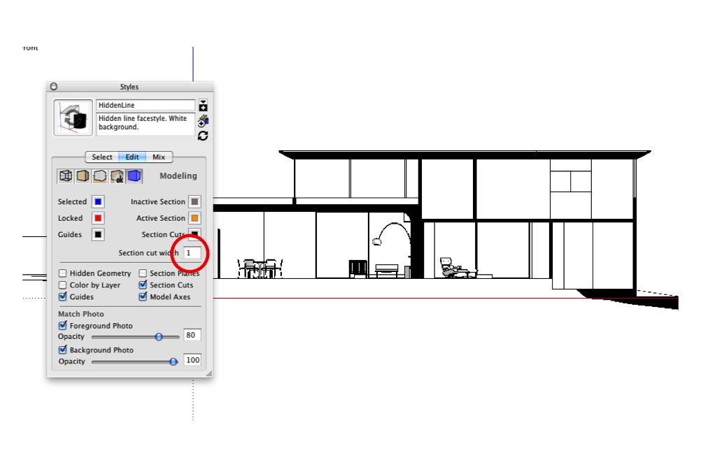
My next problem was easy to solve. The thickened-edge effect that makes section cuts stand out looked too heavy when combined with my newly-pochéd in-between areas, so I made them thinner. You’ll find this setting in the Modeling tab of the Styles dialog box (see below).
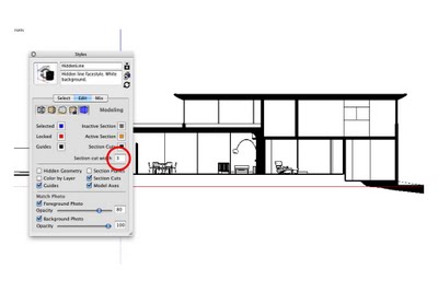 The default section cut thickness setting of “3” looks too heavy when combined with poché.
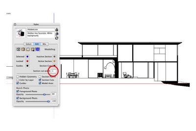 A setting of “1” looks much better.
Revelation #3: Hide Section Planes
While I was in this section of the Styles dialog box, I made sure Section Plane objects would never be visible when my style-in-the-making was applied. I deselected the Section Planes checkbox.
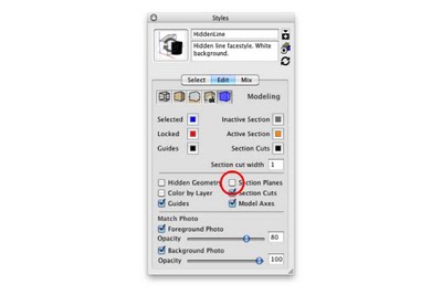 Uncheck the Section Planes checkbox while you’re in this section of the Styles dialog box.
Revelation #4: Eliminate roundness shading
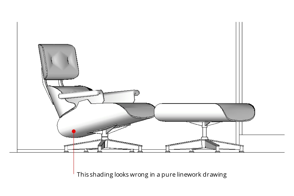
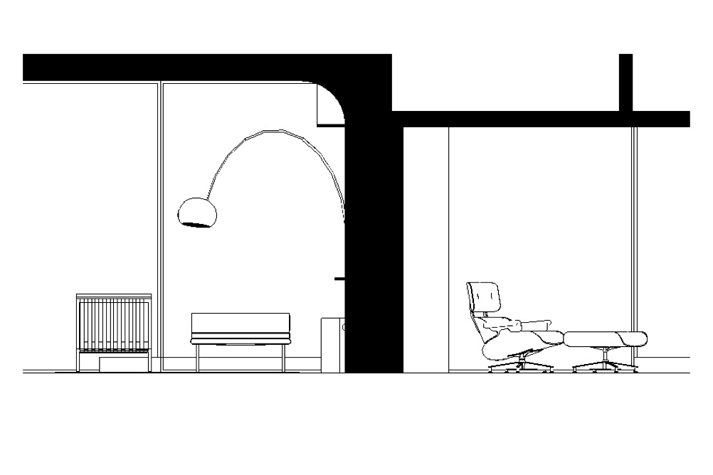
The next challenge I faced was a little trickier. In the following image, notice the shading gradient that defines the curvature on the underside of the Eames lounge? On a true, linework-only drawing, this shading wouldn’t be visible.
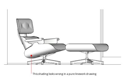 The shading in the above image looks nice, but it isn’t appropriate for the drawing type I’m trying to create.
This shading is an automatic result of SketchUp’s built-in rendering engine. It’s usually very useful, but I wanted to get rid of it. After messing around for a few late-night minutes, I figured out how. The key is to do two things:
- Turn on “Use sun for shading”. This tells SketchUp to use its shadow engine to render faces, even if shadows are turned off (which they probably should be).
- Move the Dark slider all the way to the right. A setting of 100 for Dark means that shadows basically aren’t visible. This eliminates all curve shading in your model.
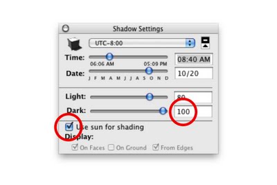 Turning on “Use sun for shading” and setting the Dark value to 100 effectively eliminates roundness shading.
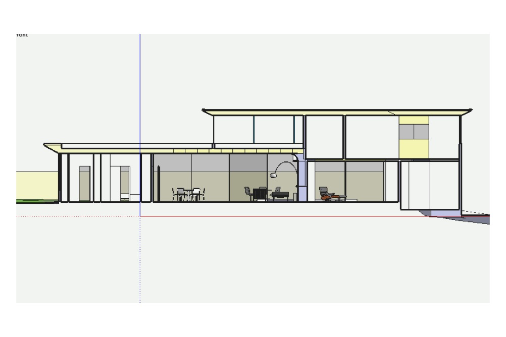
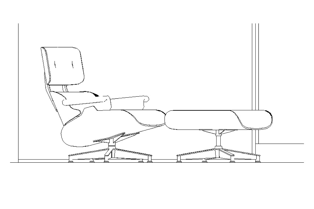
 Having removed the shading, I’m left with pure black and white linework.
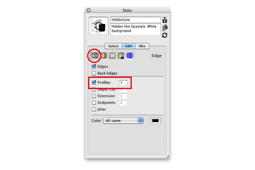
Revelation #5: Set Profiles to “1”
In keeping with my earlier discovery of the benefits of setting my Profile thickness to “1” (instead of “0”), I did so. This allowed curved, multi-faceted surfaces to appear outlined without making the boundaries of every group and component in my model look too thick. The images below show the before and after. Much better.
 With Profiles turned off altogether, some rounded objects aren’t visible.
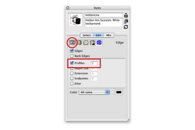 Control Profile settings in the Edge section of the Styles dialog box.
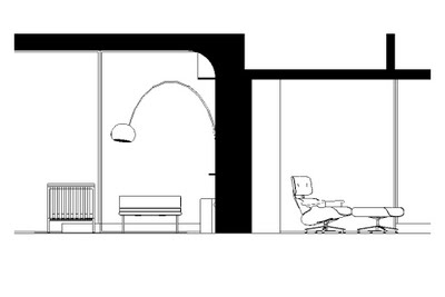 With Profiles turned on and set to “1”, rounded shapes like the lamp on the left are clearly visible.
One more thing
I wanted a nice, thick base for my house to sit on, so I modeled one. Since the base was hollow, the poché trick worked here as well.
 I added a thick base to the model.
When everything was set, I created a new style and called it “Section Cut”. With this style applied, things looked just the way I wanted them to, no matter where I cut through my model.
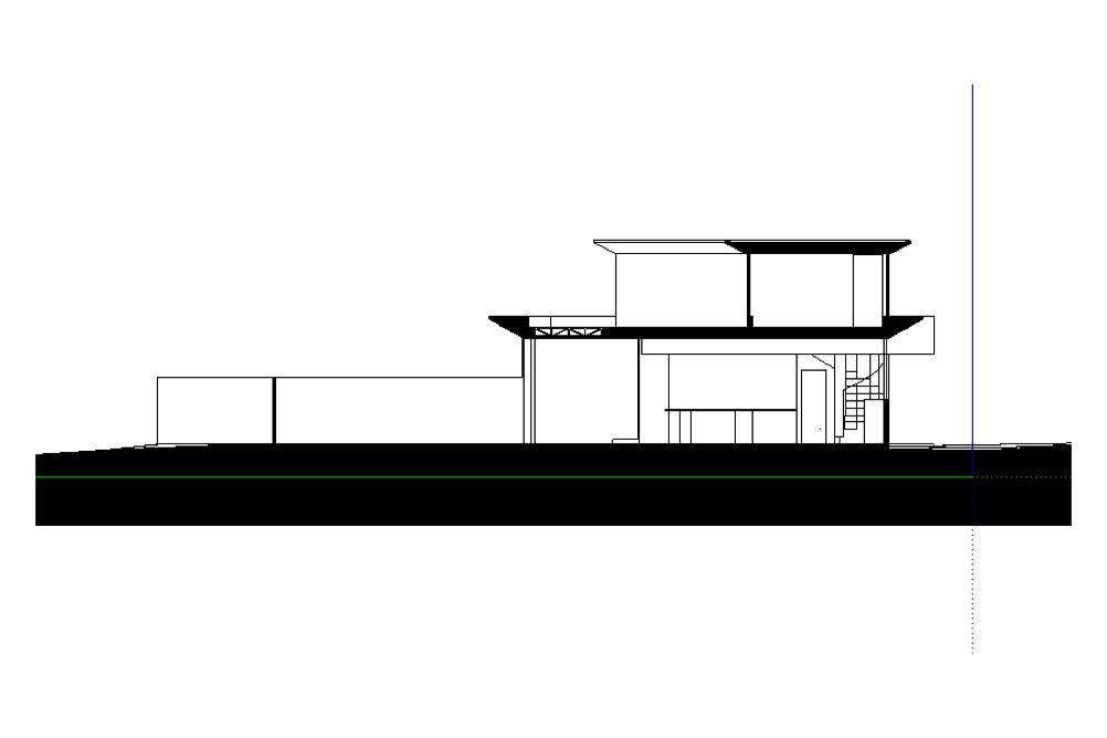
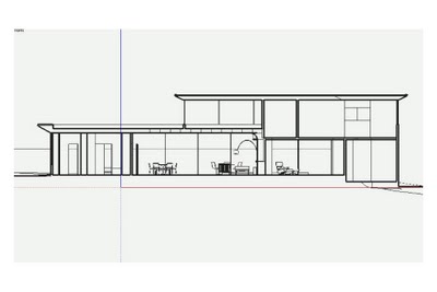
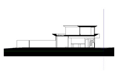 Short section through the same building
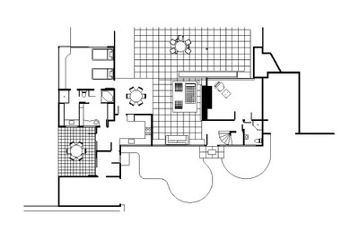 The poché trick works just as well on plan sections.

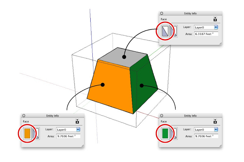
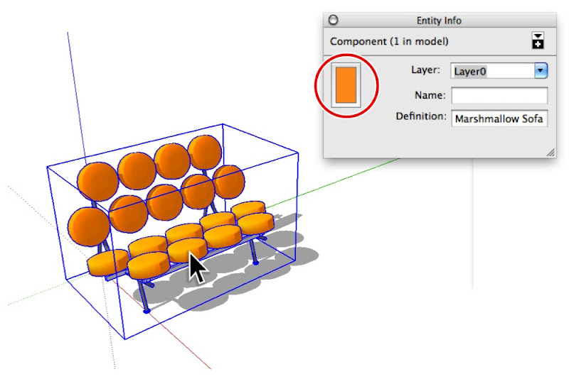 The Entity Info dialog box (Window > Entity Info) shows thumbnails for the materials assigned to selected entities. When you select a face, it shows thumbnails for the front and back sides of that face (top). Groups and components have material thumbnails, too (bottom).
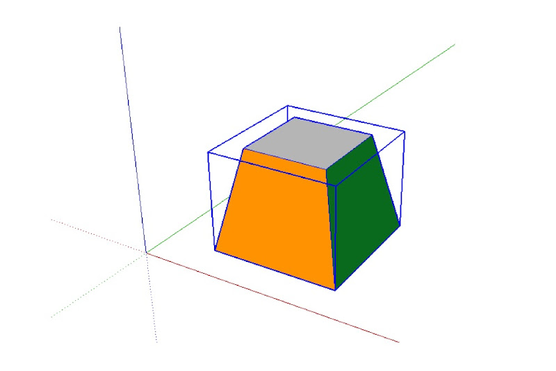
 The above group (top) includes faces that are painted with different materials (bottom). Only the top face is assigned the Default material.
 Applying a material to the entire group only changes the color of faces that are painted the Default material.
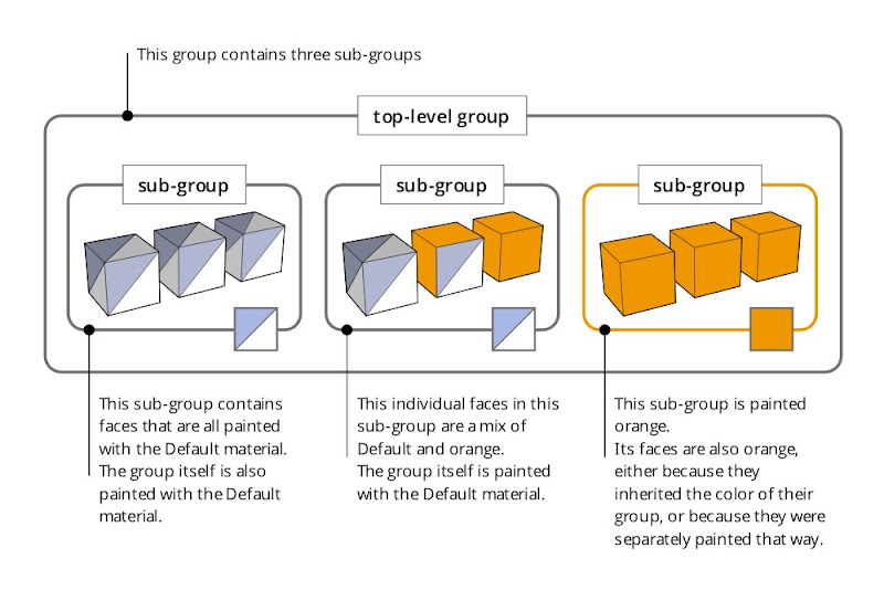
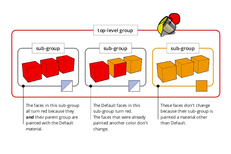 Applying a material to a group or component that in turn contains sub-groups and component instances can be a confusing experience. Just remember that the color you’re painting “trickles down” to Default-colored faces contained within Default-colored groups and components. It’s easier done than said : )
 The Windows and Mac versions of the Materials Browser. On the former, the Default material is included as a permanent thumbnail; on the latter, it’s the first material in the “Colors In Model” list.
 I downloaded this George Nelson Marshmallow Sofa component from FormFonts.
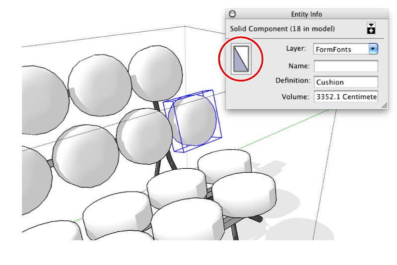 The individual cushions are instances of the same component. Each instance is assigned the Default material.
 The faces that make up the surface of each cushion are also painted with the Default material.
 The faces in the non-cushion parts of the sofa are all assigned materials other than Default.
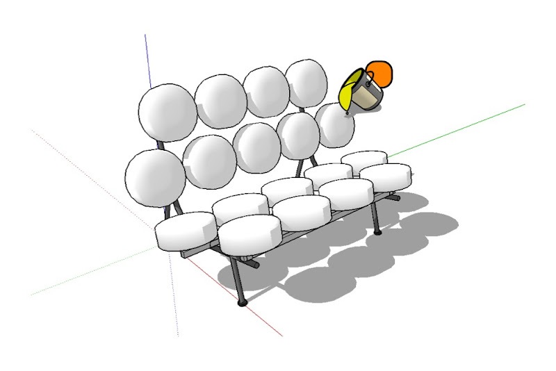
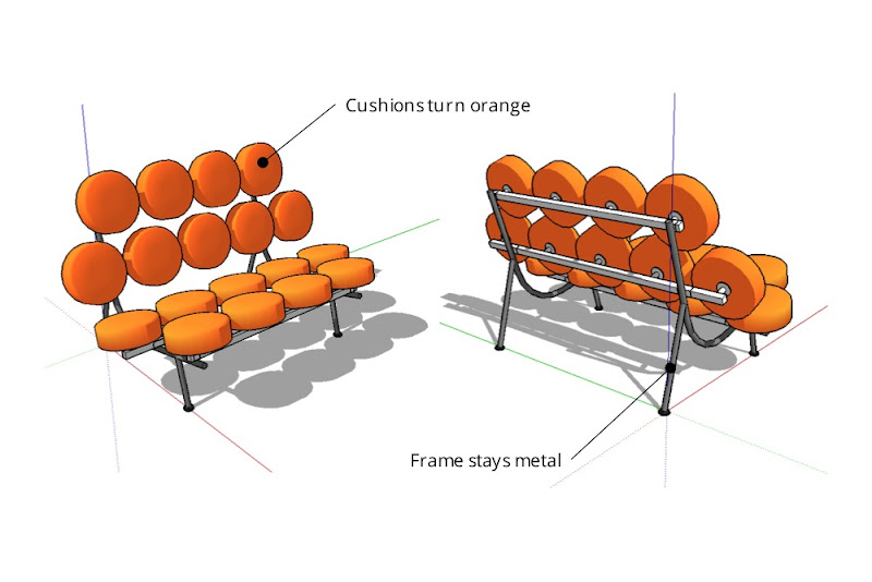 Painting the sofa component orange causes all Default-painted faces to turn that color. Non-Default-colored faces remain unchanged.