Enipedia is a wiki-based source for energry and industrial information. They have quite a comprehensive site, and they’ve just added some Google Earth tools that are very impressive.
In particular, their Power Plants tool does some neat things. At the basic level, it produces a Google Earth KML file that allows you to view over 50,000 power plants across the globe.
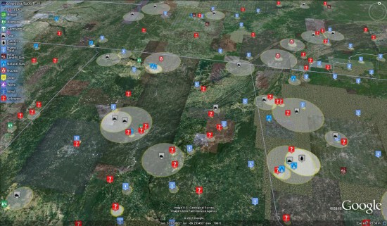
The icons on the map represent the fuel types used at each power plant, and the size of the circle around each plant is a representation of their electrical power output (MWh). Much of the data has come from sources such as carma.org, eGRID and E-PRTR.
An especially interesting piece of this is that it’s wiki-based, meaning anyone can edit it. As they mention in the Google Earth Community, they run a script that is continually updating the KML with the latest information. This is a great way to take crowd-sourced information and display it for all to see. The KML that you download is actually a network link file, so it can always be updated with the latest information.

