Flagstaff Challenge in 3D
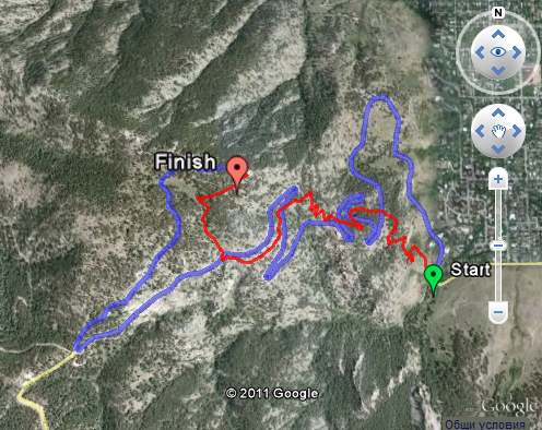
Most office rivalries rise to a boil at conference tables and water coolers. At Google’s Boulder office, our grudge matches play out across topo lines. Last week, our third annual “Flagstaff Challenge” blasted off up Flagstaff Road, Boulder, Colorado’s signature hill-climb. Over 1,500 feet of elevation gain, the Flagstaff Challenge (mapped below) attempts to answer our office’s ultimate water cooler question – what’s really faster: two wheels or two feet?
Bloggers in the office fired up Google’s KML Embed Gadget to cook up an embedded Google Earth course map (if the map below is not in 3D, try installing the Google Earth plug-in, then start embedding KML’s on your own site!).
As our route map shows, Flagstaff’s paved switchbacks criss-cross its running trail all the way up to the finish point, making this slice of topography perfect for an office grudge match between cyclists and runners.
While there was a good bit of trash-talking over GMail and in the halls leading up to the Challenge, Googlers generally prefer to let data speak for itself. Minutes after our team returned to the office, folks were already using Google Earth’s GPS tools to visualize tracks and dissect elevation profiles recorded on their My Tracks app or fitness units.
And yes, a few folks from the Docs team even fired up spreadsheets to run statistical analyses on the finish times. After accounting for outliers (those un-named Geo folks who actually got lost!), it turns out that there was no statistically significant difference between the cyclists and the runners. That just means our office feud will have to simmer for another year; enough time to sharpen our fitness and also the Geo tools we use to share and analyze our weekday warrior exploits!
Maps Usability in Google IO
Stuff I liked:
- Mobile vs Desktop: I don’t do much with mobile maps so it was interesting to have the differences between mobile and desktop discussed, I liked the idea that users on the desktop are ‘planning’
- Rendering Speed: Fast response is an integral part of the UX (user experience), I haven’t really thought about this before except for very slow rendering maps so the discussion at 21 mins in was useful.
- Emphasising: Justin’s points about how to use the GMaps API to demphasise uneeded map elements (30mins onwards) were smart and well made. I liked his examples of both good and bad maps.
- White roads for routes I especially liked Justin’s point about making roads white for route focussed maps (36 mins), he’s right that it emphasises the route well.
Stuff I didn’t:
- Placemark Clustering: At 14.29 Jez and Luke promote the idea that a placemark clustering visualisation is better than not clustering points. Strictly they’re correct as it is a way of tackling the ‘too many points’ problem but I think placemark clustering is flawed and not as good as other techniques. It should be said that this is my opinion – it may be that the clustering they show is actually a very effective technique, the proof would be a user test (which I will have a student looking at later this summer). My point is you shouldn’t promote an unproven technique.
- Walk the Walk: It would have been good if the heat map Jez and Luke presented at at 14.58 had heeded Justin’s smart advice and faded the background so the mix of colors stood out. To be fair, I guess it wouldn’t have been straight forward to do this as it was a fusion tables map visualisation rather than a straight instance of the maps API but it can’t be that difficult.
- Missing Topics: So they covered a lot of topics but there’s a of UX things that IMHO are relevant to developers that I discussed but which failed to get a mention: Layer control, Icon design (although they did point out that you should choose useful icons rather than just use the default markers), use of color, balloon design, map copy/micro-copy and introductions.

