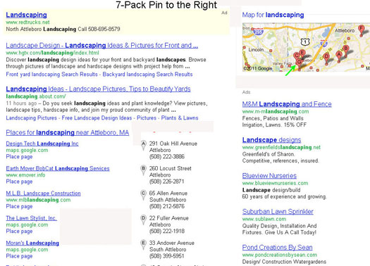
 Since Nyagoslav of Optilocal first spotted the grey pinned local results a week ago, there have been a number of other sitings of the change in the wild. There is still a fair bit of variability in the layout and arrangement indicating that Google has not yet picked a final design and they are still testing. The widespread sitings would tend to argue that ultimately the change to grey is likely.
Here are screen shots from Optilocal, LocalBusinessRockstar and LocalvisibilitySystem that capture some of the variety still presenting. Besides the grey pin, you will note that on some screen shots the pin has moved to the right. Most significant to me was the change of the Branded One Box. In moving the images to the right, Google is reducing the space given to a brand at the top of the page. We still need to see this result with SiteLinks to ascertain the full impact.
