Hot on the heels of our new style for the Google Maps user interface, today we are pushing out some further improvements to our map design to match the updated look and feel and further improve the usability of our maps.
Amongst the changes you will find a plethora of subtle changes, designed to make the map cleaner, more focused, more visually harmonious, and easier to use. Some highlights to look out for are a brighter and more cheerful color palette, a more integrated and less visually noisy labeling style, subtle improvements to footpaths and minor roads, and cleaner building and land parcel rendering.
Most of these improvements, like many that we’ve made over the last couple of years, are gentle enough that many people won’t even notice the difference. When you add them together, however, and then compare to how the map looked even as recently as two years ago, it’s remarkable to see how dramatic the change is.
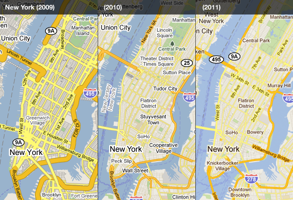
Compare how our maps of New York looked in 2009, then again the same time in 2010, and now with the new tiles for 2011. The improved colour scheme and less jarring label outlines help the labels to feel part of the map, as opposed to a distracting overlay. It’s also easier to distinguish the city name, neighborhoods, and roads through subtle changes in label color:
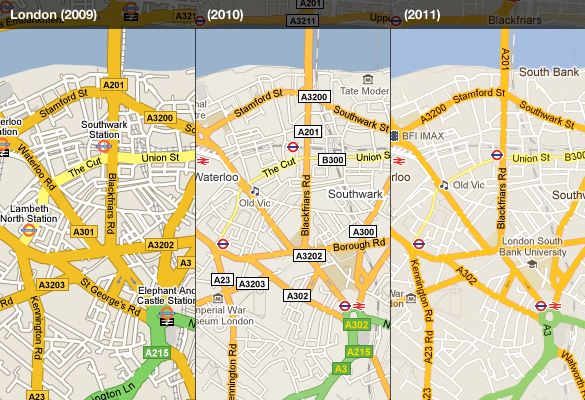
 The visually heavy highway shields are now integrated into the road labels, and the brighter and cleaner style shifts the focus onto the road names and prominent landmarks in the area. London is one place that benefits from this:
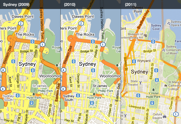
The style evolution has enabled us to place more information whilst still making the map feel simpler. In the case of Sydney, thinner and cleaner roads, better representation of tunnels, more subtle footpaths in the parks, and more subtle labeling all contribute:
We hope you enjoyed this quick retrospective and find the new improvements to the map style helpful. There are many more than have been highlighted here, so have a look around Google Maps today and see if you can spot any improvements to your local area.