Refugee Camp at Ethiopia

In the wake of intense drought, the Horn of Africa is gripped by its worst famine in more than 60 years. Over 12.4 million people across Kenya, Ethiopia, Djibouti and Somalia are threatened with hunger and disease as they are unable to access basic survival means. UN agencies and other humanitarian organizations are rallying to support refugees on the move, particularly to the thousands fleeing Somalia. Valerie Amos, OCHA Emergency Relief Coordinator, has stated that “This will not be a short crisis.” The emergency is expected to persist at least three to four months, and the number of people needing humanitarian assistance could increase by as much as 25 percent. Fresh and accurate maps are among the many critical factors in assessing such a state of crisis, as they provide vital information to facilitate emergency response and planning. Thanks to the efforts of our satellite imagery partner, GeoEye, we now have high resolution imagery of locations with the most pressing humanitarian needs. This has made Google Map Maker community mapping efforts even more effective, by allowing the creation of improved maps over refugee camps in Kenya, Ethiopia and the city of Mogadishu. Volunteers are mapping roads, hospitals, schools, community centers, and water resources, among other vital landmarks. The map data contributed is being shared periodically with the UN agencies engaged in this crisis. Google has also donated 1 million USD to help local and international organizations provide famine and drought relief support in the Horn of Africa.

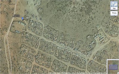
Bokolmanyo Refugee Camp, Ethiopia. IKONOS imagery, July 29th 2011, © 2011 GeoEye

You can help the Horn of Africa during its time of crisis by creating detailed maps using your local knowledge of places, such as cities, roads, and natural landmarks. If you’re unfamiliar with the region, try pairing up with people who have local knowledge, who can help by reviewing and correcting your edits. To participate in these ways and more, and offer feedback, please join our Africa mailing list and visit the Horn of Africa community mapping site as we all map the way toward crisis relief.
Geospatial Revolution continues

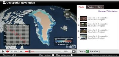
Pennsylvania State University has just released another short video in the series titled “Geospatial Revolution”. This is the fourth 15 min. episode outlining virtues of geospatial technologies and how they can assist scientists and local communities.

Episode 4 is divided into four chapters. The first chapter explains how experts studying climate change use digital maps to monitor glacier ice melt, deforestation and carbon emissions over time. Another chapter explains how geospatial technology can help aid workers anticipate food shortages around the world. The following chapter explores how geospatial technology helps track the spread of disease. And the closing chapter highlights the Map Kibera project, which empowered the people of an unmapped area of Nairobi, Kenya to map their essential facilities and provide a voice for the more than 200,000 residents.

Bookmark and share all 4 episodes via aus-emaps.com YouTube video player.


Related Posts:
Geospatial Revolution


Explore Virtual Kenya

Virtual Kenya is an amazing informational resource, offering materials in wide variety of formats including DVD for those with no internet access. Their goal is to help Kenyans in their educational and professional pursuits by giving them this high-quality spatial data.

The amount of data on the site is very impressive. Along with a variety of tutorials and their blog, they feature over 100 informational maps to give you easy access to their data.

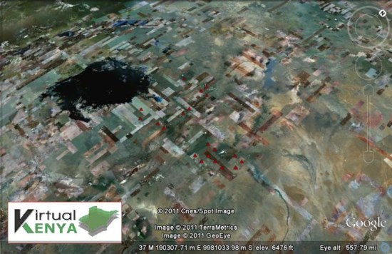
Some of the maps are relatively simple, like their Proposed Small Hydropower Sites:

hydro.jpg

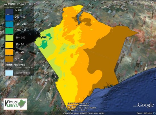
Others are more complex, such as the Average Monthly Rainfall for February map:

rainfall.jpg

Beyond that, they showcase a variety of Google Earth tours on a few different topics. A good example of that is their Wildlife and Tourism Tour, which shows off the country using quite a few different KML overlays and simple 3D models. You can view that tour on their site, using this KML file, or by watching the video below:

In all, it’s quite an amazing site! If you have data to contribute, they have a section of the site full of information on how best to submit it to them.