Google helps to grow your audience by connecting you with new users. They introduced the +1 button so your site would stand out on search and your users could easily share your content on Google+. But, sometimes you want to join the conversation and post content directly to where people are sharing.
Today they’re introducing Google+ for Business, a collection of tools and products that help you grow your audience. At the core of this is Google+ Pages, your site’s identity on Google+.
Google+ Pages: Have real conversations with the right people
To get your site on Google+, you first need to create a Google+ Page. On your page, you can engage in conversations with your visitors, direct readers back to your site for the latest updates, send tailored messages to specific groups of people, and see how many +1’s you have across the web. Google+ Pages will help you build relationships with your users, encouraging them to spend more time engaging with your content.

Google+ Pages are at the heart of Google+ for Business
Hangouts

Sometimes you might want to chat with your users face-to-face. For example, if you run a food blog, you may want to invite a chef to talk about her favorite recipe, or if you manage a fashion review site, beauty specialists might want to hold how-to sessions with makeup tips. Hangouts make this easy, by letting you have high-quality video chats with nine people with a single click. You can use Hangouts to hold live forums, break news or simply get to know people better, all in real time.
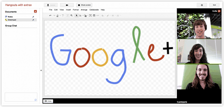
Hangouts let you meet your customers, face-to-face
Circles

Circles allow you to group followers of your Page into smaller audiences. You can then share specific messages with specific groups. For example, you could create a Circle containing your most loyal readers and offer them exclusive content.
The Google+ badge: Grow your audience on Google+
To help your users find your page and start sharing, there are two buttons you can add to your site by visiting our Google+ badge configuration tool:

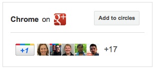
The Google+ badge, which we’re introducing in the coming days. This badge lets people add your page to their circles without leaving your site, and allows them to get updates from your site via Google+.
Extend the power of +1, stand out in Google search
You can also link your site to your Google+ page so that all your +1s — from your Page, your website, and search results — will get tallied together and appear as a single total. Potential visitors will be more likely to see the recommendations your site has received, whether they’re looking at a search result, your website, or your Page, meaning your +1’s will reach not only the 40 million users of Google+, but all the people who come to Google every day. You can link your site to your Page either using the Google+ badge or with a piece of code. To set this up, visit our Google+ badge configuration tool.
Bringing Google+ to the rest of Google

Our ultimate vision for Google+ is to transform the overall Google experience — weaving identity and sharing into all of our products. Beginning today, we’re rolling out a new experimental feature to a small group of eligible publishers,Google+ Direct Connect — an easy way for your audience to find your Google+ Page on Google search. If you’ve linked your Page to your site and you qualify, when someone searches for your website’s name with the ‘+’ sign before it Direct Connect will send them directly to your Page. For example, try searching for ‘+YouTube’ on Google. Users will also be prompted to automatically add Pages they find through Direct Connect to their circles.
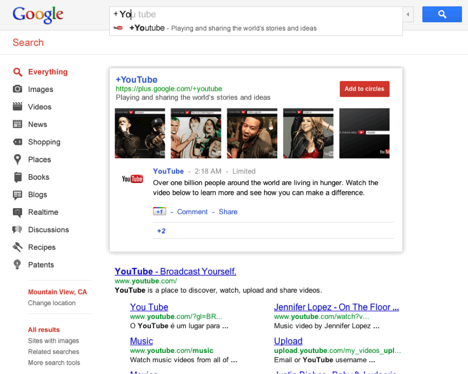
Direct Connect suggestions start populating as you type on Google.com
Just the beginning
We want to help you get your site on Google+ as soon as possible, so we’re opening the field trial for Google+ Pages to everyone today. Creating a Google+ Page only takes a few minutes. To get started, you’ll need a personal Google+ profile. If you don’t have a Google account, it’s very quick and easy to join. And if you’re looking for inspiration, check out some of the sites that are already starting to set up their Pages:

To learn more about how Google+ works for your site, check out the Google+ Your Business site. We’re just getting started, and have many more features planned for the coming weeks and months. To keep up to date on the latest news and tips, add the Google+ Your Business page to your circles. If you have ideas on how we can improve Google+ for your site, we’d love to hear them.
Cross posted from the Inside AdSense blog