New Google Earth Imagery – February 24

Google has just pushed out some fresh imagery to various parts of the world, with thanks going to sharp-eyed GEB reader ‘Andreas’ for being the first to point it out to us!

hohenfels.jpg

The full extent of the update is still unknown, but as is usually the case, you can use Google Maps to determine for sure whether or not a specific area is fresh. This new imagery isn’t in Google Maps yet, so you can compare Earth vs. Maps to see what’s new; the fresh imagery is already in Google Earth, but the old imagery is still in Google Maps. If you compare the two side-by-side and they’re not identical, that means that you’ve found a freshly updated area in Google Earth!

[UPDATED — 24-February, 11:00am EST]

  • Australia: Melbourne — thanks ‘David’
  • Bosnia Herzegovina: Various areas — thanks ‘Andreas’
  • Croatia: Various Areas — thanks ‘Andreas’
  • Germany: Hohenfels, Marl — thanks ‘Andreas’
  • Norway: Various areas — thanks ‘Andreas’
  • Romania:Various areas — thanks ‘Andreas’
  • Sweden: Areas along the western part of the country — thanks ‘John’
  • UK: London — thanks ‘Carl’
  • United States: Illinois (west central) — thanks ‘KennyB’

If you find any other updated areas, please leave a comment and let us know!

Broadband Speed Mapped for BBC Look East Research

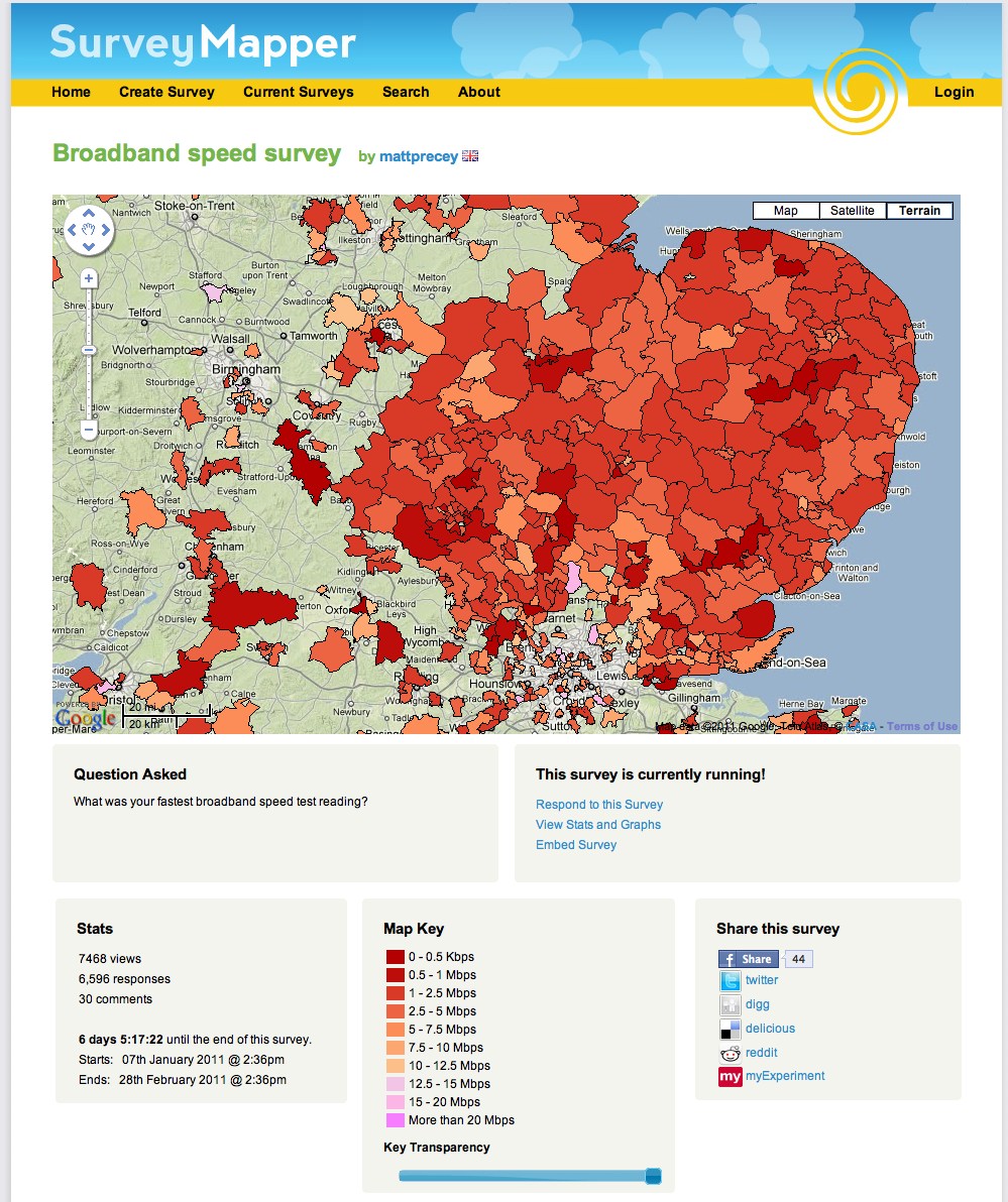
BBC Look East is calling for people in the East of England to find out their home broadband speed, as part of the TV programme’s week-long special – using our free SurveyMapper tool, at CASA, University College London, to collate and map the results in real time. So far over 6500 responses have been received.
It is estimated only 60% of households in the region have access to high speed broadband.
Look East’s business reporter Richard Bond said that the figure was unlikely to grow much in the next five years.
Home broadband users can take part by plotting their speed onto an interactive map.
The results of the research will then be shown on BBC One during Look East’s broadband week, which runs from 21 to 25 February 2011.
“Fibre optic networks, the key to a fast service, are only available to people in and around the major towns and cities,” said Mr Bond.
“Broadband speeds in rural areas are slow because they depend on copper telephone exchanges.
“Although BT is rolling out its fibre optic network, this is unlikely to make much of a difference to most rural communities over the next five years,” he added.

Speed test

Broadband users can test their upload speed on BBC News’ Technology website.
As broadband speeds on the same connection can fluctuate, it is recommended that people take the test several times and make a note of the highest speed.
Other speed-testing websites could return different results, so it is recommended for this research that third-party sites are avoided.
Once a figure is obtained, people can then plot their results on the BBC Look East map hosted on our SurveyMapper.
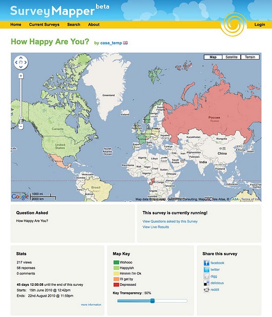
It is nice to see maps and indeed crowd sourced surveys used in such a way, SurveyMapper has been developed as part of NeISS (National e-Infrastructure for Social Simulation, funded by JISC as part of its Information Environment Programme.
You can set up your own survey or poll on SurveyMapper – If you have used other ‘polling sites’ then you will be up to speed, except we have taken away the restrictions and added real-time mapping into the mix. Simply sign up (its free) and then your be able to create your own survey and embed it into your own site. Currently we have five levels of survey available – Worldwide, based on countries, European Countries US Zip Code, UK Postcode and a Drag and Drop Pin Map.


You can ask anything, survey the nation, the world or just your street with real-time mapping and statistics.


To take part or create your own survey head over to SurveyMapper.com

The Look East survey runs until February 25th with updates each evening on BBC Look East News.

Flooding Google Earth

We’ve discussed how flooding can be visualized a few times in Google Earth, because it’s a great medium with which to show off catastrophes such as that. In addition to helping with fresh imagery from recent floods in Pakistan and Nashville, it’s also been used to help bring to life the 1966 flood in Florence and an animation of how rising sea levels would affect various cities.

Today’s post comes from Richard Treves over at Google Earth Design. He’s recently read Will Self’s “Book of Dave, which imagines a future where sea levels have risen over 100 meters.

Richard has taken that idea and given step-by-step instructions on how to simulate a 100m rise in sea level for any area of the world. I took his example and put it over London, with the results seen here:

london-flood.jpg

To view that file in Google Earth, you can download this KMZ file.

It’s a great way to visualize something like this, and Richard put together a great guide for it. However, I’d like to make one small correction. In step #4, he advises choosing “Relative to Ground” for the water level. While this will put water 100m deep in the area you choose, it’s not necessarily representative of a 100m rise in sea level. Instead, choose “Absolute” in step #4 (as I did in the KMZ above) to see what it would be like if the sea level rose 100m world wide.

As Richard mentions, and as you’ll see in the screenshot above, leaving 3D buildings turned on is a great way to see the scale of the depth of water. Check out his blog and go try it for yourself.