London Calling

Map of the Week: London Calling
Why we like it: This map is a great way to promote a city and share its history. A brilliantly designed UI, that includes info windows with map cutouts. Additionally, it’s an elegant use of Styled Maps.

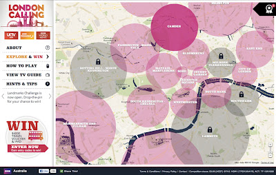
In honor of a big year for the city of London, the BBC Australia has created “London Calling” as a way to explore and celebrate London. For those of you who know your way around London, there’s a ‘drop-the-pin’ challenge, where users answer geography questions by placing a pin on the map in the right place. If you get stuck with particular questions, there’s also the option to reach out to the “London Calling” team.

For those that just want to explore London, the map is a great way to learn more about the city that has been getting a lot of attention in light of the Queen’s Jubilee and the upcoming 2012 Olympics. There’s even a chance to win prizes just by exploring the map!

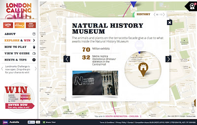
From a design standpoint, this map is really great to look at. Two things about this map really stand out to us. Firstly, Styled Maps has been used to add a sepia effect that reflects the rich history of the city of London. Secondly, this is one of the first use cases where we’ve seen a custom info window that includes a cutout to reveal the highlighted feature below. A clever design choice that’s great to look at!


University of Washington: Campus Map

Map of the Week: University of Washington Campus Map
Why we like it: A beautiful use of interactive custom tiles, custom info windows, and the Google Directions API for embedded walk/bike/drive directions. A great example of a highly customized Google Map.

The beginning of May marks the start of college graduation in many places around the world. When the day comes for long awaited college graduation ceremonies, finding the events on campus can be daunting for visiting family and friends. Just in time for spring graduation ceremonies, comes this great Google Map from the University of Washington. For a large school like the University of Washington that occupies over 500 buildings and over 20 million gross square feet of space, a good map is a must to help visitors and students alike find their way around.

What sets this map apart is the high level of customization, most notably the well designed, custom interactive tiles that highlight university buildings and points of interest. University buildings stand-out from the map in deep purple and display a custom InfoWindow with additional information when you click on them. For sharing convenience, each building has its shortened url.

Overall the map looks great responds quickly as you search around campus. Embedded into the map are walking/biking/driving directions that allows users to route in between buildings and point of interest.

Just in case you won’t be visiting the University of Washington in the near future, here are some other campus maps worth checking out: Northeastern University, UCSD Bus Map, and Universidad de Murcia. Also, the Google Developers Showcase has this and many more campus maps worth checking out.