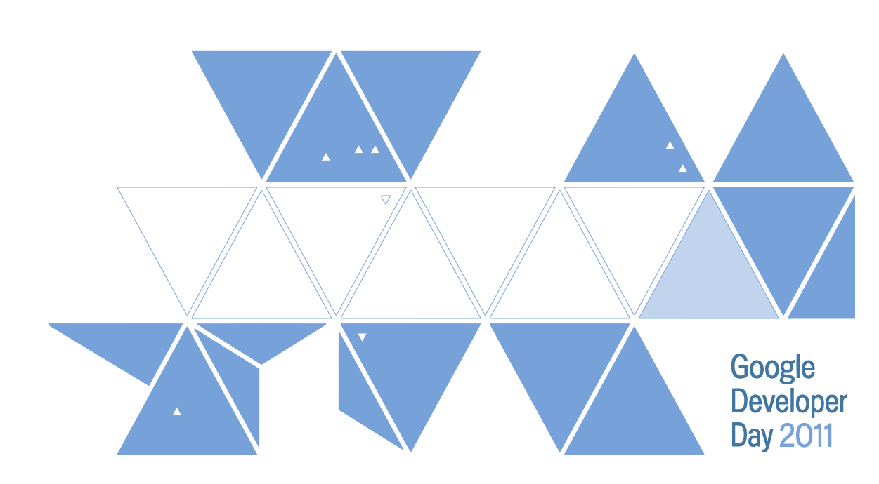
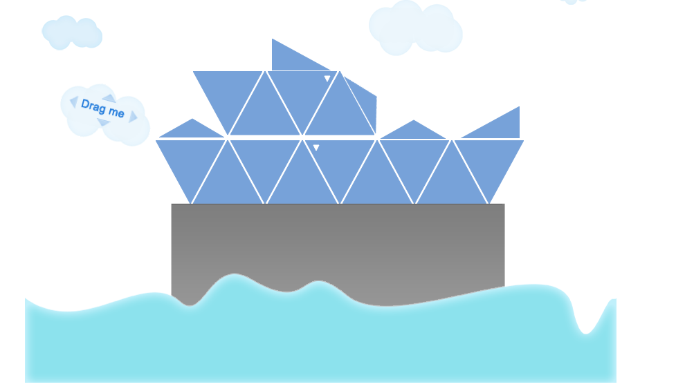
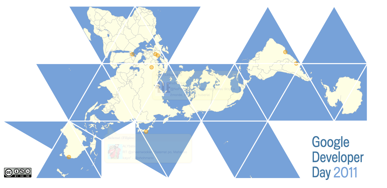
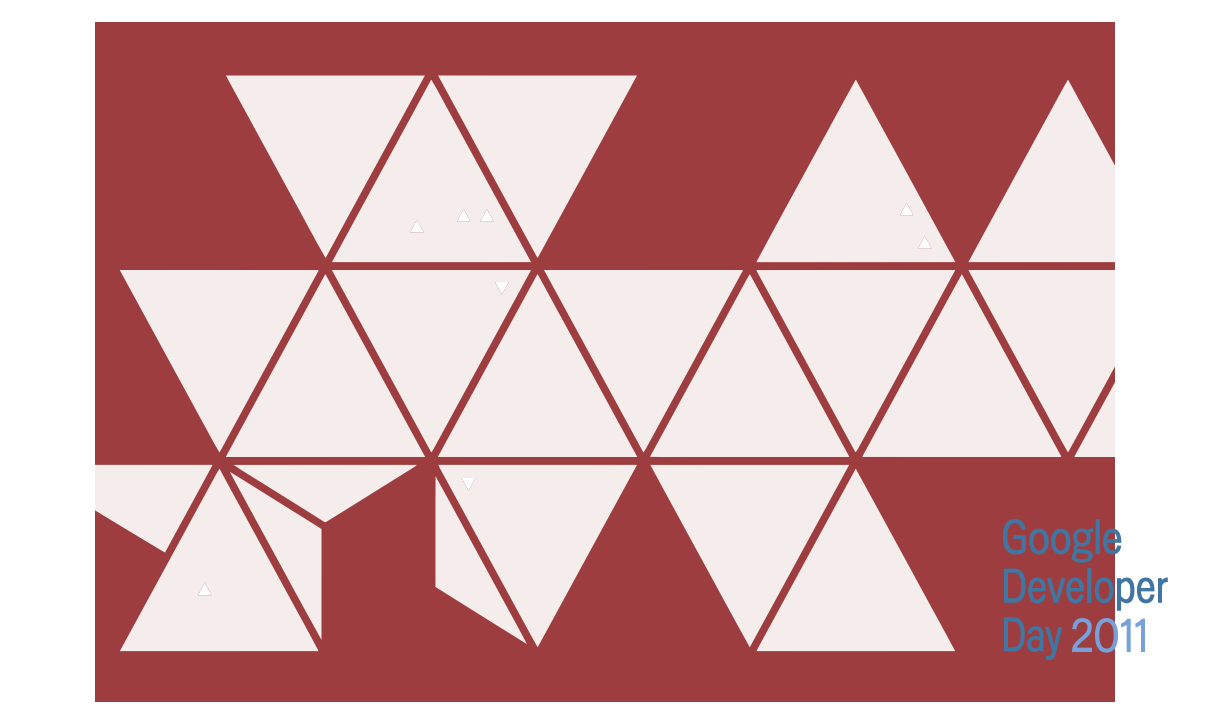
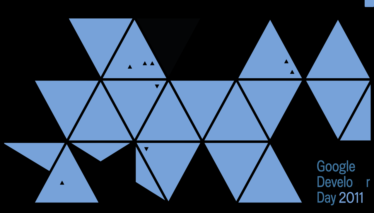
The Open Call HTML5 Challenge for Google Developer Day 2011 kicked off. With 2 weeks time to turn around a submission, participants were asked to design and implement an original HTML5 doodle of the Google Developer day Dymaxion map, adding their own local twist. Doodles had to be built using open web technologies (HTML5, WebGL, etc.) and feature a theme locally relevant to the participant’s GDD host country.
We received submissions from eight countries around the world, which were then reviewed by panels of local HTML5 experts. Overall, the judges were blown away by the creativity and innovation of the submissions. Top entries were selected from each country based on technical execution, creativity, and cultural theming. See below for the judges’ top picks, with descriptions in the creators’ own words. Some of the comments are in the creator’s native language; for translations, use Google Translate. To see a submission in action, click its thumbnail image.
Argentina
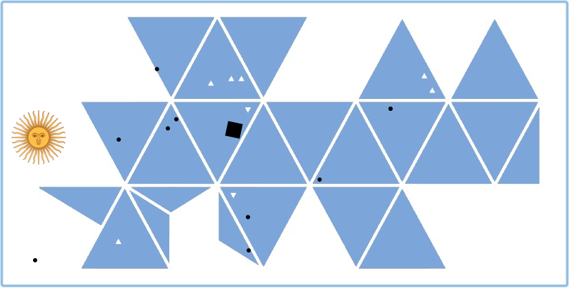
Creator: Diego Nul
How did you do it? Just used html5 canvas to do very simple game functionality and transitions. The Dymaxion map turns into an Argentinian flag when the player takes the sun into the map centre.
Creator: Carlos Olivera
How did you do it? I had to made a simple polygonal animation with background music, so, I’ve used Raphael 1.5.2 – JavaScript Vector Library for loading and display figures (SVG), and I’ve used jQuery with Runloop plugin for looping animation; the result is an HTML5 based animation with so few lines of code. The background music is possible with HTML5 element.
Australia
Creator: Peter Finch
How did you do it? The doodle is created using a HTML5 2D canvas element. The Dymaxion map is programmatically generated by subdividing the triangles in the original map into smaller sub-triangles and then drawing all of them in different colours based on a colour map representing the image to be drawn. The colour maps were generated using a Java program that mapped the relative location of the triangle onto a target image and then back onto the page colour map. The waves then merge the images, one on top of another, to create the transition effect.
Creator: Brian McKenna
How did you do it? I imported the Dymaxion map to Blender and then animated it to transform into the Opera House using “shape keys”. The Dymaxion map, Opera House, Southern Cross and stars all rendered using Three.js. Everything else rendered with normal HTML5/CSS3.
Creator: Marko Vuksanovic
How did you do it? Doodle is a manipulation of the Dymaxion map using HTML canvas element. Interactivity is achieved using native drag and drop events and transitions. Animations are used to transition between the iconic landmarks of Sydney.
Brazil
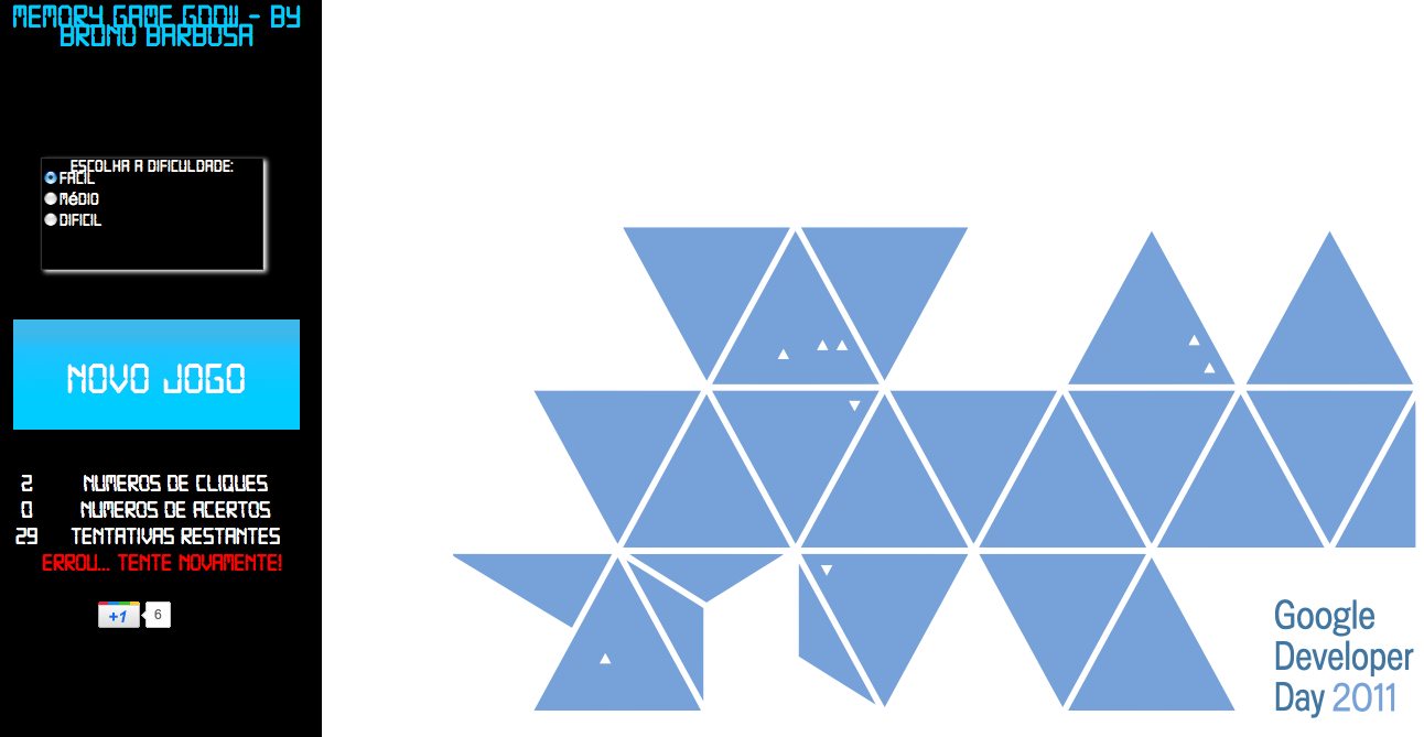
Creator: Bruno Barbosa
How did you do it? Minha ideia foi criar um jogo da memória com as cartas contendo os principais topicos do Google Developer Day 2011. No jogo foi utilizado tecnologias como HTML5, CSS3 e JAVASCRIPT.
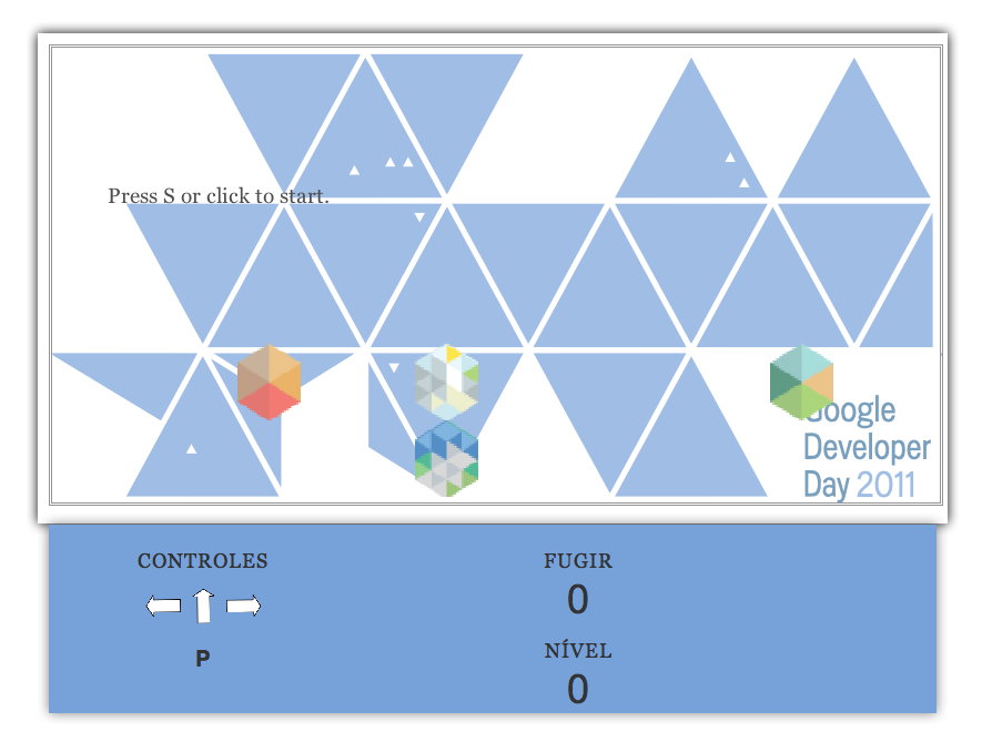
Creator: Rogério Celestino Santos
How did you do it? A idéia do jogo é fugir das outras cidades que caem no cenário. Utilizei um código antigo que eu tinha de um jogo simples em html ai então só adicionei as imagens. Fiz algumas mudanças. Mas ainda estou pensando em melhorias como pegar aleatoriamente a imagem correspondente de cada cidade. Tratar imagem de colisão. Poucas coisas ainda. Eu fiz isso hoje em 1 hora. O tempo que me restou.
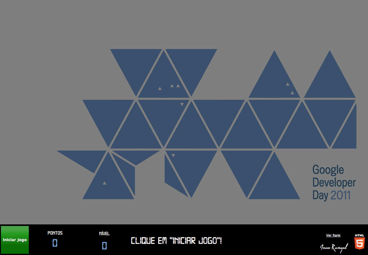
Creator: Joao Henrique Cunha Rangel
How did you do it? É um jogo de memorizar as cores do Google. O que usei: Tags de audio HTML5, Geolocation para detectar o país do jogador, CSS3 para animar os pontos, CSS3 @font-face, CSS3 Cores gradiente e opacidade.
Creator: Miguel Antonio Silva
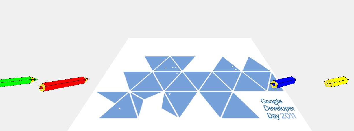
How did you do it? 3D objects and animations were created using the program Blender. The movement of the pencils was detected and painted in a 2D canvas html5. The canvas was used as texture for the 3D objects. For the 3D, the library used was Three.js, and for the animations tween.js.
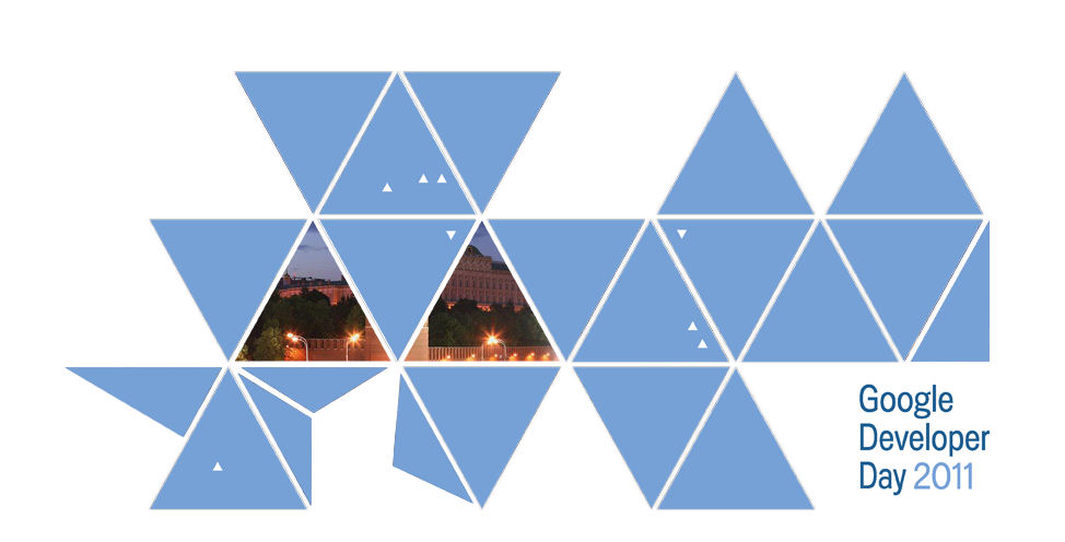
Germany

Creators: Kay Schneider, Misha Matiyenko-Kupriyanov
Music: Hanno E. Allen
How did you do it? Split SVG Dymaxion map template into small png pieces; position PNG pieces with CSS3 into HTML5 Dymaxion map; read wiki about Icosahedron; reverse engineer positioning of Icosahedron faces in space with Google SketchUp; build 3d icosahedron model with CSS3; Web Audio API Loading Sound via XHR in arraybuffer to play it via the Web Audio API and visualise it on the DymaxionMap (zIndex of elements); canvas mapping; triangle human pictures, using canvas clip(); using of the ecma5 script (forEach and much more); triangle videos by applying SVG mask; Germanizing of the nyan cat by rainbow replacing with German flag; nice fonts with Google Web Fonts.

Creator: Josep del Rio Herrera
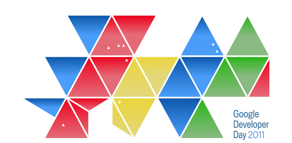
How did you do it? The GDD’s Dymaxion map is a icosahedron, and each of the little triangles is the location of a GDD event; the doodle uses that icosahedron as the second “o” for a Google doodle. Clicking on it will show the GDD logo and information for the Berlin event. It uses a WebGL canvas to render the icosahedron and the Dymaxion map, and overlays text over it using SVG and CSS3 animations.
Creator: Connor Bunting
How did you do it? Googlespiel is an interactive HTML glockenspiel. It was built using inline SVG, HTML audio and jQuery. It can be played either by clicking on the ‘keys’ with the mouse or by using the keyboard. When Googlespiel loads it play Fur Elise by Beethoven. The key sounds were created using Apple Logic Studio music software.
Japan
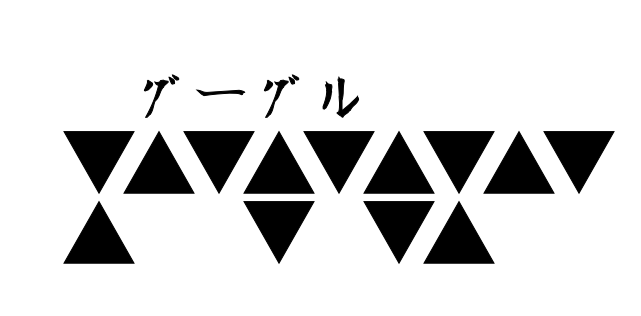
Creator: Akira Takegahara
How did you do it?
・「自分の国(日本)をアピールするものである」という課題であるため、文字は毛筆文字、(ベクター)画像は日本の水墨画を採用致しました。
・フォントや画像を含めて全てインラインSVGを使用しております。
ただし、クリエイティブ・コモンズの画像だけは提供されたラスター画像です。
webフォントは使用しておりません。
・提供頂いたOpenCallVisual.svgの画像を基に、文字がモーフィングのように変化致します。当然ながらjavascriptでギミックも実装しております。
・背景画像はラスター画像からSVGに変換して使用しております。
・開発ツールとしては特にAdobe Edgeなどを使用しないで、テキストエディターで作成しております。
・フォント及び背景画像は著作権フリー・改変許可の素材を使用しています。
・三〇秒ぐらいは見て頂ければ幸いです。
Creator: Nanako SAWA
How did you do it?
1. SVGから座標情報を取得
2. canvasで描画
3. 背景, アニメーションを追加
Creator: Shigeki Ohtsu
How did you do it? The title of this doodle is “Thank you the World from JAPAN”. This doodle expresses our gratitude to the people in the world for their hearty support for Japan at the last disaster, with the Japanese traditional style of manner of “OJIGI”. It’s also showing “”Thank you”” tweets all over the world at the location of the Dymaxion map in the background.
Creator: Aiham Hammami
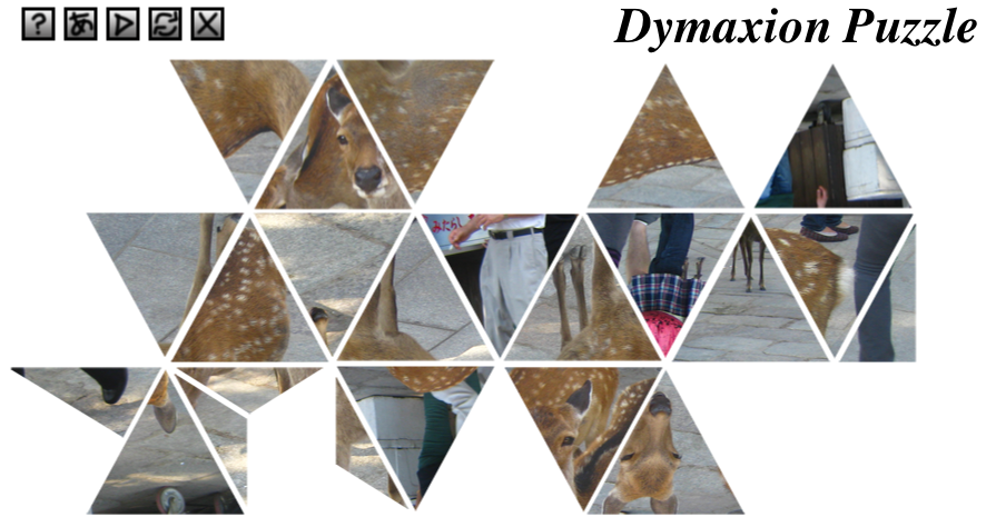
How did you do it? I have been previously creating an object oriented 2d canvas animation library so I used that to create a puzzle game in the shape of the Dymaxion map. It implements MVC design to separate concerns (UI and logic) so it makes the code easy to follow (i hope). I cut up all the photos into triangles manually, then I had to pinpoint exactly where on the rectangular image the triangle vertices were, so I could create accurate mouse overs. Enjoy.
Creator: Risa ITO
How did you do it? SVGとcss3を使って、
日本の色合いを出してみました
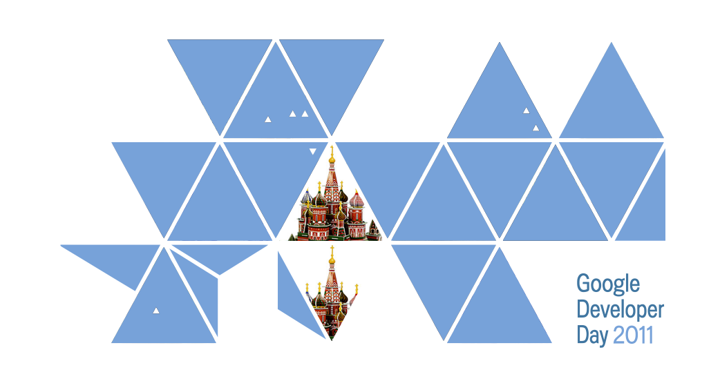
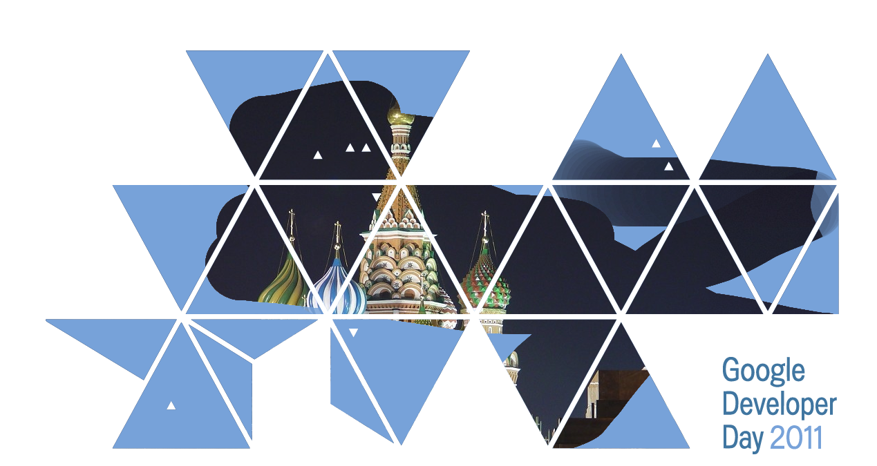
Russia
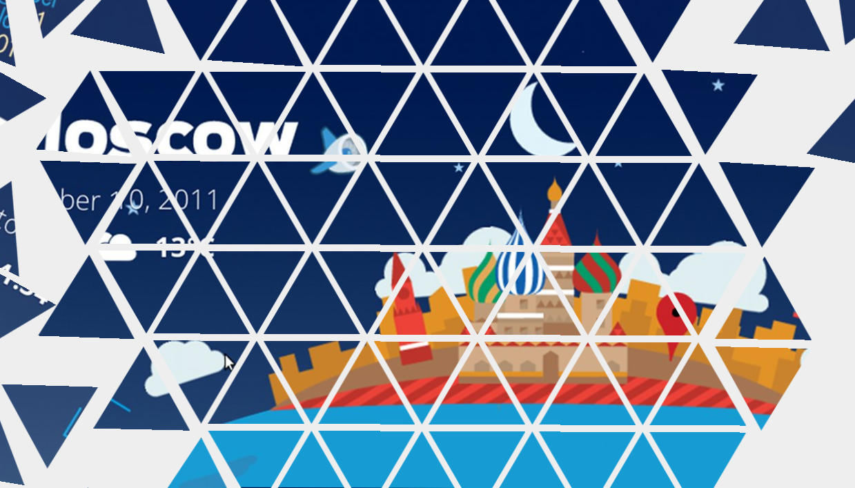
Creator: Valentyn Shybanov
How did you do it? All animations are done using CSS3 transitions – mostly no Javascript is used for it. Triangles are drawn using ‘-webkit-mask-image’: -webkit-canvas()’ trick (canvas as mask). Currently only Google Chrome supports CSS3 ‘mask-image’ so doodle can be watched only on it. Simple quiet music is pre-generated and played by HTML5 Audio.
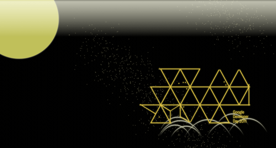
Creator: Anton Eprev
How did you do it? The idea is to show the Dymaxion map so that it would be like on ignition of a fluorescent lamp. The host country area and text letters continue to flicker after turning on. Requires browsers that support inline SVG.
Creator: Roman Fedorov
How did you do it? I really love this game and I really love Chrome and HTML5. I’ve made this doodle with great pleasure!
Creator: Mikhail Kalinin
How did you do it? This is the Memorize game. I used jQuery library with plugins. For best compatibility with all modern browsers, I used CSS3 2D transform instead of 3D transform.
Creator: Alexey Belozerov
How did you do it? I have used 2 HTML5 canvas objects as layers and performed ‘destination-over’ composition mode to make erasing effect.
Phoebe Peronto is a Developer Marketing Intern working to coordinate the launch of Google Developer Days 2011. She hails from UC Berkeley as a rising senior studying Political Science and Business, and is excited to work with the Google team for summer 2011.

