In today’s guest blog post, Greg Gould of Geodesic Development) talks about how he created a unique Google Earth Hurricane Visualization using a custom .NET application to turn NOAA storm track data into a visually exciting KML animation of the 2010 hurricane season.
Geodesic Development was formed after several years of nights and weekends working on code and custom applications specifically designed to generate KML for Google Earth visualizations. Fascinated with the potential for developing new presentations in the 3D world of Google Earth, I’m focused on the “non-traditional” areas and visualizations which aren’t seen often or at all in Google Earth, especially in the main stream media. I hope that our visualizations will affect people’s perceptions of what’s possible in Google Earth.
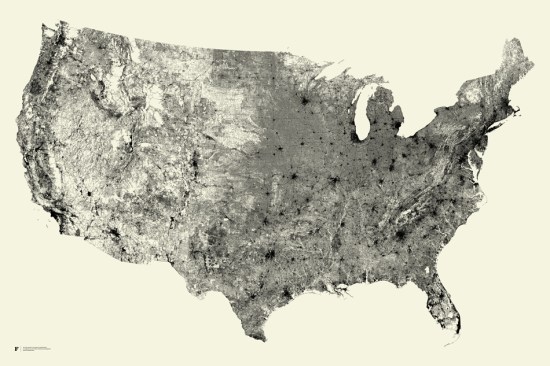
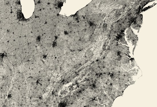
I decided to create a Google Earth hurricane visualization to test ideas and explore the creative possibilities of animating ground overlays in ways I had not seen before in Google Earth. Hurricane data is readily available in KML from many different sources, but the static track lines and colored icons don’t present the storms in a visually exciting or dynamic way. I thought it was a perfect opportunity to develop an application to take seemingly unexciting data and highlight some new possibilities for presenting it with Google Earth.
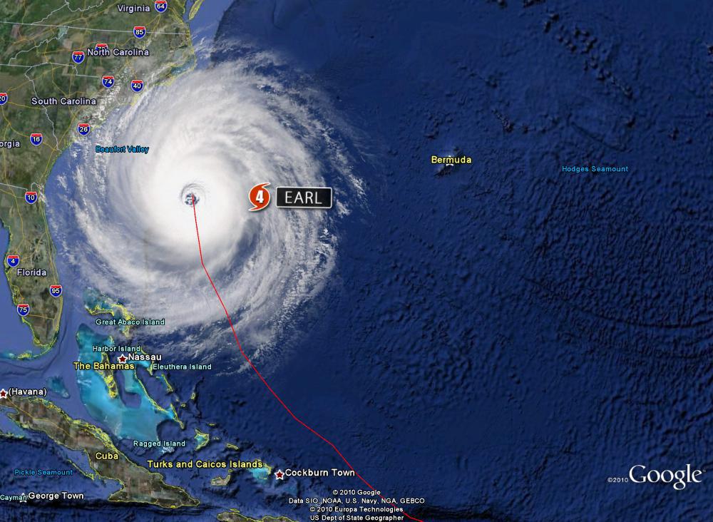
The application I developed uses a custom .NET class library to handle the calculations, data processing, and KML text generation for each storm track, which was obtained from the National Oceanic and Atmospheric Association’s (NOAA) National Hurricane Center website. Each storm data file is processed and exported to its own KML file and combined to visualize the entire season. It’s really a cool way to see how the storms developed and the track each one took for one of the busiest seasons on record.
Currently, NOAA provides storm track data in several formats, i.e. Shapefiles, XML, and DBF. For this application the DBF data is manually downloaded as a separate file which contains all the feature information needed to create the KML animation. This file is processed locally as a simple database table with known storm data for each track point, e.g. Name, Dates, Intensity, Category, and Position. These data points will determine which overlay to use and how it gets displayed.
Because this data inherently contains varied amounts of time (from 3 hours to as many as 72) and distance between track points, I had to control the display and transitions of the overlays with a series of loops which interpolate position, heading and rotation to fill in points between each segment of track data. This was an important step for creating a smoother animation and seamless overlay changes. I then use a pre-defined set of overlays, size settings, spin rates, and track icons to create a consistent look and feel for the whole presentation when animating the different layers and files together.
There were definitely some issues with creating a complex visualization like this, having it run smoothly, and all without overwhelming the cache in Google Earth. It took several iterations to find a good compromise between smooth animation and too many overlays (since elements don’t contain the Track element). I think the bigger challenge was to coordinate the overlays, transitions, and track icons with the frequently changing storm data, and get them all to play nice together.
I learned a lot from this project and I think it demonstrates some new possibilities for interesting visualizations that are not typically seen in Google Earth. I hope you like this one, it was fun doing it and hopefully we’ll have some more to show off soon.