Visualizing your location based data with Fusion Tables

Google Fusion Tables is a modern data management and publishing web application that makes it easy to host, manage, collaborate on, visualize, and publish data tables online. Fusion Tables allows for import of geospatial data to quickly and easily display that data on a Google Map.


The Fusion Tables team has been working hard to enrich what Fusion Tables offers for customization and control of the Google Map visualizations. Two very exciting announcements were made at Google I/O during the Fusion Tables session on Managing and visualizing your geospatial data with Fusion Tables. These announcements include the release of the Info Window and Styling in the Fusion Tables API and Fusion Table Styling in the Google Maps API. 


Info Window and Styling API

Previously, map styles and info window templates could only be customized via the Fusion Tables UI. The Info Window and Styling API opens up this functionality to the Fusion Tables API as well. There are many benefits of having API access to map styles and info window templates. For example:

  • This saves time when customizing hundreds of tables.
  • Since the styles and templates are JSON objects, it’s easy to serialize the objects and reuse them later.
  • The styles of public tables can be discovered and used for your own tables.

The Info Window and Styling API is still accepting Trusted Testers! If you’re interested in becoming a Trusted Tester, please join the Fusion Tables API Trusted Tester Google Group.

Fusion Tables Styles in the Google Maps API

Fusion Tables Styles further increases the possibilities of map customization. Rather than applying a style to a table via the API or UI, styling can now be introduced on the client side using the Google Maps API. There are many benefits to Fusion Tables Styles:

  • It allows for dynamic styling of map features.
  • It’s opens up the possibility for styling tables with multiple attributes.
  • You can give your users the opportunity to decide what range of styles works best for your data.
  • Third party developers can now generate visualizations of your data that differ from your own, which makes sharing your data more powerful and useful.

Fusion Tables styles are available now! Read more about how to use Fusion Tables Styles in the Fusion Tables Layer section of the Google Maps API documentation.

We’re already seeing some really nice uses of Fusion Tables for map customization. Simon Rogers, who joined us for the Fusion Tables I/O session to talk about how the UK Guardian Datablog uses Fusion Tables, has been making great use of Fusion Tables Styles. Here’s one of the Guardian’s latest examples. If you’re interested in creating a map similar to the Guardian’s, we have developed a template for plug-and-play.

What’s new since I/O?

Ever since I/O, we’ve been working to bring you new and interesting additions to the API. For example, this past month, we added IN to the list of supported column filters.
 

Real-time design with SketchUp


I especially appreciate that SketchUp allows me to model in real-time which is a feature I use in meetings with clients, stakeholders and other consultants on the design teams. A few years ago a colleague of mine, Gary Hartnett, started using SketchUp in meetings as a tool to both “wow” the client and to educate them regarding the possibilities and constraints tied to different design options.

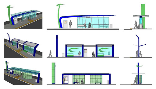
This capability came in handy on a project we were working on with Community Transit in Everett, WA to design concepts for a series of Bus Rapid Transit (BRT) Stations. After our first workshop, we came out with a couple of concepts which we refined and presented using SketchUp. One of these concepts ended up being built as close as possible to the original design. By modeling and presenting in SketchUp, the client felt ownership over the design and had a better understanding of the challenges associated with construction. Initially, they wanted something “wavy” or “fluid”, but using SketchUp, it was effective to show that a two-directionally curved canopy is not terribly easy to build, especially with a limited budget and a tight schedule.


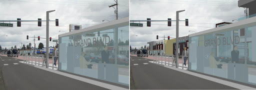
3 options developed for BRT stations. The bottom option was built in 2010. 

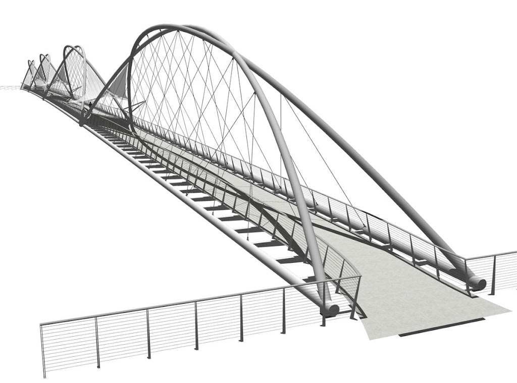
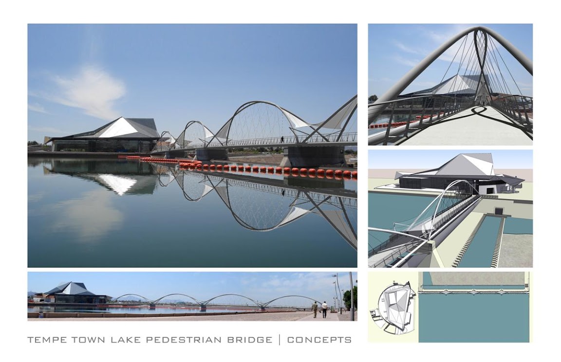
Later in 2007, we designed a Pedestrian Bridge in Tempe, AZ at the Town Lake. In meetings with the client, the engineer T.Y. Lin International, and the artist Laurie Lundquist, it was highly effective to present proposed concepts for the bridge directly from SketchUp using a laptop and a projector. This allowed the team to engage in real-time with the bridge concepts and study the relationship with the neighboring Tempe Center for the Arts, which was a sensitive issue for this design. The viewpoints at the different piers of the bridge were easy to visualize using a series of Scenes in SketchUp. The model also allowed real-time analysis of aspects like transparency, visibility and shading. I then created a rendering of the bridge using Adobe Photoshop, which was helpful in creating the reflection in the water.

SketchUp was also a great tool to do shading studies for consideration of different shading structures. A shading sail, developed together with local artist Laurie Lundquist, integrated with the flow of the bridge and proved elegant and functional.

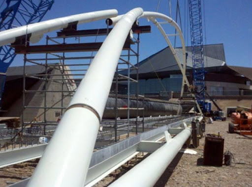
Toward the end of the design process, SketchUp actually played one more unique role. While I was determining the right angle for the 2 bridge arches to touch each other at the top of each arch in SketchUp, the 2 arches suddenly overlapped (as I was working within the component, both arches were turning simultaneously), and voila, a unique crossing arch appeared, which we introduced as our preferred alternative. Today, the bridge is currently under construction.


A shading study 


The bridge under construction 

As recently as a couple of weeks ago, I used Match Photo for the first time in a meeting with a prospective client for station design and design of alignment options for another Bus Rapid Transit (BRT) line. I created just one model to demonstrate 3D modeling, show 3D sections of the streetscape and show a Match Photo context study.


Different configurations for street lanes 

By switching Layers on and off and clicking on saved Scenes, we were able to show how future transit oriented development (TOD) would positively impact the streetscape. The different lane options were also placed in different Layers and Scenes, so we could show their respective impact with one click on the Scene tab. At the request of the client I was able to change the station configuration in real-time, which translated immediately to the Match Photo Scenes.


BRT station renderings 

I want to conclude by saying what I appreciate most about Sketchup is that it’s highly intuitive and quick enough that it enables real-time modeling, which is a real asset in presenting and shaping public projects that usually include a significant amount of community engagement.

Geographic data of Google Search with the WebGL Globe

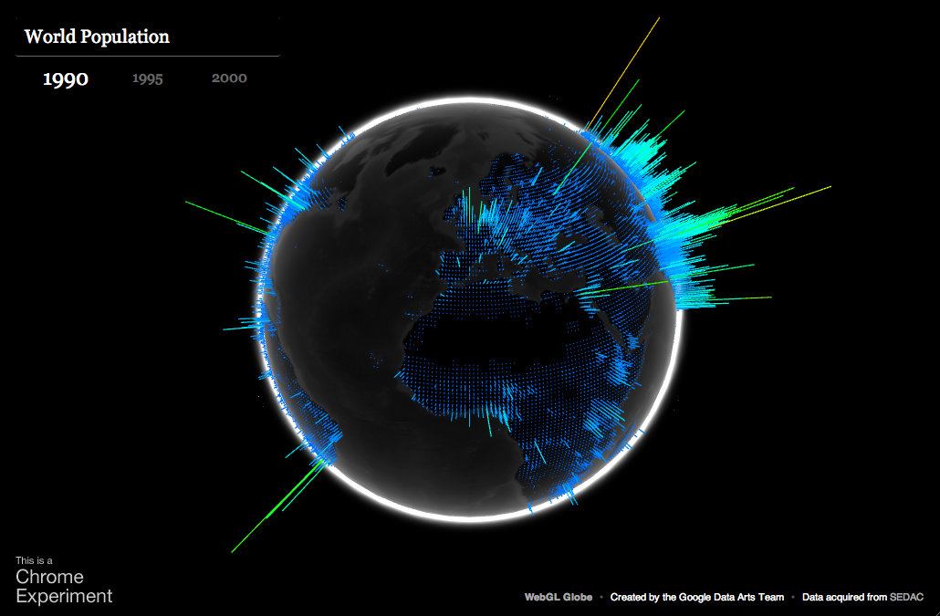
Today we’re sharing a new Chrome Experiment called the WebGL Globe. It’s a simple, open visualization platform for geographic data that runs in WebGL-enabled browsers like Google Chrome. The globe below shows world population, and we’ve created another globe showing Google search traffic.

The primary challenge of this project was figuring out how to draw several thousand 3D data spikes as quickly and smoothly as possible. To do this, we turned to Three.js, a JavaScript library for building lightweight 3D graphics. For each data point, we generate a cube with five faces – the bottom face, which touches the globe, is removed to improve performance. We then stretch the cube relative to the data value and position it based on latitude and longitude. Finally, we merge all of the cubes into a single geometry to make it more efficient to draw.

The second challenge of the project was animating the globe – we wanted it to be fun for the user to manipulate. Thanks to WebGL, we’re able to display thousands of moving points at high frame rates by using the user’s graphics processing unit (GPU) for 3D computations. Each state of the globe has its own geometry and we morph between them with a vertex shader, saving precious CPU resources. Additionally, to make the globe look nice, we took advantage of the possibilities of GLSL and created two fragment shaders, one to simulate the atmosphere and another to simulate frontal illumination of the planet.

Now that we’ve released the globe, we’re hoping that developers like you will create your own. What data will you show on it? If you’re feeling inclined, you can learn more about the data format (represented in JSON) and get the code here. If you create your own globe, please also consider sharing a link with us — at some point in the future, we hope to post a list of interesting globes that have been submitted.