Google Earth: Learn about a place

People  are usually amazed how quick and easy it is to put a place in Google Earth. Here you can see 10 easy steps used to learn about a place I read about today at GoogleSightseeing. They were writing about the extensive canal system across Germany – something I was not really familiar with. I was fascinated by their fourth entry which described the Magdeburg Water Bridge, which they said is the longest aqueduct in Europe.  Watch the short video below to see 10 steps I took to learn more about this place in GE:

You can watch the steps I took in the video above.

  1. First I found something interesting through a blog post at GoogleSightseeing.com. Alex posted some details in his post, but I find it more interesting to discover with Google Earth.
  2. So, I followed the link to view the location in Google Earth.
  3. The first thing I do in Google Earth is turn on the “Places“, “Photos” and “More” layers in Google Earth.
  4. The blue icons represent photos taken by many people around the world found at Panoramio (millions of photos are mapped into Google Earth).
  5. I quickly found a ground level photo which showed the bridge (there were even aerial photos in this case).
  6. Found a nice photo from the bridge itself as well.
  7. The white icon from “More” layer represents a Wikipedia story. Here you get a good description of the Magdeburg Water Bridge and a link to the full article with even more details.
  8. You can use the Google Earth navigation gadget in the upper right to turn and tilt your view to get other perspectives of any site.
  9. Zoom out a bit and turn on the Roads layer to get a handy map of the area.
  10. Zoom out even more and turn on the Borders and Labels layer (you might want to turn off the other layers at this point). This gives you a broader perspective. (Tip: you can also turn on the “View->Overview Map” – or hit “CTRL-M” to get a fast broad perspective map).

These are just some really basic steps I often take when trying to learn about a place. Another useful layer is the Google Earth Community layer, found inside of the “Gallery” layer. Although, for some popular places you may find dozens of placemarks by people who have posted about their favorite places – almost too much information. There are many other collections and tools (written about on this blog) for learning all kinds of things like weather, conditions of the environment, real estate prices, history, etc.

The world is a big place, and these techniques won’t work for every single place on the planet. But, if you try them out, you will probably be surprised just how much you can learn (and how many hours you can spend learning about places you’ve always wanted to visit).

via googlearthblog

Bing Maps controls enhance property search experience

John L. Scott Real Estate has been partnering with Microsoft on mapping projects for nearly eight years. In fact, we were one of the first real estate companies to offer map-based home searching way back in 2003. With Neighborhood Wizard™, released in 2007, we became the first residential real estate company in the nation to utilize the Microsoft polygon drawing technology to allow consumers to draw the exact boundaries of their desired search. In 2009 we released JLSConnect™, a customized Silverlight-based tool that we’ve continued to develop for the past two years.


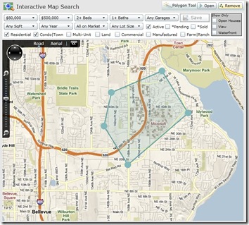
JLSConnect™ has come a long way, and we’re pleased with how the map search product now maximizes the benefits of the Bing Silverlight Map Control. While we’ve included a few screen shots of the product below, feel free to explore the product on our webpage to get a better look.

The combination of Microsoft Silverlight and Deep Zoom technologies, along with John L. Scott’s search technology, make the searching experience very smooth. With this update, customers can now specify all the same criteria they can on our AJAX-based map: property type, price range, beds and baths, etc. They can also filter their results to highlight upcoming open houses or pending and sold properties.

We’ve also made the product more powerful by adding the ability for customers to modify the shape of their search polygon. Customers can now add, move, and remove the points that make up their polygon, giving viewers unprecedented flexibility.

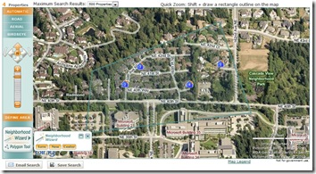
In addition to updating our JLSConnect™ to maximize the benefits of the Silverlight Map Control, we’ve also finished refactoring our AJAX-based interactive map search to use the new AJAX 7.0 Control. Due to the Control’s increased performance, we’ve been able to expand the maximum results to 500 properties.

And with the new seamless transitions between each map type, we now support polygons all the way down to Bird’s eye.

These are only a few of the updates we’ve made to our search tools. Please stop by JohnLScott.com to see how we took full advantage of the Silverlight and AJAX 7.0 controls.


Maps and investment

There is an old adage that the three most important rules for selecting a property for purchase are: location, location, location. So, maps should be one of the primary tools in making the purchase decision. With the advent of Google Maps, Bing Maps and plethora of other online mapping applications, all real estate portals integrated mapping based search options into their websites. However, mapping applications presenting analytical information on the state of the property market in various parts of the country are only starting to be brought to life.

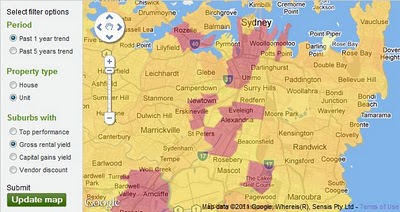
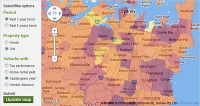
Property Investment Map on domain.com.au is the first analytical map released by the major Australian real estate portal. It contains a set of thematic overlays presenting information on gross rental yields, capital gains, vendor discounts and top performing areas – by suburb, for the entire Australia (excluding ACT). Information is available separately for houses and units, as 1 year or 5 year trend measures.


Property Investment Map provides invaluable insights into the dynamics of the property market on a local scale. For example, using the map investors can pinpoint suburbs with good rental yields and capital growth prospects. These areas are the most desirable for investors as high rental yields imply attractiveness of the location to renters as well as availability of properties at prices still offering good value. At the same time, high capital gains yields over short as well as longer term imply consistency in appreciation of properties in a given area over time. Eastlakes in central Sydney is one suburb displaying such characteristics in relation to units -median price increased 17% in 2010 and further rise of 3% is predicted for 2011.


Totally different market dynamics can be demonstrated on example of Rozelle, a suburb just west of the CBD. Despite showing high gross rental yield for units in the last year, it has relatively low rates of capital gains over one as well as 5 year period. It could imply this suburb was overpriced in the past and only now rental yields for units have increased to the level that makes them attractive again for investment purposes (median price dropped 4% in 2010 and prediction for 2011 is 0% growth). If history is to repeat, there is a good chance prices could overshoot again if Rozelle is suddenly “rediscovered” by investors. Property Investment Map cannot give all the answers so, the picture would have to be validated with local knowledge before making any decisions.

Property Investment Map should be in the toolbox of not only investors but also anyone serious about purchasing a property. The only limitation of the map is lack of details on how the information was derived (eg. methodology for data range determination). It is a good starting point for deciding on alternative locations for investment, although it would also be nice to have a numerical version of the dataset available for more detailed comparisons.