Spreadsheet Mapper now with more advanced customization

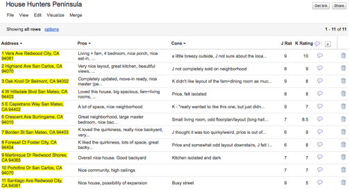
Do you have a spreadsheet of locations that you’d like to see on a map? Here on the Google Earth Outreach team we talk to many nonprofits who use Google Earth and Maps to tell their stories and visualize their data. Often the data is in spreadsheets, or other tabular formats. Converting these rows and columns into a map brings the spreadsheet to life by providing geographic context and a new way to visualize the information.

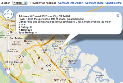
Spreadsheet Mapper is a tool that enables anyone to easily create a well-designed KML file to show off their data in Google Earth and Maps. Since Spreadsheet Mapper is a Google Docs template, you fill in your data using the familiar interface of a spreadsheet, and create a great KML without any coding. It gives you all the cloud-based benefits of Google Docs, including collaborative editing and the ability to publish directly to the web.

When we released Spreadsheet Mapper 2 a few years ago, it had a number of limitations, especially with regard to the number of placemarks it could create and the available balloon templates. In response to user feedback, and taking advantage of new features in Google spreadsheets and Google Apps Scripts, we have upgraded Spreadsheet Mapper with a variety of new and improved features:

  • More placemarks: Support for 1,000 placemarks and ability to add more as needed
  • Flexible balloon design: Take advantage of even more balloon design templates and simplified starter templates
  • Simplified publication: Just click “Publish to the web” to share your map (no more fussing with URLs)
  • New customization options: Advanced users can change the default view and network link details

Ready to try it? The Spreadsheet Mapper v3 tutorial will get you started.

Find your perfect home with Google Fusion Tables

My husband and I were recently in the market for a new home. We worked with a realtor for a few months, looking at several houses every weekend. As we checked out each house, we tracked our thoughts about it in a Google spreadsheet, which included columns for the address, our pros and cons, individual ratings and the combined rating of the house.

One day, while my husband and I were rating a recently viewed home, he came up with a brilliant idea to put all of our home data on a map. We realized that adding geographic information to our personal opinions would help us find trends, such as which neighborhoods we preferred. A light bulb went on over my head: Google Fusion Tables!

Fusion Tables is a data management web application that makes it easy to view tabular data on a Google Map. Columns with location data, such as addresses, points, lines, or polygons, are automatically interpreted and mapped. The map features can be styled according to the data in your table. It’s also simple to share the map visualization with others.

In just a few steps, we were able to convert our spreadsheet into a fusion table:


This was a great start, but what we really wanted was to quickly get a glimpse of this data on a map. All we had to do was select ‘Visualize > Map’ from the table menu and the data in the ‘Address’ column was geocoded (i.e. converted into latitude and longitude coordinates) and the markers were displayed on the map. Clicking on the markers showed additional information about the house pulled from our spreadsheet, including the pros, cons and ratings we inputted for each location.

Our house ratings viewed in Google Maps (after being converted into a Fusion Table).
Fusion Tables also allow you to style the features on the map according to data in a numerical column in the table. We had the perfect column to use for this purpose: the ‘Total Rating’ column!


In order to color code the map markers by their ‘Total Rating’ score, we customized the icons based on a range of scores, with red representing the lowest scores, yellow show mid-range scores and green showing the houses with the highest combined rating. After saving these new settings, the map markers were immediately styled:


Our new map made it much easier to see what locations we were most interested in (the house just south of Redwood City) and the neighborhoods of low interest (those that were closer to the bay or hills).

We shared the map with our realtor and she loved it. It helped her refine the selection of homes she showed us and in just a matter of weeks, I’m happy to say that my husband and I found the perfect house!

Posted by Kathryn Hurley, Developer Programs Engineer, Geo DevRel

via: GoogleLatlong

Google Apps Script And Calorie Counting

It’s in the news lately that by 2030, 50% of the population will be obese. Well, I’m a bit (ok, maybe more than a bit) overweight now and was looking to do something about it. So for my diet, I’ve started counting calories. I’ve tried a number of other diets with mixed results, but calorie counting for me always works. However, counting calories can be a bit of a pain. There are a number of ways to figure out how many calories are in things, such as the container the item comes from, websites like http://caloriecount.about.com/, http://fatsecret.com/ or search on your favorite search engine. Finding out the calorie content of a food isn’t really so much of a problem in and of itself because after awhile you just know how many calories are in the usual things you eat. But where is the best place to keep track the current running total for the day? It has to be easily accessible to me or I don’t do it. I don’t always have paper, nor am I in places where I have connectivity. Android, Gmail and of course, Google Apps Script to the rescue!

Counting Calories using Apps Script


The process is simple. I send an email to myself with the subject “@FOOD” where the body contains the number of calories in the food and the name of the food, one per line. I wrote a script which, every 15 minutes, scans my email and computes the total of calories I’ve consumed in the last 24 hours and updates a spreadsheet with the total.

Why do it this way? Using Gmail for the recording makes it so if I’m offline on my phone, the gmail app will send it when I’m online. Putting it in a Google spreadsheet means I can make a shortcut for it in chrome, and a desktop web shortcut icon on my Android phone for easy access. Additionally, using a spreadsheet allows me to perform other calculations, make charts, etc.

How do you set it up?

First create a new spreadsheet, and click on Tools > Script Editor. Click on File > New > From Script Template. Search for “Calorie Counting” and you will be able to locate the script. Then, click Install and you are all set. Save the script, run it, at which point you’ll get two authorization dialogs, click ok through them. Run it again to make sure it populates the sheet properly. Then, in the script editor, click Triggers>Current script’s triggers and add a new trigger:

And you’re all set! Your spreadsheet, after the script runs will look like this:

From here the possibilities are endless. I’m thinking I could make a UiApp script which uses the new Charts bean to draw a graph. Perhaps make a service to view/change calories because I mess things up every once in awhile. You could also add code for “@WEIGH” messages to track weight and could graph that too. Your imagination is the limit! And if you have an even better idea for how to use Apps Script to improve Gmail and Spreadsheets, you can post it to our Gallery (Script Editor > Share > Publish Project) to share with the world.