The imagery update is now live in Google Earth and will be live soon in Google Maps. To see the places around the world that we’ve updated this time around, please download this KML.
The Google Earth and Google Maps Imagery Team will be publishing the latest batch of imagery in our next update, and as always, there are numerous fascinating and notable areas around the world.
One of the areas that was already slated for this regular update is Abbottabad, Pakistan, which is of particular interest given yesterday’s news. The imagery of this area that is currently available in Google Earth and Maps is from 2005. Higher resolution imagery taken in May 2010 has been prepared for our next imagery update release. However, given the number of inquiries we have received about this area, and to help users better understand recent events, we’ve published an advanced preview KML of the new imagery for viewing in Google Earth. This imagery will be pushed live in Google Earth and Maps as part of our next periodic imagery update.
In addition, as part of our continued effort to provide up-to-date imagery, we’ve worked with our provider again to obtain even fresher satellite imagery of Abbottabad, Pakistan from this morning local time. We have provided this imagery, which is of lower resolution than the scheduled update, to the media. This imagery will be accessible in the near future through the Historical Imagery feature of Google Earth.
This round of imagery also includes many other interesting sites, a few of which are shown below.
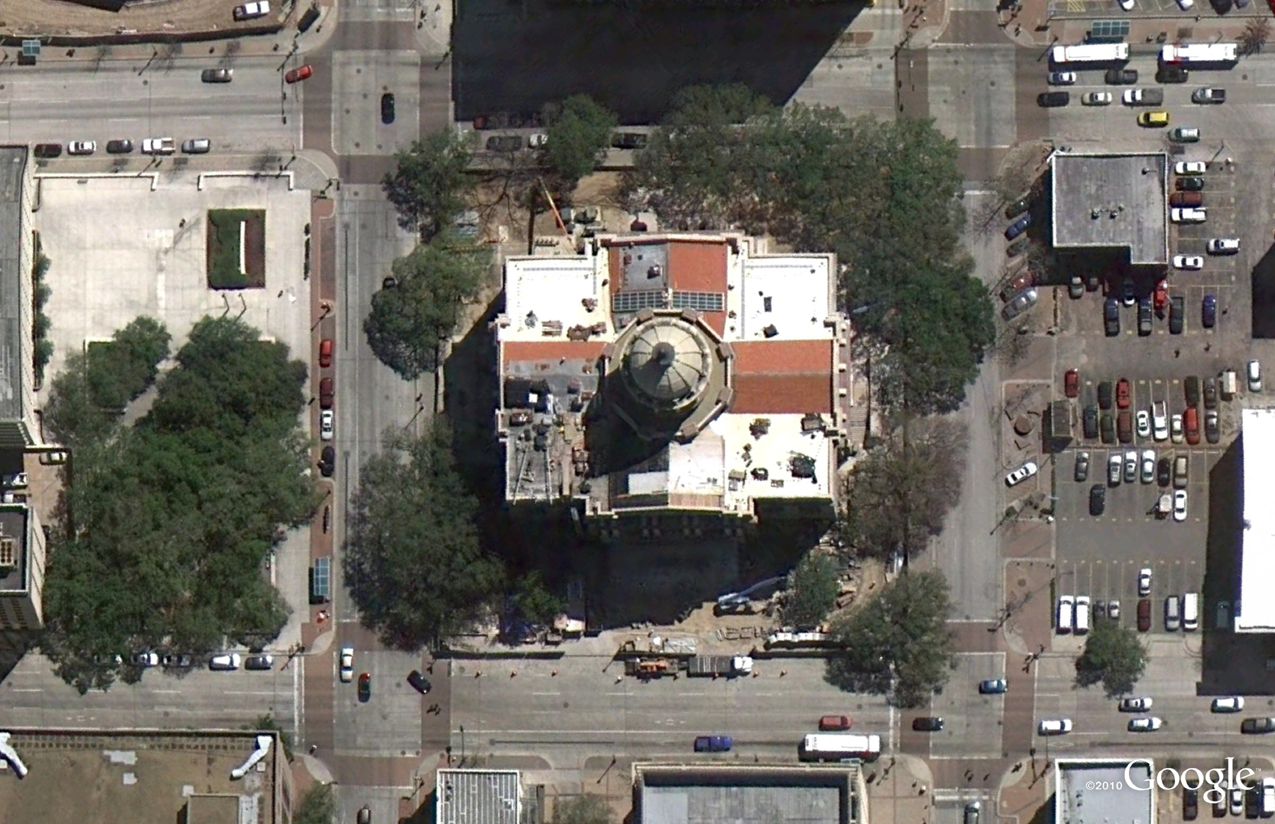
Here’s an image of the Harris County Court House of 1910, located in downtown Houston, Texas. Here you can see the ongoing restoration of the building, returning to glory its halls of justice. It is one of the most important historical buildings in Houston, and is often considered one of the best examples of historic courthouses in Texas.
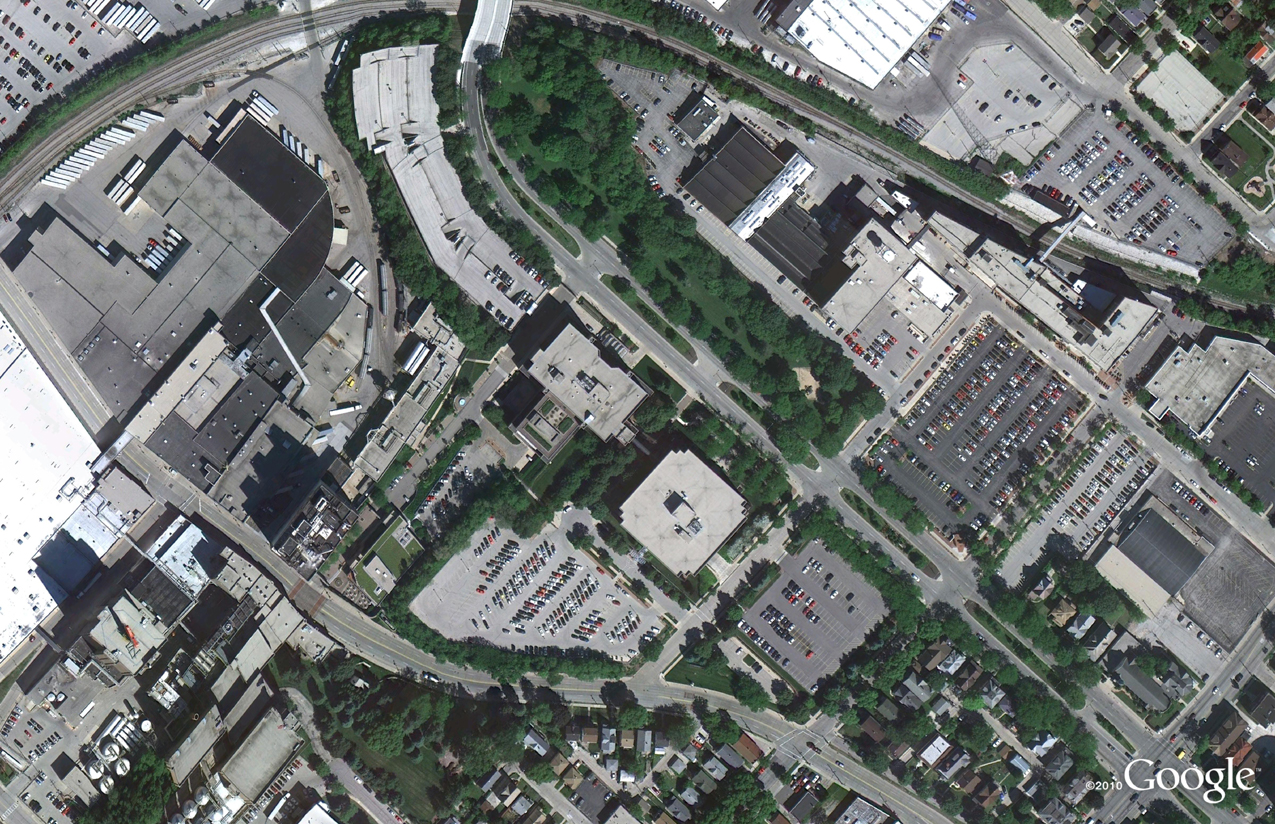
Below is an image of part of Milwaukee, Wisconsin. In it you can see two industries that are part of the might of Milwaukee: the Harley Davidson factory (right hand side of image) and the Miller Brewing Company (left hand side of image).
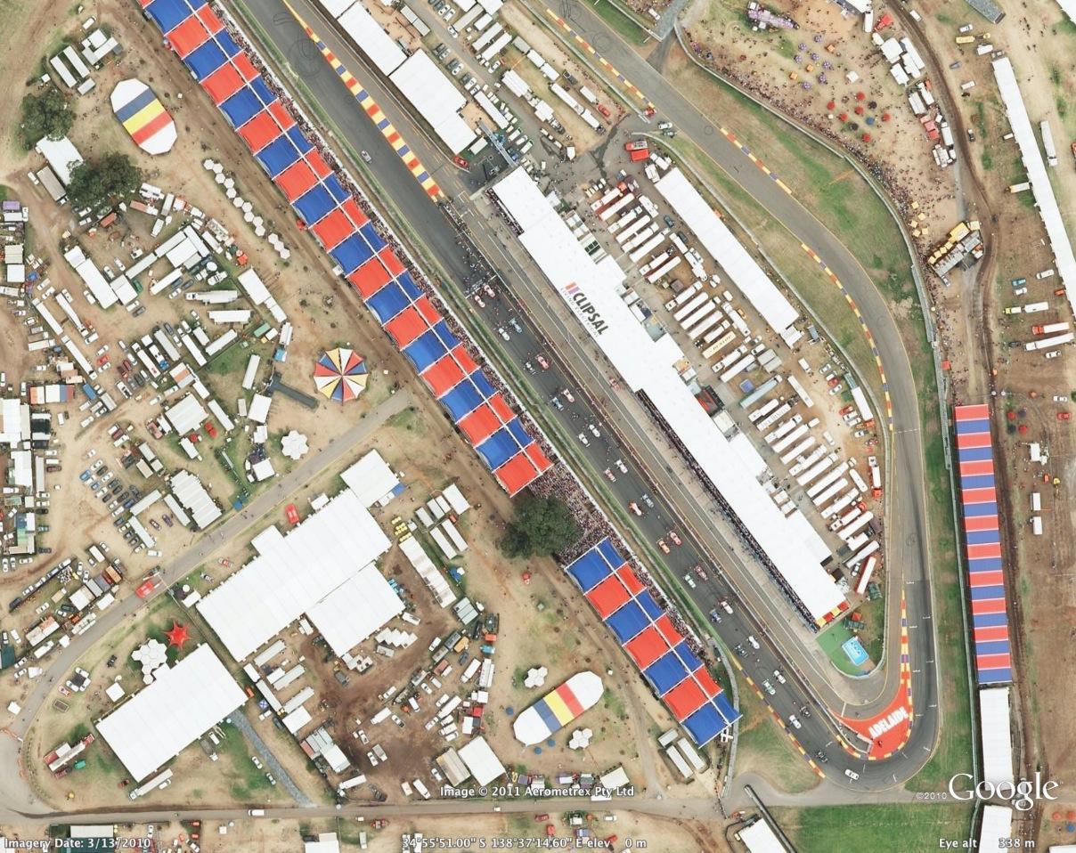
Now here’s a colorful sight: the Clipsal 500 Adelaide race, a four-day event consisting of two 250 km races of V8 Supercars. The race is often attended by well over a quarter million people. This photo shows the race in March 2010.
These updates will be made available soon in both Google Maps and Google Earth.
High Resolution Aerial Updates:
USA: Brookshire, TX; Brownsville, TX; Dallas, TX; Ft Stockton, TX; Hebbronville, TX; Houston, TX; Laredo, TX; McAllen, TX; Milwaukee, WI; Padre Island, TX; Wharton, TX; Zapata, TX;
Australia: Central Coast, New Castle, and Salamander Bay
Norway: Buskerud, Fredrikstad, and Oslo
Countries/Regions receiving High Resolution Satellite Updates:
Algeria, Angola, Antarctica, Antigua and Barbuda, Argentina, Australia, Austria, Bangladesh, Belarus, Benin, Bolivia, Brazil, Burundi, Cameroon, Canada, Central African Republic, Chad, Chile, China, Colombia, Costa Rica, Croatia, Czech Republic, Democratic People’s Republic of Korea, Democratic Republic of the Congo, Denmark, Djibouti, Dominican Republic, Egypt, Eritrea, Estonia, Ethiopia, Finland, France, Georgia, Germany, Greece, Greenland, Grenada, Guadeloupe, Guinea, Haiti, Honduras, Hungary, India, Indonesia, Iran, Ireland, Israel, Italy, Japan, Jordan, Kenya, Kuwait, Latvia, Lebanon, Lesotho, Lithuania, Madagascar, Malawi, Mali, Mexico, Mongolia, Morocco, Mozambique, Myanmar, Namibia, Nepal, Netherlands, New Zealand, Niger, Nigeria, Norway, Oman, Pakistan, Paraguay, Peru, Philippines, Poland, Portugal, Republic of Korea, Romania, Russia, Saudi Arabia, Senegal, Serbia, Seychelles, Sierra Leone, Slovakia, Somalia, South Africa, Spain, Sri Lanka, Svalbard, Swaziland, Sweden, Switzerland, Syria, Taiwan, Tanzania, Thailand, The Gambia, Tunisia, Turkey, Uganda, Ukraine, United Arab Emirates, United Kingdom, United States, Uruguay, Venezuela, West Bank, Western Sahara, Yemen, Zambia, Zimbabwe