Google Earth: The Harrisburg Capitol Complex


As I’ve mentioned on here on GEB a few times, I love high-quality 3D models. I think they add a lot to the Google Earth experience, and I enjoy highlighting users that create awesome models.

In the past we’ve shown you work from people like Andy Dell and companies such as Estate3D and CyberCity3D. Today I want to show you some of the work from Steve Cline of Urban 3D Modeling.


building.jpg 

He lives in Harrisburg, PA and built out much of the downtown area in 3D. In his words:

“As a resident of Harrisburg I wanted to show off the beautiful architecture and history of our state capitol complex. All the state government buildings are clustered into a dense complex that is bisected by State Street. The principle entrance from the east is the State Street Bridge which passes through two towering pylons as you enter directly into the Capitol Building and surrounding complex. Most of the complex buildings are a mix of neoclassical design and some art deco influence from the later additions. Of the 15 buildings in this collection my personal favorites are the Keystone Building, Judicial Center, and Forum Building. The only building not done by me was the previously done Capitol Building.”

You can find all of the models in Google earth, and he’s also put them together in a collection in the 3D Warehouse. For a quick look at all he’s done, you can use this KMZ tour to fly around and see it all.

For more on Urban 3D Modeling, you can check out their website, follow them on Twitter or connect with them on Facebook.

Building 3D Agent-Based Models for Urban Systems

Number 161 in the every growing CASA Working Paper Series is Building 3D Agent-Based Models for Urban Systems by A.T. Crooks, A. Hudson-Smith and A Patel in a collaboration between George Mason University, United States of America and here at Centre for Advanced Spatial Analysis (CASA), University College London.


There is a growing interest in relating agent-based models to real- world locations by combining them with geographical information systems (GIS) which can be seen with the proliferation of geosimulation models in recent years. This coincides with the proliferation of digital data both in the two and three dimensions allowing one to construct detailed and extensive feature rich and highly visual 3D city models. This paper explores some of these developments in relation to our own initial work on building 3D geospatial agent-based models of urban systems and the technologies that allow for such models to be created. Furthermore, we highlight some techniques for the creation of 3D agent-based models and stress that such models are not a substitute to good models.


The intention of this paper is to explore the recent advances in computer technology, software and associated techniques that allow for the creation of 3D agent-based models which can be used to simulate various aspects of city life focusing on our own initial research of creating 3D cityscapes and 3D agent-based models. The remainder of this paper will therefore explore our attempts to use digital data to create feature rich 3D cityscapes (Section 2), discuss why such cityscapes are important for ABM (Section 3), before moving into how advances in computer hardware allow for the creation of 3D agent-based models (Section 4); we then briefly explore a potential application domain, that of pedestrian modelling (Section 5). Section 6 presents techniques which we are currently utilizing to create 3D agent-based models through various linking and coupling approaches along with advantage and disadvantages of each approach before a discussion is presented (Section 7).

Download the full paper (748k pdf).

London Twitter Network Map

Fabian Neuhaus author of Urban Tick here at the Centre for Advanced Spatial Analysis, University College London has kindly agreed to write a guest post on the London Twitter network, the zoomable version embedded below is particularly notable:

Following up from the New City Landscape maps, where we mapped tweet densities in urban areas around the world, we have now started to look into the socia network aspects of this data set. As a complementary graph to the map the network illustrates how the twitter users are connected through their activities and usage of the platform.

LND-NCL_NWgraph_s
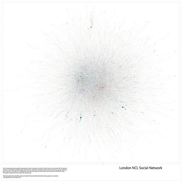
Graph by urbanTick / The London NCL Social Network graph of twitter users. The dataset is defined as geolocated tweets collected over the period of one week in the urban area of London set to a 30 km radius. Click on the image for a larger version on flickr or see the interactive zoomable version HERE.

The network is built from nodes and edges, were the nodes are the twitter users active during the time period of message collection back in May 2010. The edges visualise the connections between these users. From the messages sent connections are established based on activity and interaction. In reality these are the @ messages that are directed at one or more particular user. The second indicator of a connection are the RT messages, the message that have been retweeted by followers of the creator of the initial message.

LND-NCL_NWgraph-04
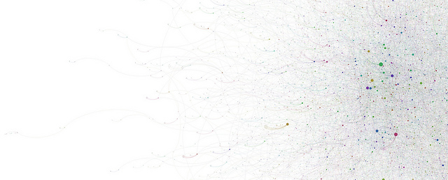
Graph by urbanTick / Zoom of the London NCL Social Network graph of twitter users. The dataset is defined as geolocated tweets collected over the period of one week in the urban area of London set to a 30 km radius. Click for a larger version on flickr.

Using these two methods the network graph is established as a directed network, meaning that the connection between the nodes has a direction since a message originates from a sender being delivered to a receiver.

The resulting network is built from a total of 17618 nodes and 26445 edges. In the case of this London twitter network not everyone is connected to everyone and about 5400 subnetworks were identified. Furthermore via the colouring the modularity of the network is visualised. Each subgroups has a unique colour shading indicating groups with tighter connections.

London NCL Social Network

Graph by urbanTick using the GMap Image Cutter / London NCL Socia Network – Use the Google Maps style zoom function in the top left corner to zoom into the map and explore it in detail. Click HERE for a full screen view.

The sizing of the nodes is derived from the number of connections this particular node has for both incoming and outgoing edges.

For the comparison of the networks we are currently working on graphing out the whole range of NCL across the world in order to establish a analysis parameter set. We’ll keep you posted about the progress here.

To compare it, the geolocated London New City Landscape map. It is important to keep in mind that the graphs are not spatially representative as compared to the NCL maps which are properly geolocated.

london_contourColour_2
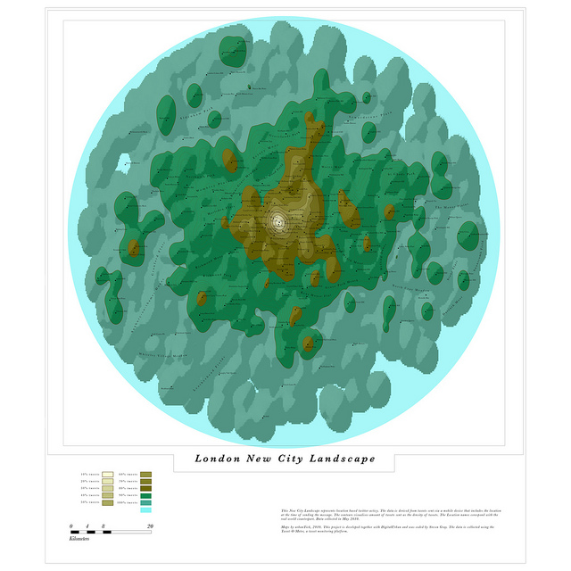
Image by urbanTick using the GMap Image Cutter / London New City Landscape Click HERE for a full screen view.


Post by Fabian Neuhaus, Urban Tick.