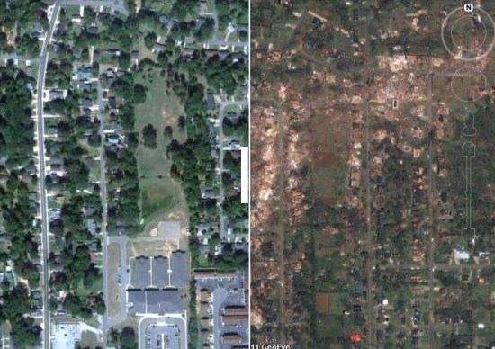
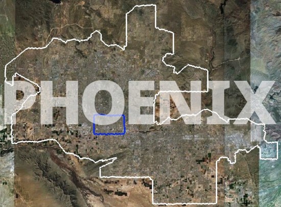
In addition to their obvious functional purpose, maps can be objects of great aesthetic beauty. On my bookshelf I have a book (The Map Book, by Peter Barber) full of beautiful illustrations of maps throughout history, such as these:
 |
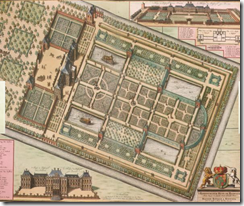 |
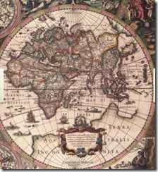 |
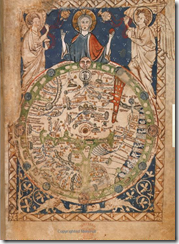 |
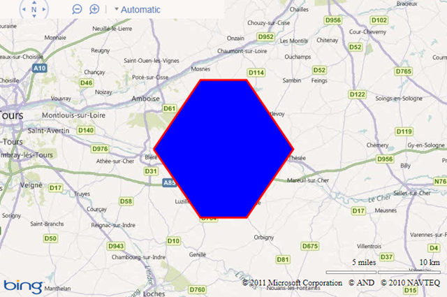
Perhaps it is unreasonable to compare a simple web-mapping tool such as Bing Maps to the art of a master cartographer, but one thing is certain; namely, this is not beautiful:
I try to convince myself that Microsoft chose these horrible default colours so that people would look at them, think “My God – those colours are awful – I must change them!”, and then look up how to set the FillColor, StrokeColor, and StrokeThickness properties of the Microsoft.Maps.Polygon object, but in practice this doesn’t always happen. Every time I see a default-coloured polygon like that above, I’m sure Marinus of Tyre must turn in his grave.
But it doesn’t have to be like this. Applying some simple style rules to change the fill and stroke properties can have a dramatic improvement on the appearance of your map. As an example, I took around 3,000 features from the OS Vector Map dataset in an area around Norwich and plotted them on Bing Maps as polylines and polygons. Every element contained an additional feature code property, which described the type of feature using the same numbering system as with the Ordnance Survey’s own dataset. For example, feature code 25710 is a motorway; code 25999 is an area of woodland, and 25301 is a single-track railway.
Then I created a set of “stylesheets” – simple arrays of different Microsoft.Maps.Color values that should be applied to features based on their type. For example:
var style1 = {
// Building
25014: {
strokeColour: new Microsoft.Maps.Color(alpha, 126, 119, 98),
strokeWidth: 1,
fillColour: new Microsoft.Maps.Color(alpha, 232, 214, 176)
},
// Glasshouse
25013: {
strokeColour: new Microsoft.Maps.Color(alpha, 232, 214, 176),
strokeWidth: 1,
fillColour: new Microsoft.Maps.Color(alpha, 255, 255, 255)
},
// Electricity Transmission Line
25102: {
strokeColour: new Microsoft.Maps.Color(alpha, 158, 170, 158),
strokeWidth: 1
},
…
}
[/php]
And finally, a simple function that looped through the elements on the map and applied the correct “style” to each element based on its feature code, using the setOptions() method. The results are shown below, or you can try a live demo here.
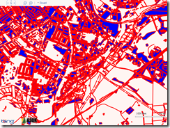 Default |
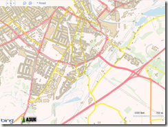 Style 1 |
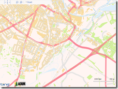 Style 2 |
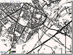 Black and White |
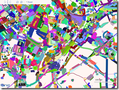 Random (very Mondrian-esque, I think!) |
