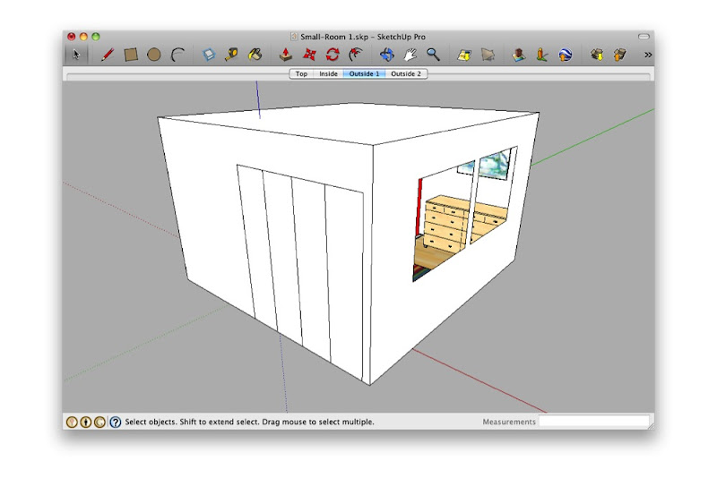
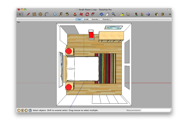
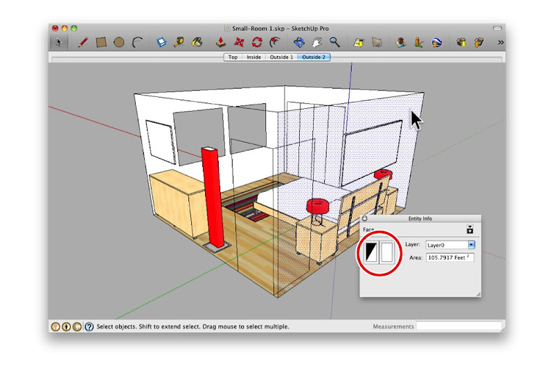
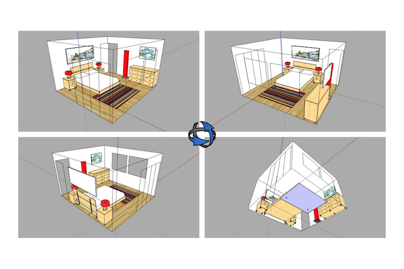
When you’re modeling a small room, it can be a pain to see what’s inside. The problem is that the walls and ceiling get in the way. One solution is to lop off the ceiling and work in a top view, dollhouse-style. Other folks set up scenes from the interior corners and adjust their Field of View to something super-wide like 90 degrees.
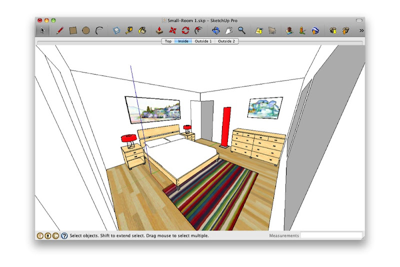 Standing in the corner and making your Field of View really wide is just weird. What are you—a housefly?
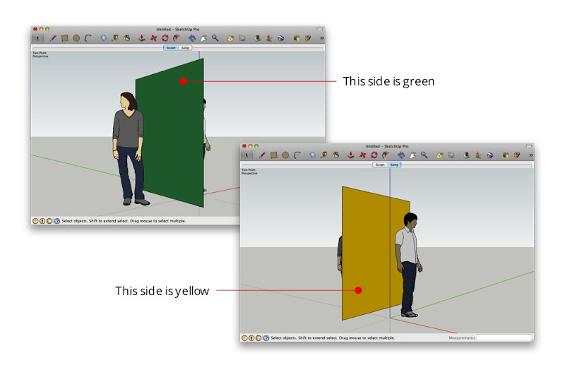
Both of the above techniques work—to a point. Personally, I think it’s like trying to read a book through a keyhole. By far my favorite method for working on small interiors is to make use of SketchUp’s ability to have faces with different materials on each side:
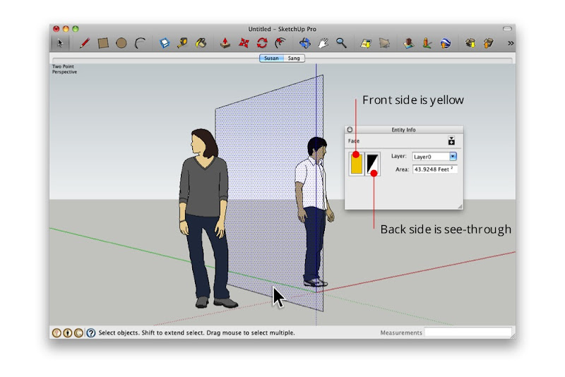 The Entity Info dialog box shows that the selected face is yellow on the front and see-through on the back.
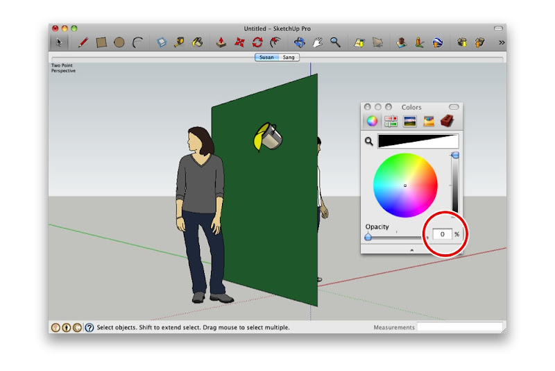
By painting the outward-facing surfaces with a see-through material—one whose opacity is set to 0%—I can see in from the outside. Super useful, super simple.
