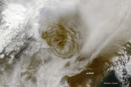
Another year, another Icelandic volcano with a difficult-to-pronounce name. Here’s Earth Observatory’s satellite image of Grímsvötn’s ash cloud (above) and Ogle Earth’s post about visualizing said ash cloud in Google Earth. Here’s an ESA article on the ash plume that includes animations of its spread
Reviewed: Fujifilm FinePix XP30
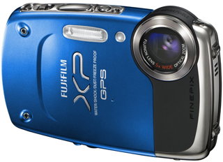
Photography Blog has a review of the Fujifilm FinePix XP30, a rugged pocket digital camera with built-in GPS. The review cites some problems with both the camera’s ruggedness and its GPS. “Putting GPS on the camera is a great idea, but living in England as we do, we couldn’t get it to work because of the bad weather we experienced at the time of testing. There are good GPS systems on the market that can get a signal when indoors and in tunnels but the XP30 can’t even get through clouds.”
The Weird Terrain Layers
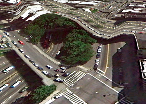
Clement Valla collects instances where Google Earth’s 3D terrain layer doesn’t play well with the satellite and aerial imagery — elevated highways and bridges, for the most part. The effect is redolent of Dali — and it’s what happens when you try to make a 3D model of 2D imagery of a 3D surface.