Much has been written about what Google left out in the Places upgrade and much speculation has been offered as to the reasons for the change. The specualtion have often made the assumption that the new design was a reactive response on the part of Google.
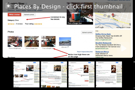
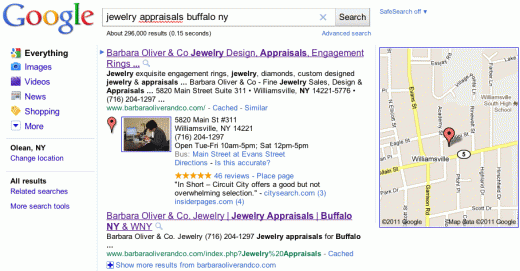
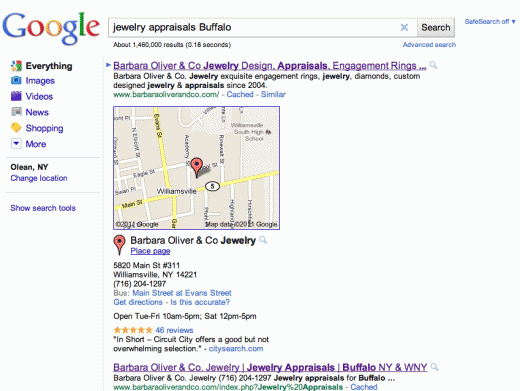
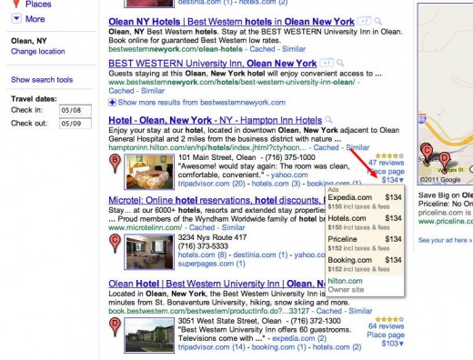
After looking at a large number of pages, I would suggest that the changes were primarily proactive in a nature and design driven (did I just say design and Google in the same sentence?). To get a sense of Google’s intentions I looked at a number Places pages in a range of industries and states and captured a screen shot of the information above the fold on a typical size screen 1280 x 1024 screen to see exactly which objects and activities had been prioritized. I captured the same Places page on my iPhone for comparison.
We all know of the call to action for additional reviews and uploaded photos those were very obvious. However Google made a number of other decisions in terms of how to prioritize the information. Here is the slide show and I think you will find the choices made interesting and design driven. Click to start the slide show:

While Google may have left some things off in response to complaints about their use of 3rd party reviews, for the most part the changes are a conscious design effort to make Places more interactive, more current and more social and more transactional.
They include a strong call to action (review, upload photos) and clear sense of priorities as to what is important going forward – even coupons now have a higher visibility – more user generated content, more understanding of your social circles intent and a greater desire, at least in the hotel industry, to use Places to “close” the sale.


