Symbols and Heatmaps in the Google Maps API

The Google Maps API provides a robust platform in which you can add geographical context to your data in a variety of ways. Data visualization is therefore one of the elements at the heart of the Maps API, and today we’re introducing two new techniques for visualizing your data in flexible and dynamic ways.

Symbols

At SXSW Interactive in 2011, I attended a session on geotemporal data visualization that made me keen to make it easier for Maps API developers to build visualizations similar to those discussed. For this reason I’m particularly excited to introduce a simple, yet powerful, new concept to the Maps API v3 that we call Symbols.

Unlike the image icons currently used for marking locations on a map, a Symbol is defined as a vector shape. The size, stroke width, color, and opacity of the shape, are all set by the Maps API application and can be dynamically modified. A small number of shapes, such as a circle, are provided by the Maps API, and custom shapes can be expressed as an SVG path.

Symbols open up a wide range of compelling new possibilities for data visualization and visual effects. For example, the below map illustrates the expansion of the Walmart chain of stores between 1962 and 2006:

In addition to using symbols to represent point features you can also decorate polylines with Symbols. One or more symbols, such as an arrowhead, can be placed at fixed positions on the polyline or repeated along the polyline. Because the polyline that has been decorated does not need to be visible, this feature can also be used to created dotted or dashed polylines, and just as the style of the symbols can be dynamically modified, so too can their location on the polyline:

Heatmaps

Developers often ask how they can represent large amounts of data on a map. Improvements in web browser technology have increased the number of markers that can be rendered by a Maps API application, but above a certain threshold the density of markers can overwhelm the user.

An alternative approach is to use a heatmap, and to enable this approach we’re launching support for browser rendering of heatmaps by the Maps API using the new Heatmap Layer. Your Maps API application can define the colour spectrum, intensity range, and behaviour of the heatmap when the map is zoomed. Here’s the Walmart example from above, but this time visualized as a heatmap:

If you have any technical questions about these new features, we recommend engaging with our developer community online, or joining our regular Google Maps API Office Hours. If you’re at I/O come see us in person at Office Hours in the Google Maps developer sandbox.


Band of Bridges: Celebrating the Golden Gate Anniversary


Editor’s Note: Today’s guest author is Greg Moore, President of the Golden Gate National Parks Conservancy. Google is excited to help support this celebration of the Golden Gate Bridge.

On May 27th, the San Francisco Golden Gate Bridge celebrated its 75th anniversary. Our organization, the non-profit Golden Gate National Parks Conservancy, is working with the Golden Gate Bridge, Highway and Transportation District; the National Park Service; the Presidio Trust; and the City of San Francisco to help commemorate this landmark event.

As president of the Golden Gate National Parks Conservancy, I have the privilege of enjoying the majestic architecture of the bridge and its landscape on a regular basis. This iconic Bridge stands at the center of the Golden Gate National Parks.

However, we’re pleased to announce that now the American spirit and beauty of the bridge will be available to everyone. Our new interactive website, Band of Bridges, brings the celebration of the Golden Gate Bridge’s 75th anniversary into everyone’s homes.

The website enables visitors to virtually connect bridges from around the world to the Golden Gate, making what we hope will be the longest bridge in history. Using the Google Maps API, users can navigate every corner of the Earth and search for bridges or enter a specific bridge they are already familiar with—maybe even one from their hometown. Each new bridge added will connect to preceding bridges, resulting in spans that stretch hundreds (or thousands) of digital miles.

With the U.S. Bureau of Transportation Statistics approximating 600,000 bridges in the United States alone, we hope to connect thousands of bridges and people from across the globe.

Just as the Golden Gate blends together its surrounding nature, culture and people, Band of Bridges, conceived by San Francisco advertising agency Goodby Silverstein & Partners and brought to life by the Google Maps team in Mountain View, is a culmination of the amazing creative and technological talent of the Bay Area in California.

The Golden Gate National Parks Conservancy would like to thank Goodby Silverstein & Partners and Google for bringing such vision, beauty and authenticity to our efforts.

Please join us in celebrating the Golden Gate Bridge’s 75th anniversary and be part of our Band of Bridges.

Great tools for information about the solar eclipse


Over the next few weeks, the earth will be seeing a series of unique celestial events. Tomorrow many of us we will be able to see a a solar eclipse, June 4 will feature a lunar eclipse, and June 6 is the Transit of Venus. As you might expect, there are great Google Earth tools to help you make the most of all three events.

For the solar eclipse, the eclipse viewer from HeyWhatsThat.com 
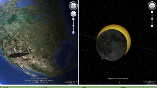
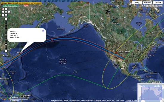
is a great way to see where the best locations for the viewing the eclipse are located.


eclipse.jpg 

You can use the dropdown box in the lower right corner of the site to view other simulations, both past and future. You can learn more about the features available on their site by reading this text file.

Another great resource for this eclipse is Xavier Jubier’s map.


xavier.jpg 

In addition to this eclipse, he has an extensive collection of data from other eclipses from 1961 through 2039 available to view.