Band of Bridges: Celebrating the Golden Gate Anniversary


Editor’s Note: Today’s guest author is Greg Moore, President of the Golden Gate National Parks Conservancy. Google is excited to help support this celebration of the Golden Gate Bridge.

On May 27th, the San Francisco Golden Gate Bridge celebrated its 75th anniversary. Our organization, the non-profit Golden Gate National Parks Conservancy, is working with the Golden Gate Bridge, Highway and Transportation District; the National Park Service; the Presidio Trust; and the City of San Francisco to help commemorate this landmark event.

As president of the Golden Gate National Parks Conservancy, I have the privilege of enjoying the majestic architecture of the bridge and its landscape on a regular basis. This iconic Bridge stands at the center of the Golden Gate National Parks.

However, we’re pleased to announce that now the American spirit and beauty of the bridge will be available to everyone. Our new interactive website, Band of Bridges, brings the celebration of the Golden Gate Bridge’s 75th anniversary into everyone’s homes.

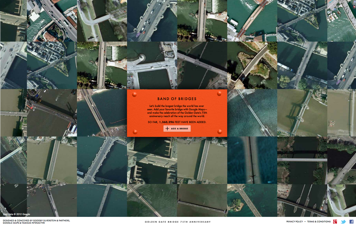
The website enables visitors to virtually connect bridges from around the world to the Golden Gate, making what we hope will be the longest bridge in history. Using the Google Maps API, users can navigate every corner of the Earth and search for bridges or enter a specific bridge they are already familiar with—maybe even one from their hometown. Each new bridge added will connect to preceding bridges, resulting in spans that stretch hundreds (or thousands) of digital miles.

With the U.S. Bureau of Transportation Statistics approximating 600,000 bridges in the United States alone, we hope to connect thousands of bridges and people from across the globe.

Just as the Golden Gate blends together its surrounding nature, culture and people, Band of Bridges, conceived by San Francisco advertising agency Goodby Silverstein & Partners and brought to life by the Google Maps team in Mountain View, is a culmination of the amazing creative and technological talent of the Bay Area in California.

The Golden Gate National Parks Conservancy would like to thank Goodby Silverstein & Partners and Google for bringing such vision, beauty and authenticity to our efforts.

Please join us in celebrating the Golden Gate Bridge’s 75th anniversary and be part of our Band of Bridges.

London Calling

Map of the Week: London Calling
Why we like it: This map is a great way to promote a city and share its history. A brilliantly designed UI, that includes info windows with map cutouts. Additionally, it’s an elegant use of Styled Maps.

In honor of a big year for the city of London, the BBC Australia has created “London Calling” as a way to explore and celebrate London. For those of you who know your way around London, there’s a ‘drop-the-pin’ challenge, where users answer geography questions by placing a pin on the map in the right place. If you get stuck with particular questions, there’s also the option to reach out to the “London Calling” team.

For those that just want to explore London, the map is a great way to learn more about the city that has been getting a lot of attention in light of the Queen’s Jubilee and the upcoming 2012 Olympics. There’s even a chance to win prizes just by exploring the map!

From a design standpoint, this map is really great to look at. Two things about this map really stand out to us. Firstly, Styled Maps has been used to add a sepia effect that reflects the rich history of the city of London. Secondly, this is one of the first use cases where we’ve seen a custom info window that includes a cutout to reveal the highlighted feature below. A clever design choice that’s great to look at!


The Microsoft 311 Service Center with Bing Maps


Microsoft now has an all-in-one fully integrated solution for city governments with the 311 Citizen Services Center. It combines the power of several Microsoft technologies and has both a citizen-facing portal and a back-end management module, including interactive Bing Maps for both components. When cities use the 311 service center, citizens can easily report outages, potholes, etc. by locating them on a map. City workers and contractors can use Bing Maps for service request information and updates. 311 Service Center is another great example of how Bing Maps integrates with

Microsoft Dynamics® CRM to show the data the customer is managing, and to speed up the decision process.

To learn more about how your city can benefit from the Citizen Services Center (311), visithttp://www.microsoft.com/gov311 and watch this video.


Citizen-facing portal with self-service and multi-access channels


Google Earth on 48 screens

Back in 2009, Google developed the first Liquid Galaxy, an entirely new way to display Google Earth on eight screens – which creates an immersive experience of virtually flying around the globe. Since then, we’ve built dozens of Liquid Galaxies all over the world and open sourced the code so anyone can build their own.

Late last year, the Paris Center for Architecture and Urbanism: Le Pavillon de l’Arsenal, approached us asking if they could use Google Earth to power a new interactive display highlighting the Paris metropolitan area in 2020 with upcoming buildings in 3D. Naturally, we were excited about the project, especially when they shared that the display would be 40 square meters – posing a fun and unique challenge.

A year later, we are excited to share that the first 48 screen Liquid Galaxy is now on display in Paris. We believe this to be the largest screen showing Google Earth to date!

Photo: Vincent Fillon
What started as a 20% project to support the new Google Cultural Institute resulted in a stunning display of the Earth in almost 100M pixels – powered by 48 instances of Google Earth synchronized and operated through 4 multi-touch screens with pinch and zoom functionality. The view is even sharper due to a refresh of the entire Paris area with higher resolution imagery.

As a Parisian, it’s amazing to be able to see what the city will look like in the future. If you can’t make it to France in the near future, you can preview it at home by downloading this KML file and opening it in Google Earth.

The Canopy and Transport Hub: Patrick Berger and Jacques Anziutti architects
This project was a close collaboration between Google and Le Pavillon de l’Arsenal, as well as technology JCDecaux, End Point and design partners ultranoir.

Over the next few months we’ll be fully open sourcing this work on Liquid Galaxy, as well as the graphical interface. Keep an eye out on our source code page for updates.

DiscoverBPS

Every year in Boston, parents navigate the school selection process in an effort to get their kids into the best possible public schools. The process is complicated, and, depending on the outcome, can leave parents feeling frustrated and confused. DiscoverBPS was designed to make the process more intuitive, and to help parents make better choices for their kids.

Iteration #1 – Geocoded Addresses

In our first iteration, we used a home address and grade level to identify a student’s eligible schools, and then displayed the results on a map. In the screenshot below, the green circle represents the student’s “walk zone” (in this case, a 1.5 mile radius appropriate to a 7th grade student), the yellow polygon represents the North Assignment Zone, and the markers represent the schools.

With a little help from Google’s Geocoding and Maps APIs, we seemed to be well on our way!

On closer inspection, however, we noticed one school that fell just outside of the walk zone boundary, even though – after zooming in and switching to satellite view – the school campus was clearly overlapping with the walk zone:

Obviously, if our goal was to build a tool to make the process more intuitive, we needed to avoid introducing new ambiguities into the system.

Iteration #2 – School Parcel Shapefiles

To solve the overlap issue, we obtained shapefiles for all of the City’s school properties, and used a PostGIS-enabled database to calculate distances between the home address and the nearest point on the school parcel. In so doing, we were able to calculate walk zone distances, which allowed us to properly identify schools with walk zone eligibility:

After a several weeks of deep-diving into the internals of PostGIS mapping, we seemed to be back on track.

Stepping back, however, a new consideration came to light: was it fair to assume that a 7th grader could walk from downtown Boston, across the Charles River, and to a school in Charlestown in less than 1.5 miles? A Google Directions search suggested otherwise (the route below is estimated at 1.9 miles):

If the purpose of the walk zone policy was to determine which schools a student could reasonably get to on foot (and to discourage parents from busing their kids to schools on the other side of town), our walk zone circle began to seem misleading.

Iteration #3 – Walkshed Mapping

In the end, we decided to use an open source project called pgRouting (which extends PostGIS to provide geospatial routing functionality) along with OpenStreetMap to derive a “walkshed” polygon and to calculate street walking distances. We also could have used the Google Maps Distance Matrix API to calculate walking distance, but opted to go with pgRouting based on the need to create the walkshed polygon. These tools allowed us to then visualize the walkshed in Google Maps:

Aside from being noticeably smaller than the walk zone circle, the walkshed conveys a representation of walkability that is customized to the home address. Notice how the walkshed area is confined by bodies of water that are not spanned by any bridges.

DiscoverBPS is now live at www.discoverbps.org. The walkshed map (which would require policy changes by Boston Public Schools) is being considered for use in 2013.