7 February 2011 marked the second anniversary of the worst bushfire tragedy in Australian history – 173 people died and 414 were injured as the result of infernos raging around the State of Victoria. The Black Saturday Bushfire was a very traumatic event for many Australians, those directly affected by the fires but also those thousands who got emotionally and personally involved in post event forensic studies, clean up, counselling, rebuilding, Royal Commission and general assistance through voluntary work or collection of donations. The whole nation felt the pain and helplessness in the wake of such an enormous tragedy.
After a period of a relative calm over the last two years Australia has been struck again by several major natural disasters, such as flush floods in Queensland and Victoria, tropical cyclone Yasi, or bushfires in Western Australia. Events like these bring online crowds of people: those caught inadvertently in the incidents, or those concerned about safety of their family members and friends, but above all, “curious onlookers” from around the world who just would like to know what is happening. All those people are looking for basic information, such as maps of places to identify where “these things” reported in commercial and social media are happening, as well as anything that relates to progress of the event, likely scenarios it may evolve into and the impact on people, infrastructure and the surrounding environment.
In the first instance they turn to official sites run by State authorities – those that issue the alerts and warnings – and of course the Australian Bureau of Meteorology. When they can’t find what they are looking for, or the information is not in the format that is meaningful, they turn to online search engines seeking more details about the event. It is therefore not a coincidence that during the times of natural disasters the traffic to sites providing information on maps goes through the roof. A question comes to mind if there really is enough tools in the public domain to keep general public fully informed. Has anything changed since Victorian bushfires of 2009?
In an ideal world, all the relevant information would be provided by the authorities, along with alerts, warnings, evacuation orders, road closures and detour routes, situation briefs etc. And through all possible channels: online, stationary and mobile phones, radio and TV, and in all formats: text, audio and video broadcasts and online streaming, printed as well as static and interactive maps, and above all, web services for republishing the information through media and social channels. But that is still only a distant dream. The reality is that information is very fragmented, differs in formats and content from State to State and ultimately in reliability, accuracy and timeliness.
So, what information is actually available, in spatial format, to an average person interested in a particular event? Let’s start with bushfire related information as there is quite a few resources available…
Part 1: Mapping Bushfires
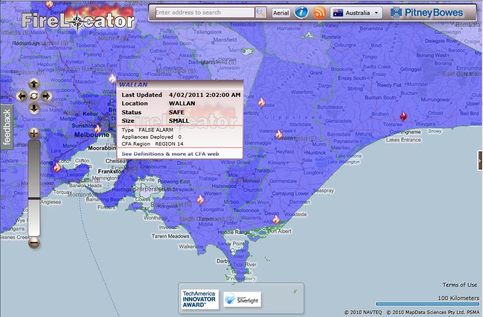
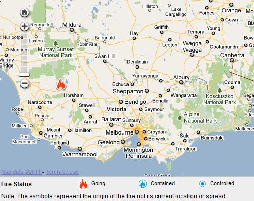
Detection of fire hotspots from satellites has been around for quite a while and Australia has two systems delivering such information that pre-dates Victorian bushfires of 2009: Geoscience Australia’s Sentinel and Landgate’s FireWatch. Both are using data obtained from the NASA Earth Observation Satellites Terra and Aqua which pass over Australia up to three times a day (although a revisit of the same area is only two times a day). Although data has some limitations, like timeliness due  to infrequent revisit cycle or inability to detect hotspots through thick smoke and clouds, these applications provide excellent location reference for larger fire outbreaks throughout Australia. Geoscience Australia publishes the data in KML, WFS and WMS formats. I use those in my Hazard Monitor Bushfire Incidents map to publish an alternative view of the information. FireLocator from PitneyBowes provides yet another version of the same data in Silverlight format and with Bing Map in the background.
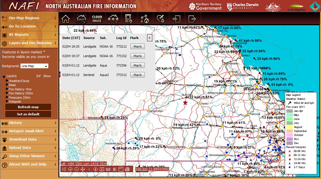
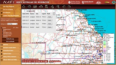 North Australia Fire Information is an application dedicated to monitoring fires in the northern part of Australia. In addition to satellite detected fire hotspots it also includes information on fire scars from past bushfires. Some of the information available on this site can be accessed in KML and WMS formats.
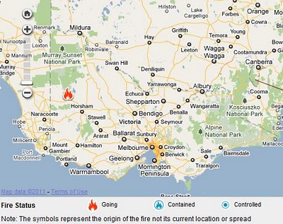 State authorities responsible for emergency alerts and response to natural disasters are publishing on their respective websites summaries of information on the latest incidents. Victorian Country Fire Authority (CFA) publishes a summary of incidents in a tabular format and on a Google Map. The information is also available as RSS feeds (locations are not georeferenced, hence cannot be directly imported into maps).
In NSW Rural Fire Service (RFS) publishes its version of summary of incidents – as a list and a map. Georeferenced RSS feed is also provided.
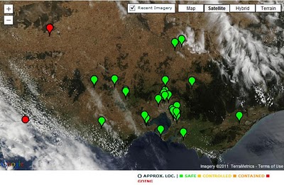 Both Bushfire Incidents map and FireLocator (developed in late 2009) are using the above feeds to display information about the latest incidents on the maps. During the peak of Victorian bushfires Google released its own application that mapped these feeds and showed satellite imagery of smoke and cloud cover.
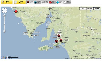
Tasmania Fire Service (TFS) is another agency that publishes fire incidents information and a map as well as distributes the information via RSS (non-georeferenced) and KML. And South Australian Country Fire Service (CFS) publishes map and incidents in a similar fashion to already mentioned States (their RSS feed is also not georeferenced).
There are no interactive maps with the latest incidents for Queensland and Western Australia and those states do not publish RSS feeds in the format that could be easily reused for displaying the information in third party mapping applications.
The most recent additions to the list of online bushfire related information sources are BushfireConnect and everymap.com.au. Built with Ushahidi, these online mapping applications aim to publish information supplied by the public located in the affected areas, either by lodging reports online, or via SMS or Twitter (ie. crowd sourcing). They also republish RSS alerts from State authorities. Not the easiest and the most intuitive tools to use but these initiatives are attempting to engage a wider community in reporting of incidents so, deserving all the support.
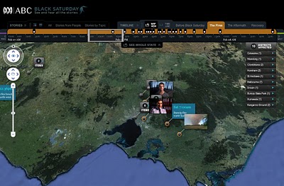 At the time of major disasters media and private individuals create maps and various applications to share the information about a particular event. Examples include a Black Saturday feature created by ABC that allows users to explore timeline of events on an interactive map, or Google’s MyMap version created by a private individual as a static record of events (presented here on aus-emaps.com shareable map).