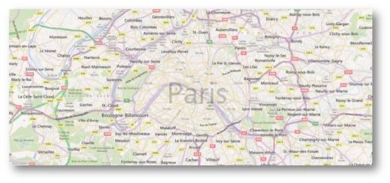
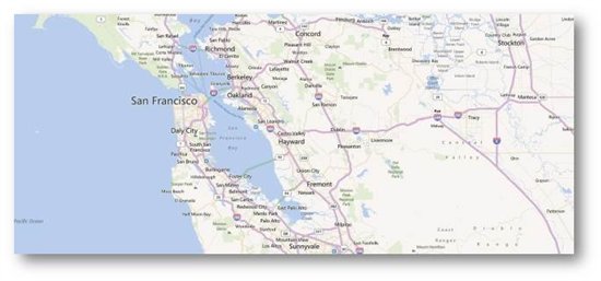
Last year, we entered into a strategic partnership with Nokia which included plans to offer a unique and compelling mapping experience for our customers. Since then we’ve been working with Nokia and Windows Phone to deliver a unified map style based on one set of design principles with the goal of providing a more intuitive and pleasing online mapping experience. Our Bing Maps designers teamed closely with our partners at Nokia Maps and the Windows Phone team to unify our map elements, improve contrast and usability to ultimately create a more beautiful and functional map. Today we’re excited to share the new map design, available on desktop and mobile versions of Bing and Nokia maps.
Let’s take a closer look at the updates.
Common color palette for road map style
We’ve updated our color palette to create a cleaner and consistent view of roads and landmarks resulting in a map that’s easier to interpret. For instance, the new road color is further clarified from rivers while not competing with traffic colors or overlaid information.
Celebrate Typography
We focused significantly on improving various typography components in order to provide further clarity on maps including font updates, improved readability and contextual labeling. Type size hierarchy further delineates classes of labels. The user watches city names consistently grow and become more transparent through the zoom levels. Small type is demystified from its surroundings with a technique that reduces clutter instead of adding glows or ever-present strokes. The right use of typography helps our customers consume mapping details more quickly.
Using Visual Hierarchy to create Focus and maintain context
At each level, there’s an appropriate amount of information conveyed to the user. Too little or too much information can lead to overload and thereby an unpleasant user experience. We’ve redesigned with this in mind, so a very different level of information is presented to you when you zoom compared to when you pan out. Go in for detail, pull back for context. We strive to keep the orientation and context of a user within the map surface persistent across various levels of zoom.
In addition to our map design updates, we’re also adding a significant amount of mapping coverage and data due to our partnership with Nokia and NavTeq. Each map data refresh from NavTeq brings with it many improvements, and each one also attempts to include as many new roads/subdivisions/ changes/etc. as possible. This update is no exception and the changes are too vast to list but most notably, there are a few entire countries that really improved including Egypt, Israel, Malta, Philippines, Uruguay and Venezuela to name a few.
All in all, we believe that the new map styles available on Bing Maps (http://www.bing.com/maps) and Nokia Maps (http://maps.nokia.com) and on your mobile device are easy, satisfying, and truly a delight to use.


