Unified Map Design of Bing Maps and Nokia

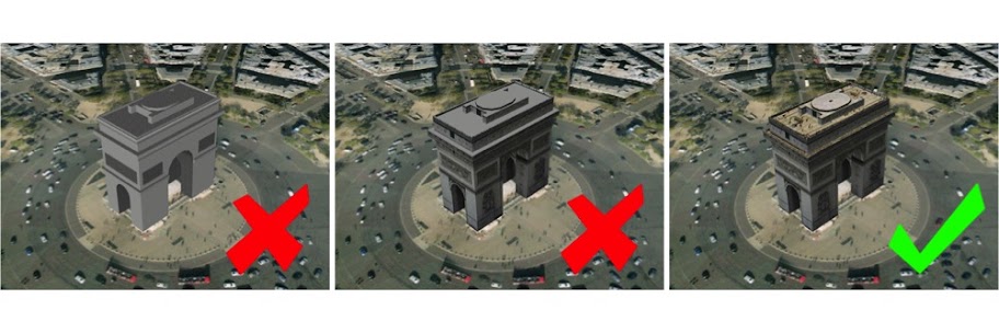
Last year, we entered into a strategic partnership with Nokia which included plans to offer a unique and compelling mapping experience for our customers. Since then we’ve been working with Nokia and Windows Phone to deliver a unified map style based on one set of design principles with the goal of providing a more intuitive and pleasing online mapping experience. Our Bing Maps designers teamed closely with our partners at Nokia Maps and the Windows Phone team to unify our map elements, improve contrast and usability to ultimately create a more beautiful and functional map. Today we’re excited to share the new map design, available on desktop and mobile versions of Bing and Nokia maps.

Let’s take a closer look at the updates.

Common color palette for road map style
We’ve updated our color palette to create a cleaner and consistent view of roads and landmarks resulting in a map that’s easier to interpret. For instance, the new road color is further clarified from rivers while not competing with traffic colors or overlaid information.

Celebrate Typography

We focused significantly on improving various typography components in order to provide further clarity on maps including font updates, improved readability and contextual labeling. Type size hierarchy further delineates classes of labels. The user watches city names consistently grow and become more transparent through the zoom levels. Small type is demystified from its surroundings with a technique that reduces clutter instead of adding glows or ever-present strokes. The right use of typography helps our customers consume mapping details more quickly.

Using Visual Hierarchy to create Focus and maintain context

At each level, there’s an appropriate amount of information conveyed to the user. Too little or too much information can lead to overload and thereby an unpleasant user experience. We’ve redesigned with this in mind, so a very different level of information is presented to you when you zoom compared to when you pan out. Go in for detail, pull back for context. We strive to keep the orientation and context of a user within the map surface persistent across various levels of zoom.

In addition to our map design updates, we’re also adding a significant amount of mapping coverage and data due to our partnership with Nokia and NavTeq. Each map data refresh from NavTeq brings with it many improvements, and each one also attempts to include as many new roads/subdivisions/ changes/etc. as possible.  This update is no exception and the changes are too vast to list but most notably, there are a few entire countries that really improved including Egypt, Israel, Malta, Philippines, Uruguay and Venezuela to name a few.

All in all, we believe that the new map styles available on Bing Maps (http://www.bing.com/maps) and Nokia Maps (http://maps.nokia.com) and on your mobile device are easy, satisfying, and truly a delight to use.

SketchUp: How to assign materials to groups and components

Everybody knows that faces in SketchUp can be painted with different materials. What lots of folks don’t know is that you can apply materials to groups and components, too. The following illustration shows the Entity Info dialog box, which is a great place to see which materials are applied to your geometry.

The Entity Info dialog box (Window > Entity Info) shows thumbnails for the materials assigned to selected entities. When you select a face, it shows thumbnails for the front and back sides of that face (top). Groups and components have material thumbnails, too (bottom).


When you paint a group or component red, only the faces inside it that are painted with the Default* material turn red. Faces that have already been painted with another material don’t change at all.

The above group (top) includes faces that are painted with different materials (bottom). Only the top face is assigned the Default material.


Applying a material to the entire group only changes the color of faces that are painted the Default material.


This trick also works with groups and components that are nested inside one another. When you apply a material to a top level group or component, all the Default-colored faces that are inside nested, Default-colored groups and components inherit that material automatically. The following diagram is my best attempt at a visual explanation of this phenomenon.

Applying a material to a group or component that in turn contains sub-groups and component instances can be a confusing experience. Just remember that the color you’re painting “trickles down” to Default-colored faces contained within Default-colored groups and components. It’s easier done than said : )


*SketchUp automatically applies the Default material to faces you create from scratch. You can also paint anything with the Default material at any time; just pick it in the Materials Browser (which looks completely different on PCs and Macs.)

The Windows and Mac versions of the Materials Browser. On the former, the Default material is included as a permanent thumbnail; on the latter, it’s the first material in the “Colors In Model” list.


As you can see, this technique is a godsend for building complicated objects that need to change color easily. In the case of the George Nelson Marshmallow Sofa in the images that follow, the cushions are individual component instances nested inside the main Sofa component. These are assigned the Default material.

I downloaded this George Nelson Marshmallow Sofa component from FormFonts.

The individual cushions are instances of the same component. Each instance is assigned the Default material.

The faces that make up the surface of each cushion are also painted with the Default material.


All of the metal and rubber frame pieces are also groups and components, but their faces are all assigned specific materials.

The faces in the non-cushion parts of the sofa are all assigned materials other than Default.


When you use the Paint Bucket to paint a color—in this case orange—on the main Marshmallow Sofa component, only the cushions take on that color. Everything not assigned the Default material stays exactly the way it is.

Painting the sofa component orange causes all Default-painted faces to turn that color. Non-Default-colored faces remain unchanged.

Google Earth: The New Acceptance Criteria for 3D buildings

It was over five years ago when we came up with the initial Acceptance Criteria for photo-textured 3D buildings in Google Earth. Since then, we’ve learned many things and have also made many improvements to the 3D modeling process—including the release of Building Maker and two updated versions of SketchUp. Given all of these changes, we realized that our Acceptance Criteria were due for an overhaul.

Our new Acceptance Criteria have been completely rewritten with the goal of making them clearer and easier to follow. Issues relating to photo textures, permanence of structures, splitting, and entourage have proven to be the most common areas of confusion in the past:

Photo Textures

Our new minimum requirement for photo textures is more lenient than it’s been in the past. Photo textures are only required on upward facing surfaces of the model and on the main facade. We encourage you to photo texture the entire model, but we also understand that it may be difficult to get accurate imagery on every side of some buildings. Any remaining, non-photo-textured faces in your model should be painted with realistic-looking textures that match the color and look of the building in real life.

Permanent Structures

Beginning today, only permanent structures will be accepted. As we constantly refresh our satellite imagery, temporarily-positioned entities like vehicles and people don’t belong in Google Earth’s 3D Buildings layer.

Model Splitting


From now on, all submitted models should contain only one structure each. Each structure should be uploaded as a separate model file. This includes properties that have multiple buildings on them such as a house and a shed or garage. If buildings are all connected in a city block, they should be split into separate models based on building type, function or address. When our review team is assessing connected block models for splitting issues, we will look at the facade and roof textures to see if there are changes in material that signify where a split should have occurred.

Entourage


In addition to splitting buildings, we are now requiring all models of trees and other permanent entourage (such as signs, light posts and benches) to be uploaded separately from the buildings with which they may be associated. This ensures that when another building is uploaded in the same location, we are only judging the quality of the new building model versus the original. It’s a shame to have to remove good tree models just because they’re attached to a building model when a better building model is submitted that doesn’t contain trees.

Also, multiple, related trees and other entourage objects can be grouped into a single model as long as they are located in a relatively concentrated area. This means a single model can contain all the trees for a block or a park, but it shouldn’t contain all the trees for multiple blocks or an entire city. Remember that only permanent entourage is acceptable—cars and pedestrians move around, and thus don’t belong in Google Earth’s 3D Buildings layer.

Other improvements

One other big improvement we’ve made is the addition of tips and suggestions to each of the thirteen individual Acceptance Criteria. If a model you submit isn’t accepted, you’ll receive an email notification (opt into these emails via your preferences) that includes a direct link to concrete information about how you can improve it before you re-submit.

What about models that have already been accepted?

To help make this transition easier, we won’t be going through all the models we’ve already accepted in order to remove ones that fail to meet the new Acceptance Criteria. If your model has already been accepted, it will stay in the 3D Buildings layer until and unless it is sent through the evaluation process again. There are four actions which can cause a model to re-enter this process:

  1. You make an edit to your model and re-upload it to the 3D Warehouse, replacing the previous version.
  2. Someone else submits a model in the same location as your model.
  3. Periodic terrain and aerial imagery updates cause your model to go through our automated alignment process.
  4. Someone clicks the “Report a problem” link for your model in Google Earth.

It’s still a bit of a subjective process

Keep in mind that judging 3D models is still a difficult task and is prone to subjectivity. All submitted models are reviewed by real human beings who take time to ensure that they meet our standards. Because human beings sometimes make mistakes, we have a way for you to appeal negative judgements. If, after reviewing the Acceptance Criteria, you feel we’ve made the wrong decision, use the “Tell us why we’re wrong” link (at the bottom of the model’s 3D Warehouse page) to ask us to take another look. You’re encouraged to include links to photos of the actual building or other online resources to will help us to understand your point of view.

We know how much time and love goes into making beautiful 3D models for Google Earth, and we greatly appreciate all the effort you put into your work. Here’s hoping that the changes we’ve made will make for a smoother, more enjoyable geo-modeling process for everyone.