New Branded Onebox Display in Google Places

Today is a new day and brings an apparently new display to the Branded Onebox display in the main search results. As Daniel Sheehan noted several weeks ago in the post about the change away from photos in the display, “When it comes to Google Places it seems that there is no normal. There are just short lived tests and longer tests.”


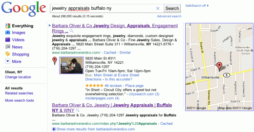
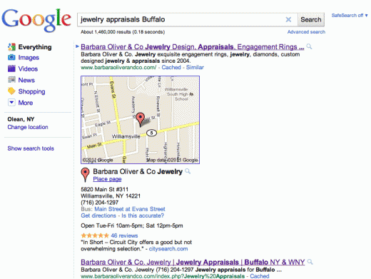
Slightly after midday yesterday (when the second screen shot was taken) Google changed the branded Onebox display to now include the image from the Places page and placing the map to the far right. Here is a screen shot from this morning and yesterday afternoon:

New:

Old:

The Future of Google Places

The Google Lat Long Blog has formally announced the changes to Places that roll out earlier in the day with their normal happy talk:

Making constant tweaks and adjustments to our user interfaces and overall user experience have always been the norm at Google, and you may have recently heard about our renewed effort across all Google products to make the user experience more focused, elastic and effortless. Changes have already started to appear on Google Maps, and we’ve now simplified our Place pages across desktop and mobile devices as well.

But there was one thing that was unique in today’s post about the change that departed from the past. For the first time that I can remember Google has provided, even if guarded and vague, some clue about the future direction of Places:

Beyond today’s transition, our long-term vision for local search includes:
  • Bringing you more personalized results when you search for local places — because we understand that information from the people you know is most meaningful;
  • Integrating some of the great information that’s been buried on Place pages into your web search experience across all Google platforms;
  • Giving you more ways to rate, discover and share places you love faster and easier than ever, wherever you are, and on whichever device you choose.

New Look for Google Places and Maps


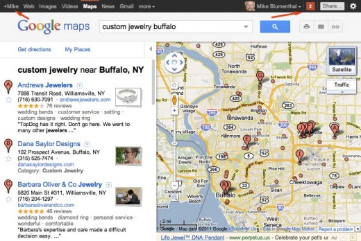
Google, in anticipation of their coming Google+ social product, rolled out a new interface across most if not all of their products including Google Maps, Google Places, the Place Pages AND the mobile interface. The change, first spotted last weekend, adds a sharp, modern and one might even say a designed look to the UI. While the UI is a significant change, it is but a prelude and perhaps foundational change to Google’s forthcoming effort to “socialize” all of their products with the new Google+.

You will notice in my screen shot, the integration of Google+ along with the many other changes to the interface:
The Places page has a similar look but the outcome, because of the start contrasts and additional whitespace is more striking. Although it does seem that there might be more ads than previously. They are certainly more noticeable:
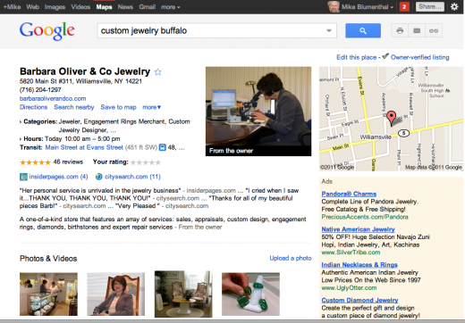
The new One Box display, rolled out last week, makes more visual sense when viewed in the context of the new interface as well:
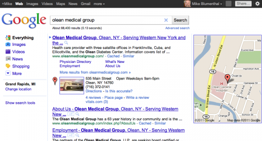
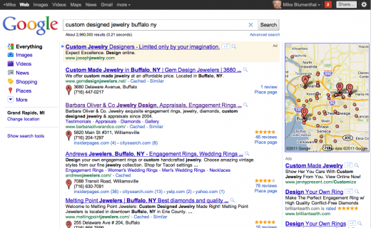
Here is a screen shot of the blended results in the new layout. Like the One Box, the recent changes were obviously made with this UI update in mind. Although even here, with the pins and the Map, the users eye is still drawn away from the search results towards the array of Google products, the new (bright red) social function and the user photo at the top of the screen: