WikiEDdata – Mapping Poverty in Washington School Districts
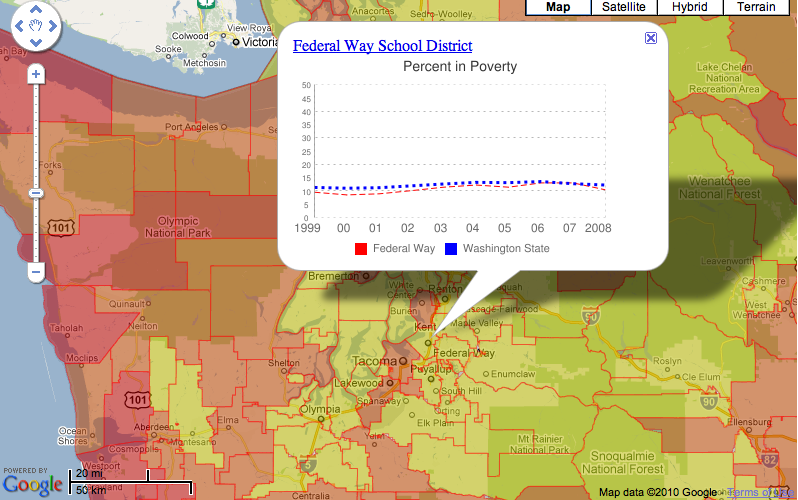
The most powerful maps allow users to quickly understand the significance of large amounts of data. Using Fusion Tables, polygons representing school districts and poverty levels are rendered and colored based on their assigned values in the tables.
Clicking on a district polygon will bring up an infowindow containing a poverty line data chart, dynamically generated through the Google Chart API.
Reporting Road Potholes in Spain
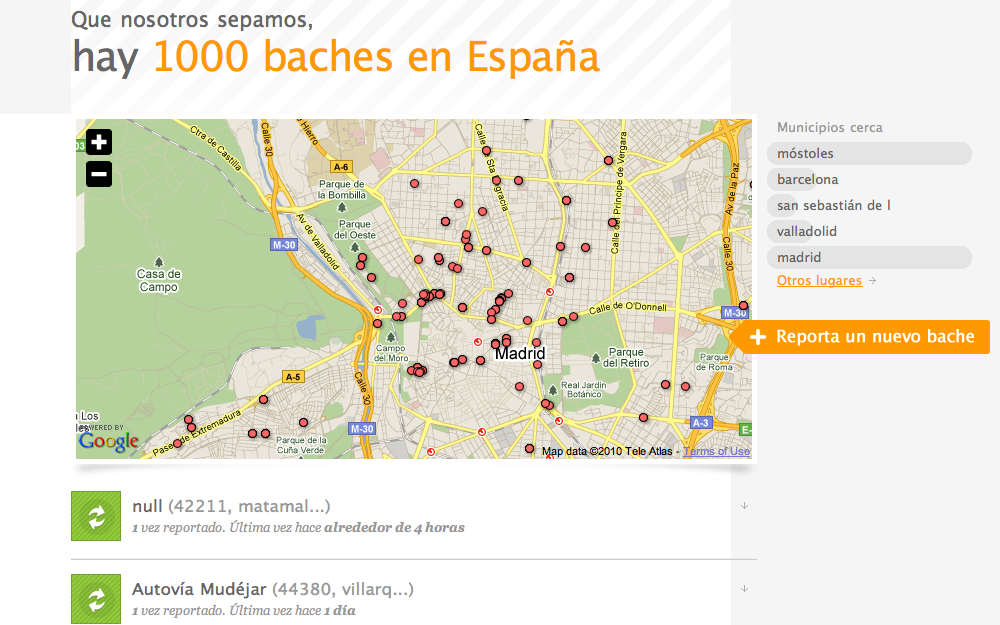
Fusion Tables makes crowdsourcing easy. Using Fusion Tables, Otrobache.com allows Madrid citizens to log on and report the location of potholes. The newly reported potholes appear on the map in real time (as soon as the map is refreshed).
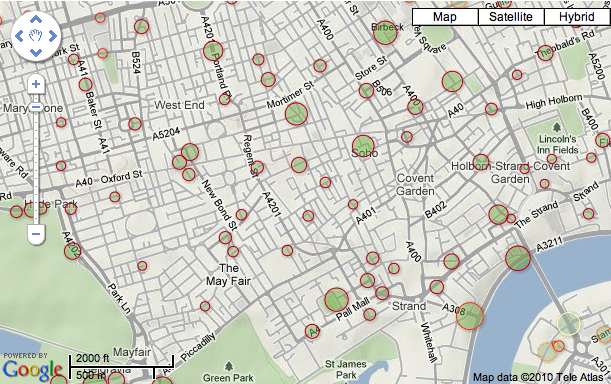
The Telegraph – UK Charities Map
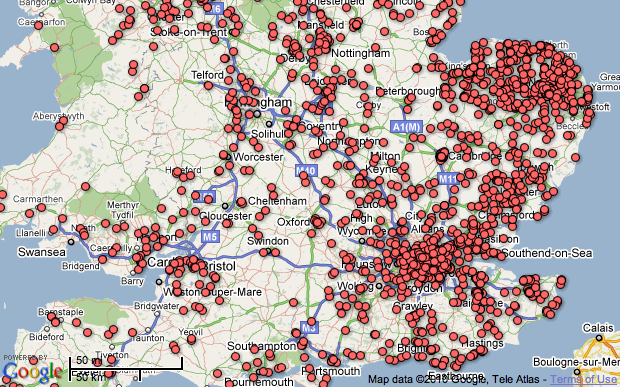
Fusion Tables is a great way to store and quickly render large amounts of data. The Telegraph used Fusion Tables to catalog and map literally tens of thousands of charities throughout the UK.
Analyzing Concealed Handgun Licenses in San Antonio
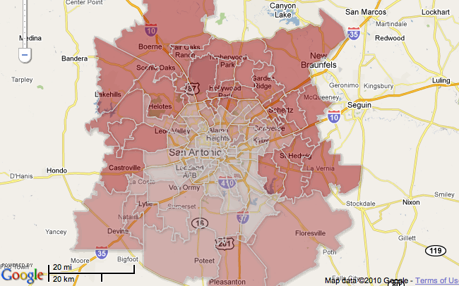
From San Antonio Express-News, “The Texas Tribune analyzed a Department of Public Safety database that tracks concealed handgun licenses in Texas. The Tribune’s analysis found that the number of gun permits in an area often correlates with income and political beliefs.”
Fusion Tables is used here to overlay the data with boundaries and view possible correlations. The implementation also makes use of Gradient styling. Gradients allows developers to specify a color ramp and a number range; features will be displayed in the color appropriate for where they belong in the range. Much like the built-in Intensity map visualization, but now you can change the colors and use your own boundaries!
Using geometry styling controls in Fusion tables, this implementation is a live visualization of London Cycle Hire Rank availability using data from the Boris Bikes API.