The above video, which animates those maps to show nearly a century of presidential politics in just over a minute, is particularly dramatic. That said, David’s other work is also worth a look, including his attempt at k-means redistricting — redrawing electoral districts based on a minimum mean distance from each district’s centre — a link to which he sent me last month and I’ve been saving for you.
Cartograms of the 2010 U.S. Midterms
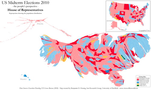 Benjamin Hennig has plotted the results of the U.S. congressional elections on a population-based cartogram (which evens out the very large, sparsely populated districts with the small, densely populated urban districts that don’t show up well on a geographical map). There are cartograms for the Senate and governors’ races, too, but they’re less dramatic.