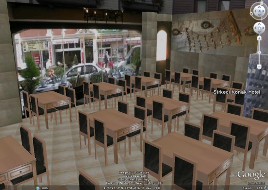
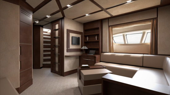
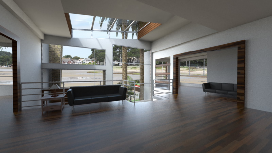
Following in the footsteps of great sites such as 3DHawaii and 3DLasVegas, we travel to the other side of the globe to check out 3DLocationEarth , set in Turkey.
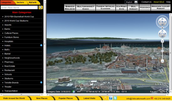
The basic idea of the site is similar the concept behind the Hawaii and Las Vegas sites; provide information about area hotels, businesses, schools, etc, and “fly” the user to each place using the 3D map on the screen.

Note: When the site first loads, all of the text is in Turkish. To convert, find the “language” drop-down near the top-right corner and select “English”.
While the amount of content on this site is quite impressive, it’s a bit clunky to use when compared to sites like 3DLasVegas. The Vegas site, if you recall, has a slick “Location Navigator” at the bottom of each item to help you easily explore it in 3D. This site has similar icons at the top of the page, but they’re very inconsistent. I suppose that’s part of the issue when dealing with such a large dataset. In addition, 3DLasVegas has thumbnails of all their locations on the left site, whereas 3DLocationEarth simply has a text-based list.
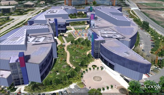
However, what is truly amazing is the 3D content that 3DLocationEarth has contributed to the 3D Warehouse, and therefore to Google Earth. As of right now, they have nearly 3400 models in Google Earth, including some notable items such as the Google headquarters in Mountain View, CA!

Even more impressive is their ability to view inside of various buildings. A great example of that is the Sirkeci Konak Hotel . Once you load that page, play with the silver icons at the top to go to the lobby, various rooms, the pool, etc.
We’ve shown you a few 3d interiors before, but this hotel is quite remarkable.

It will be interesting to see which direction Google pushes going forward. While the interior of this hotel feels similar to the Street View-based art gallery interiors that Google released earlier this week, they’re vastly different technologies. You would think that a single method for creating interiors would be ideal, but we may be a few years away from that.
In any case, check out 3DLocationEarth to see all of the great work these guys have done.
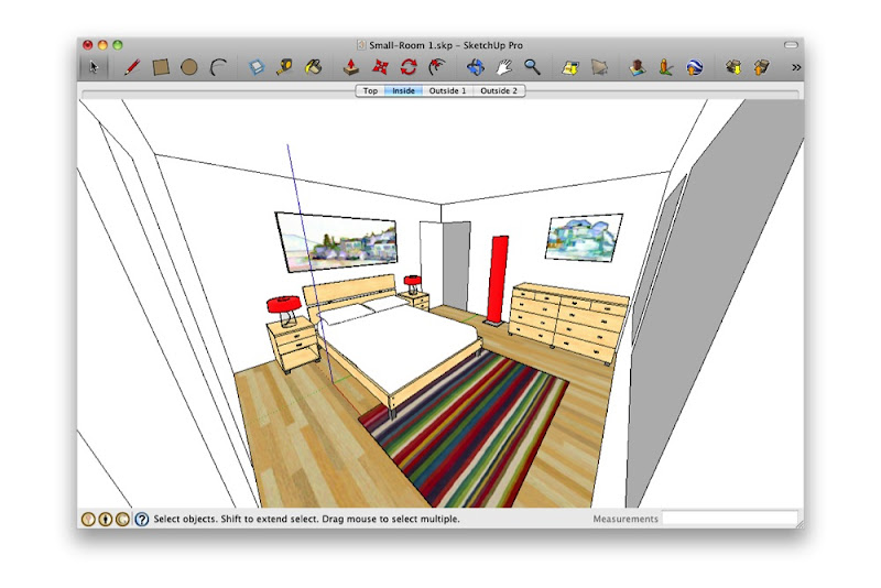 Standing in the corner and making your Field of View really wide is just weird. What are you—a housefly?
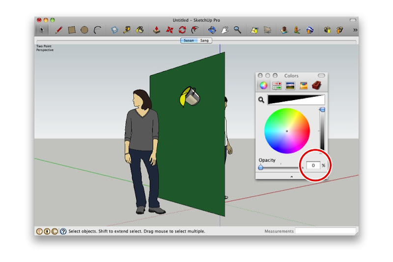
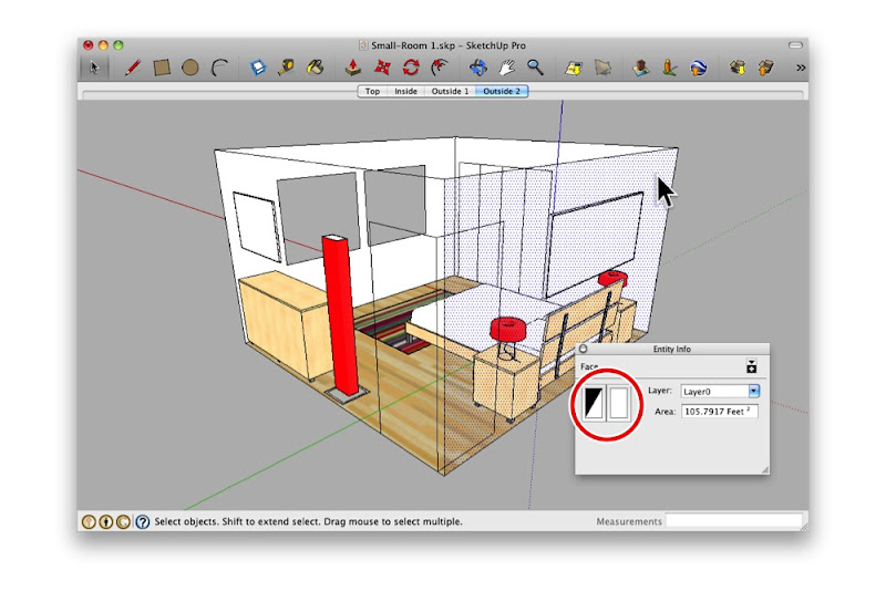
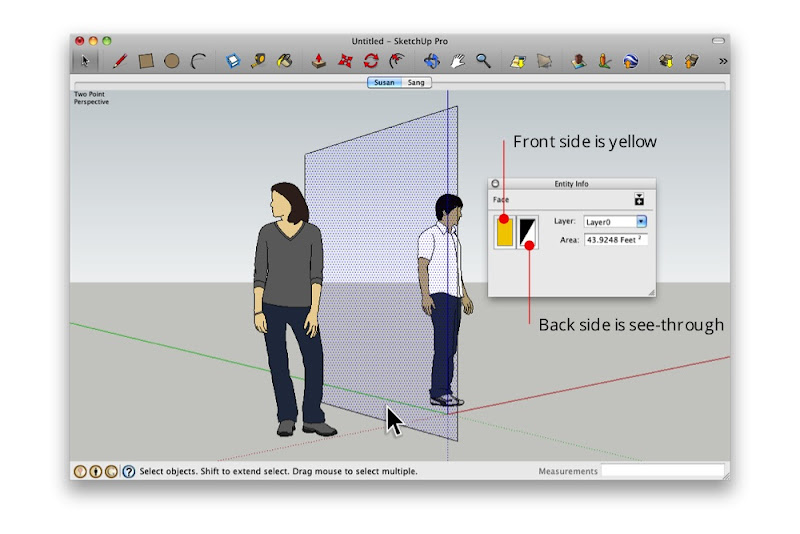 The Entity Info dialog box shows that the selected face is yellow on the front and see-through on the back.