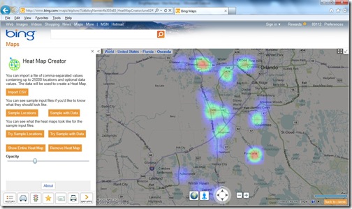
Bing Maps offers the capability to visualize data in various manners. Viewers are, of course, always looking for ways to better understand their data. Showing data on a map alone—customer locations for monthly sales, for example—provides quick and easy insights. However, it doesn’t allow you to see trends, like volume of sales. Advanced map-based visualizations like thematic and heat maps allow for greater extrapolation of such data. The focus of this blog is on heat maps, specifically a new heat map app that we recently released.
The Heat Map Creator allows you to easily create heat maps that can be cut and pasted into a presentation or report. As a reminder, heat maps (or density maps) are maps that use color gradients to show data/attribute density. Heat maps are becoming quite popular because they provide compelling visualization without requiring geographic region data (polygons) to be acquired and maintained. Check out the app to see some examples of just how useful and informative heat maps can be.
Figure 1 – OnTerra Heat Map Creator app showing sample data.
The Heat Map Creator allows you to produce a heat map by importing up to 25,000 locations (latitude and longitude) and an optional numeric value from your data, like monthly sales (imported via a CSV file). From there, you can easily print screen and capture the image for a presentation or document.
