Bing Maps: SQL Server Denali CTP3

At the beginning of the week, there was a new version of the Bing Maps AJAX API rolled out (version 7.0.20110630165515.17). There’s a list of changes at http://msdn.microsoft.com/en-us/library/gg675211.aspx but, to summarise them here:

  • Directions and Traffic information (both features that were included in the core 6.x control) have been added back into v7 using the new optional module functionality.
  • New venue maps mode allows you to see layouts in the inside of shopping malls etc.(Haven’t seen much use for this yet – don’t know if it really exists outside the US)
  • You can now disable birdseye mode – very useful since it prevents you accidentally breaching the Terms of Use if not licensed to use it!
  • Polygons and polylines have a new dashstyle property, which means you can style vector shapes so that, for example, electricity lines and railways show as dashed lines (as in an Ordnance Survey map).

I’m particularly pleased about the last two features, since these are both things that I’ve suggested about on the MSDN forums… whether it’s coincidence or not, I’m glad they’ve now been implemented.

SQL Server Denali CTP3

A download link to the latest preview version of SQL Server was announced on Twitter, and a rapid rush of tweets followed as people clammered to see what new features were included.

image

I’m only interested in summarising changes for the spatial toolset, which as far as I’ve found out so far, are as follows:

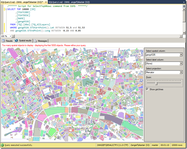
Firstly, the Spatial Results tab is back! Introduced in SQL Server 2008, broken in CTP1, and back again, it’s everyone’s favourite quick way of visualising geometry or geography data. The 5,000 object limit still seems to be in place:

image

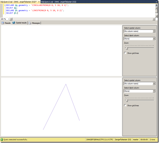
My next test was to see whether it could plot the new curved geometry types. Initial results were disappointing, when selecting a CircularString resulted in nothing but a white screen, while a LineString drawn between the same set of points was displayed as expected:

image

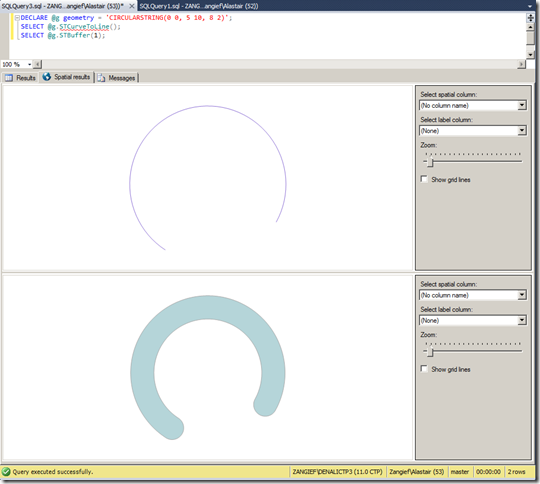
This same problem occurred across all curved geometry types – to display a curved geometry in the spatial results tab, it seems you have to linearise it first – for example, using STCurveToLine(), or creating a linear buffer around it using STBuffer() as shown here:

image

(Note that, although these features look curved, they’re really just a many-sided LineString and Polygon, respectively). Hopefully displaying true curved features will make it into the next release.

As for new functionality, there’s a new extended method, IsValidDetailed() – which tells you not only whether a geometry is valid (which is what the OGC STIsValid() method does), but why it’s invalid. Here’s an example script to test it:

DECLARE @g geometry = 'LINESTRING(0 0, 5 10, 8 2)';
DECLARE @h geometry = 'LINESTRING(0 0, 10 0, 5 0)';
DECLARE @i geometry = 'POLYGON((0 0, 2 0, 2 2, 0 2, 0 0), (1 0, 3 0, 3 1, 1 1, 1 0))';
SELECT
  @g.STIsValid() AS STIsValid, @g.IsValidDetailed() AS IsValidDetailed
UNION ALL SELECT
  @h.STIsValid(), @h.IsValidDetailed()
UNION ALL SELECT
  @h.STIsValid(), @i.IsValidDetailed()

And this is the output – which is much more useful when it comes to fixing invalid data than a simple Boolean obtained from STIsValid():

image

As with some of the updates to the Bing Maps control, I was particularly pleased to see this feature get included since it was something I’d raised in the MSDN forum – Microsoft are certainly scoring lots of points with customer responsiveness with me this week!

The only other functional addition I could see was the AsBinaryZM() method, which retrieves the Well-Known Binary of a geometry, complete with Z values. Previously, the only way to retrieve (or input) geometries containing Z and M values was via Well-Known Text, since the WKB representation stored 2d coordinates only.

The new method works pretty much as you’d expect, and the resulting serialised value also demonstrates some of the flags indicating this geometry has Z values:

DECLARE @g geography = 'POINT(1.6 52.5 100)';
SELECT
  @g.STAsBinary(),
  @g.AsBinaryZM()

Bing Maps Geodesics

This month’s MSDN magazine has an article describing how to create curved lines on the Bing Maps AJAX control. While I don’t want to criticise the author at all, there are two comments I would make on the article:

  • Firstly, it’s written using v6.3 of the AJAX control – v7.0 has been available for well over 6 months now and (despite some teething problems) this latest version is recommended for all new development.
  • Secondly, the article describes how to draw arbitrary Bezier curves on the projected plane of the map. Whilst this is an interesting exercise (and the author goes on to describe important concepts such as how to test the routine), it’s not actually that useful. More often, when we see curved lines on a map, we expect them to represent geodesics – the shortest path between two points on the surface of the earth. Although this was never the intention of the article, Bing Maps evangelist Chris Pendleton mistakenly drew this conclusion and tweeted a link to the article stating that it demonstrated geodesics, when in fact it does not.

Therefore, I thought that responding to this article would provide a good prompt for me to dust off and update my own v6.x geodesic curve script from several years ago (originally published here).

What’s a Geodesic, anyway?

A geodesic is a “locally-length minimising curve” (Mathworld) – it’s the shortest path between any two points on a given surface. On a flat plane, like a piece of paper, a geodesic is a straight line. On a sphere, a geodesic is a great circle. When dealing with geospatial data, a geodesic is the shortest distance between two points on the surface of the earth.

Generally speaking, Bing Maps has no regard for geodesic shapes relative to the earth’s surface – instead it draws shapes directly onto the projected map image. Drawing a straight line between two points on a map represents the shortest path between those points in the projected plane of the map, but it generally does not represent the shortest path between those same two points on the surface of the earth.

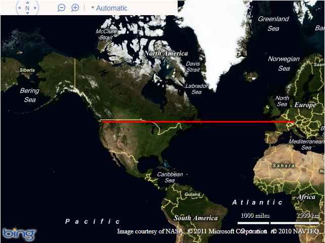
For example, consider a polyline drawn between Munich and Seattle, both of which lie at a latitude of approximately 48 degrees. You can define a polyline connecting these two points as follows:

Microsoft.Maps.Polyline([
  new Microsoft.Maps.Location(48, 11.5),
  new Microsoft.Maps.Location(48, -122)]);

When displayed on the map, this polyline will follow a constant latitude between the two points, like this:image

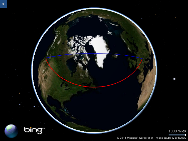
However, this is certainly not the shortest route between Munich and Seattle. If you are unsure why, consider how this same line would appear when viewed on a 3-dimensional model of the earth. In the screenshot below, the line that follows a constant latitude of 48 degrees, as shown above, is plotted in red, while the geodesic line that represents the true shortest line connecting the destinations is shown in blue:

image

Notice how, rather than being parallel to the equator, the geodesic route goes much further north over the top of the UK, then over Iceland, Greenland, and much of Canada before turning south again into Seattle. You can try this yourself on a globe – the geodesic route is the path that a piece of string follows when held tight between two locations. (For those readers familiar with SQL Server, the red line above is equivalent to a route calculated using the geometry datatype, while the blue line is equivalent to using the geography datatype)

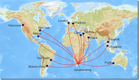
As shown above, the shortest “straight line” route on a map is not the shortest direct path between two points on a globe. Likewise, the shortest geodesic route between two locations on the globe does not generally correspond to a straight line on a map. This is why, when airline companies show maps illustrating the flightpaths to various destinations, the lines appear curved – because they’re representing the geodesic path on the surface of the earth, which, when projected onto a map, will generally not be straight lines:

image

Drawing Geodesic curves in Bing Maps

Geodesics are clearly very useful if you want to visualise the path of shortest distance between two points. So how do you go about drawing geodesic curves in Bing Maps? Well, Bing Maps does not support curved geometries directly, so instead we must approximate the shape of a geodesic curve by creating a polyline containing several small segments. Using a larger number of segments will make the polyline appear more smooth and more closely resemble the shape of the smooth curve, but will also increase its complexity. I find that using 32 segments is more than sufficient accuracy for most maps. We’ll call this value n.

var n = 32;

Then, we need to determine the overall extent of the route, which we’ll call d. The shortest distance between any two points on a sphere is the great circle distance. Assuming that the coordinates of the start and end points are (lat1, lon1) and (lat2, lon2) respectively, measured in Radians, then we can work out the great circle distance between them using the Haversine formula, as follows:

var d = 2 * asin(sqrt(pow((sin((lat1 - lat2) / 2)), 2) + cos(lat1) * cos(lat2) * pow((sin((lon1 - lon2) / 2)), 2)));

We then determine the coordinates of the endpoints of each segment along the geodesic path. If f is a value from 0 to 1, which represents the percentage of the route travelled from the start point (lat1,lon1) to the end point (lat2,lon2), then the latitude and longitude coordinates of the point that lies at f proportion of the route can be calculated as follows:

var A = sin((1 - f) * d) / sin(d);
var B = sin(f * d) / sin(d);

// Calculate 3D Cartesian coordinates of the point
var x = A * cos(lat1) * cos(lon1) + B * cos(lat2) * cos(lon2);
var y = A * cos(lat1) * sin(lon1) + B * cos(lat2) * sin(lon2);
var z = A * sin(lat1) + B * sin(lat2);

// Convert these to latitude/longitude
var lat = atan2(z, sqrt(pow(x, 2) + pow(y, 2)));
var lon = atan2(y, x);

By repeating the above with different values of f, (the number of repetitions set according to the number of segments in the line), we can construct an array of latitude and longitude coordinates at set intervals along the geodesic curve from which a polyline can be constructed.

The following code listing wraps this all together in a reusable function, ToGeodesic, that returns an array of points that approximate the geodesic path between the supplied polyline or polygon locations.

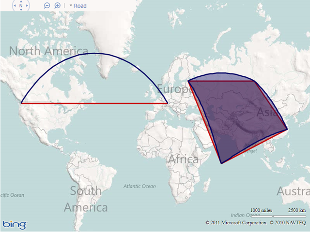
To demonstrate the use of the function, I’ve added two entity collections to the map. The simple layer acts a regular shape layer, containing polylines and polygons displayed in red. Whenever an entity is added to this collection, the entityAdded event handler fires, which converts the added entity into the equivalent geodesic shape and adds it to the geodesicShapeLayer, displayed in blue. By maintaining two layers you can continue to deal with shapes as per normal in the layer collection – the additional points needed to simulate the geodesic display of each shape only get added in the copy of the shape added to the geodesicShapeLayer. You may then, for example, choose not to display the non-geodesic layer and only use it as a method to manage shapes, while the geodesic layer is used to actually display them on the map.


Here’s the results, showing both the flat (red) and geodesic (blue) layers of a polyline and a polygon:

image

Google is Trying To Bring ERP Consumers To Big Spatial Data Sets

SAP is going deeper with its Google collaboration to help customers manage large data volumes. The companies are working to make big data more intuitive, with visual displays to help decision-makers act more quickly.
Specifically, SAP plans to enhance its business -analytics software with location-based data capabilities that let people interact with real-time information. The companies want to pair enterprise apps with consumer tools like Google Maps and Google Earth.

“The trend toward ‘big data’ is accelerating the need for geospatial visualization of data. An increasing amount of data is being tagged with location information,” said Jonathan Becher, executive vice president of marketing at SAP. “For many applications, humans can see information relationships and data trends more easily when they are shown with maps and other spatial visualizations than they can using rows and columns of numbers. This allows non-expert users to make more accurate decisions on data, unlocking business intelligence for a wider audience.”

SAP-Google in Action

The SAP-Google partnership aims to help bring corporate information to life with location-based intelligence, including Google’s interactive map, satellite and even street-level views. Practically speaking, this allows SAP customers to analyze their businesses in a geospatial context to understand the “where” of their information.

Bringing mapping and other real-time technologies to the big-data front also lets decision-makers identify global, regional and local trends and how different scenarios impact them. The intended result includes increasing efficiency and profitability. SAP offers several examples of how organizations running SAP solutions with Google Maps API Premier could benefit from overlaying enterprise information onto intuitive mapping tools.

For instance, a telecom operator could use Google Earth and SAP BusinessObjects Explorer software to perform dropped-call analysis and pinpoint the coordinates of faulty towers. A state revenue department could overlay household tax information on a map and group it at the county level to track the highest and lowest tax bases. Or a mortgage bank could perform risk assessment of its mortgage portfolio by overlaying foreclosure and default data with the location of loans on Google Maps.

“SAP is using a private API from Google that is not currently available to any other enterprise-software vendor. This private API provides additional functionality that, for example, allows the end user to upload their own geospatial information, including maps,” Becher said. “This opens up new use cases. A department store can use Google Street View to add an interactive virtual layout of their store with directions to each department. This street-view information can be combined with on-shelf availability and pricing information to allow customers to actually see the store and buy product from their mobile device.”
SAP is working to drive a convergence of enterprise and consumer software, giving an increasing number of people the ability to make important business decisions through the lens of mobile and social technologies while navigating the complexity of big data, or the growing volume, variety and increased velocity of information.

But do enterprises yet truly understand the value of this blend of enterprise with consumer technologies? “We are early on in the trends of marrying geospatial visualization tools with enterprise information, but it is rapidly accelerating,” Becher said. “We’ve seen dozens of use cases across all 24 SAP industries. Virtually every customer we’ve shared the vision with has been excited about using it to improve decision-making and operations in their business.”

newsfactor