SketchUp: Better sectional views in LayOut

Cutting plans and sections through your SketchUp models is the very definition of “hott”—everybody knows that. Getting those plans and sections to appear properly in your LayOut documents is a tricky proposition, though. Maybe this will help.

The Problem

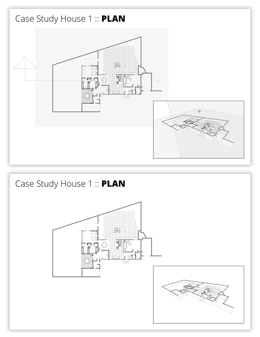
Here’s the scenario: You have a building model. You want to show a plan and a section in a LayOut document derived from your model. This involves using Section Cuts to make the slices. This sounds simple enough, but there are two factors that complicate matters significantly:

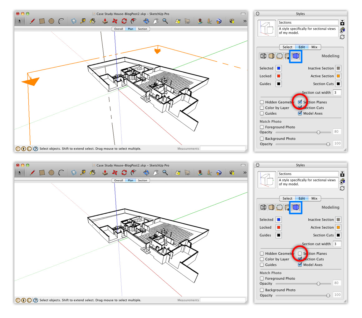
  • You need to create a new style specifically for the scenes that show your Section Cuts. If you don’t, it’s really complicated to make sure unsightly Section Plane objects don’t show up in your LayOut document. The image below provides a visual explanation.
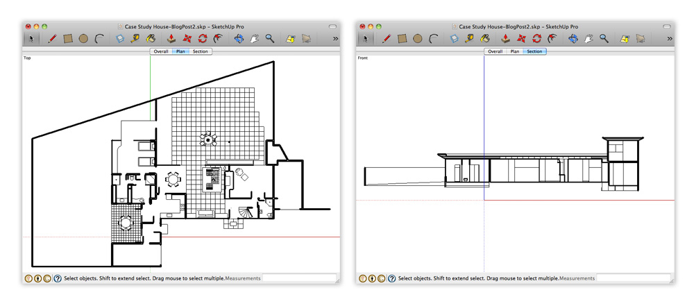
Top: If you’re not careful, your Section Plane objects will show up in your LayOut document. Bottom: Things look much better when they don’t.
  • You need to use Scenes to let LayOut “see” each of your two Section Cuts (plan and section) independently. Without setting up scenes in your SketchUp model, there’s no way to assign specific a Section Cut to a viewport in LayOut. The blog post Connecting SketchUp Scenes to LayOut model viewports goes into more detail about this.

The Solution

The key to making this process work is to create a custom style specifically for sectional views of your model. Here’s how:

Step 1
Choose Window>Styles to open the Styles Manager.

Step 2
Click the Create New Style button (see below).

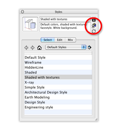
Click Create New Style in the Styles Manager.

Step 3
Give your style a meaningful name; I suggest something like “Sections”. Press Enter on your keyboard to make sure it sticks.

Type in a new name for your style, then hit Enter to make the change stick.

Step 4
Use the settings in the Edit tab to make your model look exactly the way you want it to.

I use these style settings for sectional views of my model.

Step 5
IMPORTANT: Under “Modeling Settings”, make sure the Section Planes checkbox is deselected.

Deselecting the Section Planes checkbox in the Modeling Settings section of the Edit tab is the key to making sure your Section Planes are invisible.

Step 6
Click the Style thumbnail image to update your style with the changes you’ve made since you created it in Step 2.

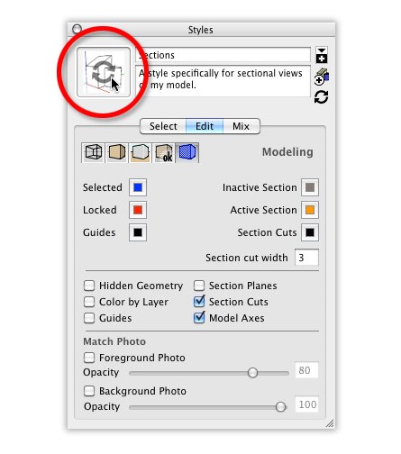
Click a style’s thumbnail image to update it. This saves the settings you’ve changed since you started editing it.

Now that you have a custom style just for sectional views, you can apply that style to all the scenes that show Section Cuts. In my case, I created a new scene for each Section Cut. They’re called “Plan” and “Section”, appropriately enough.

The “Plan” and “Section” scenes in my SketchUp model are set up to show different active Section Cuts. The style “Sections” is applied to both.

To make sure that the Sections style is applied to each scene, do this:

1) Activate one of the Section Cut scenes by clicking its Scene Tab.
2) Apply the Sections style by choosing it from the Select Tab in the Styles Manager.
3) Right-click the current Scene Tab and choose Update Scene.
4) Repeat Steps 1 to 3 for each of your other Section Cut scenes.
5) Save your SketchUp file.

With the right style applied to your sectional scenes, you’re ready to assign those scenes to different viewports in LayOut. Again, I covered the nuts and bolts of this process in this blog post from last year.

Another thing you should know

Every time you add a new Section Cut, all of the existing Section Plane objects in your model become visible. The custom style you created doesn’t change, though; as long as that style is applied to your scenes, and those scenes are assigned to your viewports in LayOut, everything should be fine. If (after adding a new Section Cut) you want to hide all of your Section Plane objects, all you have to do is choose View>Section Planes from the menu bar. Voilà!

Extra Bonus: This blog post from last year provides some suggestions for ways to poché (fill in) your Section Cuts.

Update: A previous edition of this blog post included some (bad) advice about waiting until you get to LayOut to assign orthographic views. On the advice of an expert, I’ve taken that bit out. Apologies for the confusion.

Using My Maps for your summer sublet

[Cross-posted from the Google Student Blog]


Today’s guest author is Katie Corner, an Electrical and Computer Engineering student at University of Colorado, Boulder and a Google Student Ambassador. Check out more tips from students on the Google Student Blog, or submit your own to share.

The spring semester ends, and the frenzy begins: Quick, everyone find someone to sublet your apartment for the summer!

Hundreds of students in your university town will be simultaneously advertising their apartments to potential summer subletters. How can you help your apartment stand out among the crowd? Bring in Google Maps to save the day. Google Maps has a feature known as My Maps, which enables you to quickly and easily build a personalized map highlighting the locations you care about — all on one map! Simply share the map link with your family or friends to let them see it too.

Everyone knows that when looking for a summer sublet, it’s all about location, location, location. Where are the closest grocery stores? What’s fun to do nearby? There’s a running path along the creek just two blocks away? And the local bus picks up on the corner? Nothing sells these points better than an easy, personalized map.

It only takes minutes to create your own My Map. To start, sign in to your Google account and go to maps.google.com. Click on the link in the upper-left corner labeled “My Maps.” By clicking the “Create new map” link, you can pick a title and get to building your housing map.

To start finding locations of interest and placing them on your new My Map, search for those places in Google Maps, for example “park in boulder co.” After finding the location you are interested in, simply click on the red pin on the map, followed by the “Save to…” link. From here you can easily select the new My Map you created.

After adding a number of specific locations to your map, you can also customize and edit the map to fit your style preferences. To access your map thus far, click on the “My Maps” link in the top left corner of the page, and select the map you are interested in editing. By clicking the “Edit” button, you are now in editing mode on the map and can easily make changes to the names of locations or the style of icon. To make a change to a specific place, just click on that location. On the map, an editable box appears where you can easily make changes, such adding as some notes about the place.

The end product is a unique map showcasing why your sublet is the right option to pick. Here’s an example I used for an apartment in Boulder, Colorado.

Stand out in your next apartment rental posting with My Maps today!

Collecting Data from Non-Mapmakers

A few months back, we partnered with the UW Cart Lab to build a map for the University of Wisconsin Arboretum. The map itself is relatively accessible so I’ll let you explore it on your own as most of the functionality is immediately apparent when you use it. However, I did want to talk a little bit about a major piece of functionality that is completely transparent to the end-user. First, a little background…

The University of Wisconsin Arboretum is easily the fourth best thing about living in Madison, WI after the Memorial Union Terrace, The Farmer’s Market, and being able to bike to anywhere (coming in fifth: that bonkers taxidermy museum). It’s a relatively vast piece of natural land on the near-West side of town. In just a 5-minute bike ride from downtown, you can feel like you are in the middle of the wilderness. Residents and researchers alike use the Arboretum for everything from running and biking to invasive species research, from snow-shoeing and hiking to painting and nature writing. This piece of land is very meaningful in many different ways to many different people.

Credit: University of Wisconsin ArboretumCredit: University of Wisconsin Arboretum

That diversity of experience was the main challenge we faced coming into this project. There were lots of voices that wanted to be heard and have their perspective on the Arboretum reflected on the map. How do we engage these researchers, volunteers and nature enthusiasts without having to train each of them on the minutiae of collecting and preparing geographic data?

After looking around for a service that was already doing something similar, we landed on Google My Maps (since it was Google, we didn’t have to look very far). We had already planned on using Flickr to allow users to place their own photos on the map so this didn’t seem like to far of a conceptual jump. My Maps is a simple way for users to edit maps, adding vector points, lines and polygons just by drawing on a Google Map. Best of all, it outputs to KML, the format of the data already included in the map.

After adding their feature and attribute data to My Maps, all the user would need to do is send the URL of the KML file to the map administrator and it would be added to the map. Done? Nope. This is where things get cool.

While the input methods for Google My Maps are fantastically easy and well done, the symbology needed some work to fit in with our map. We didn’t want to have to sacrifice our cartography just for ease of input. We wanted to have full control over the colors and the point icons used by this incoming data.

Changing point styles is relatively simple. There is a lengthy XML file that the map administrator uses to configure the map. Through this file, the administrator has a large amount of control over the data included in the map and can change it to instantly meet the Arboretum’s needs. It allows the admin to specify:

  1. The location and title of each layer
  2. Where the layers appear within the categories of the map
  3. What control users have over the layers (which show up in the legend, which start visible, which remain on)
  4. The available basemaps for each category
  5. All text content in the map
  6. If a layer’s feature contains photos or a slideshow
  7. Which layers are grouped into map animations and their corresponding date

The last thing the admin can do, is override the default point style by defining the URL to a PNG stored on the server. This icon will replace the default Google pushpin. We’ve designed a few of the default icons currently shown but with a little Photoshop work, any image can be used as a point symbol.

Arboretum Icons

Changing the stroke and fill color of a line or area symbol was a little trickier. Google offers a choice of 70 different colors for use on My Maps. Not every single one of those colors is going to look good on our basemaps, displayed with the other layers. To solve this, we created a color compatibility chart. Every single color on the Google My Maps selection corresponds to a color deemed compatible with our map. When a My Maps KML is loaded into the map, it automatically adjusts the colors based on the chart below. It is not a 1:1 relationship, as we’ve had to limit our palette to less than 70 colors. However, it gives the user the expected control over color and makes the finished product more visually pleasing.

myMapsArbMapColors

This solution is not 100% perfect and there were some sacrifices that had to be made to get this compatibility. Firstly, the data-model we used for each feature was limited. Google allows just one name and one description per feature. This eliminated the possibility of doing quantitative mapping and classification on the fly. (For data created outside of Google My Maps, we enabled categorical mapping using standard KML styles and including the name of the category as the name of the style).

Secondly, KML is not known for its friendly file sizes and the data used in this map is HUGE. We’ve tried to optimize it as much as possible but have resorted to inserting loading screens with informational content about the Arboretum to make those download times seem much shorter.

Hopefully this gives you a clear picture of what’s going on behind the scenes of the Arboretum map. The flexibility we’ve given to the map administrator to configure the map as well as the power we’ve given to the stakeholders to add their own data was new for us at the time, but is something we’ve continued to add to our more recent projects, albeit to a lesser degree. The UW Arboretum map still feels young and in its infancy. As more Arboretum volunteers and researchers get involved and add their considerable expertise to the map, we’re looking forward to watching it grow into something great.