Bing Maps just rolled out some exciting new updates to www.bing.com/maps that make it easier for you to find information on the map, explore the layouts of over 850 venues, as well as get to where you’re going with public transit (or transport). Read on to learn more!
Pushpin and Popup refresh
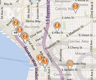
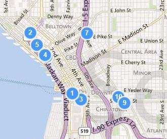
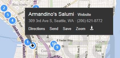
The pushpin. It’s the most common element overlaid on a map. And today, it’s getting an update. In making these changes, to both the pushpin and corresponding popup, our goals were simple: enable you to find the information you want, more quickly and efficiently, while at the same time minimizing obstruction of the map. Let’s take a deeper look at some before and after examples.


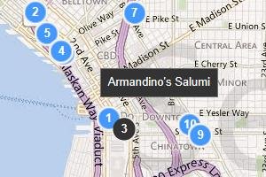
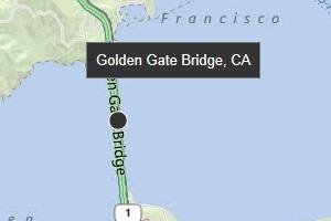
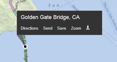
The updated pushpins are designed to better overlay on top of our base map color scheme and make it easier to find results when you perform a search. Search related content appears in blue, while user-generated and saved content (such as “My places”) use an orange colored pin. The contrast changes are more pronounced on hover (and for business searches, the corresponding item in the left-hand panel is adjusted as well), and we’ve also added a new small popup to tell you the name or location or the pin you’re hovering over. Now it’s much easier to quickly scan a bunch of pins to see what they are.


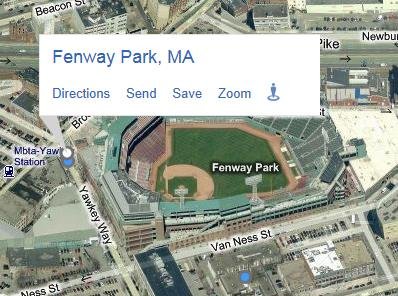
When you click to select a pin, it actually shrinks so as to expose more of the map underneath, and unveil our streamlined popup. Here, we’ve made a number of changes to more compactly display the relevant business or location information and stand out against the backdrop. The most popular actions available for each item have been simplified and consistently placed at the bottom. For most users (except those in the UK), the interaction has changed from a hover-only model to a click-based model for showing the full popup contents. (For users in the UK, where you already had to click to see the popup, we’ve simply added the new smaller hover popup in addition to the layout and style changes.) Overall, these improvements allow you to keep a popup visible while panning/adjusting the map, and even hover over other pins to see what they correspond to, ultimately making it easier for you to find the place you want more efficiently.


One final change you may have noticed is that the pushpins and popups dynamically adjust based on the current map style in order to ensure the information does not get lost on the map.

Enhanced Transit Experience
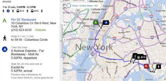
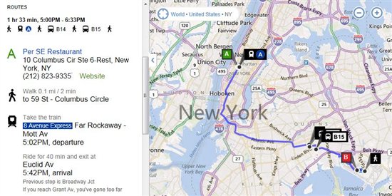
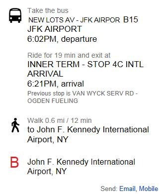
Public transit (and UK transport) users will find a handful of subtle improvements to our directions experience that make it easier to get where you’re going, and make sure you’re on the right line to get there. We’ve changed the way we represent each transit line to better reflect the actual colors and signage used by the line, both for our US and UK markets. You’ll see this reflected both in the on-map waypoints as well as our enhanced directions list.


More sharing options
We’ve also extended our ability to send directions to your mobile phone (via SMS) to support transit directions. This functionality is accessible via the “Send: Mobile” link at the bottom of the directions panel. You’ll receive a link on your mobile phone which loads the directions on m.bing.com, and works for all devices which can access m.bing.com (unfortunately, Windows Phone does not currently support transit).

Drag to modify your route
Users can now easily modify their directions routes by clicking and dragging on start, end, or waypoints. You’ll see a helpful tooltip appear when you hover over an element that can be adjusted simply by dragging and dropping—and the route will be recalculated automatically!
Explore venues
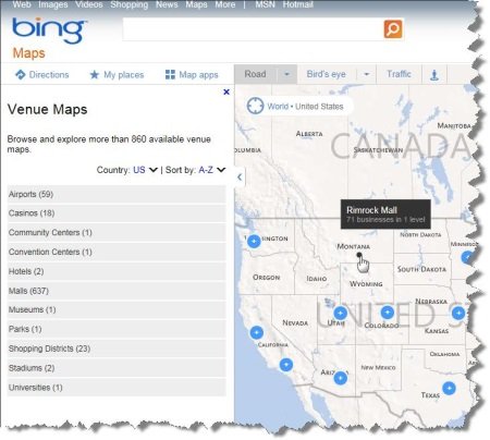
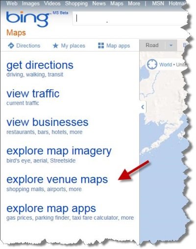
Did you know Bing Maps now has over 850 venue maps of airports, malls, shopping districts, and more? Browsing through them is now easier than ever! Just click on the “explore venue maps” link on Bing Maps, or visitwww.bing.com/maps/venues to get there directly, to browse a categorized listing of available venue maps. You can filter them by country, sort them by location (or alphabetically), and browse through them spatially on the map. If you want to have your venue be part of Bing Venue maps, please contact us for details.


We’re excited about this next step in the evolution of our visual design and believe it is a big step forward for simplifying user interaction with the map, and helping users find the information they want quickly and efficiently. We’ll be rolling out these changes to bring consistency across the broader Bing network over the next few weeks.
