Local Branded Onebox Display


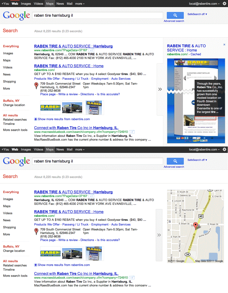
Google has just upgraded the Branded Onebox display to allow the user to more easily view either a (very large) thumbnail preview of site or a map. The result defaults to the Map but there is an obvious arrow to guide the user to the preview mode. The preview is significantly larger than the standard preview taking up all of the room of the Map ad then some.

One will now need to go back to the Senators hearing testimony from Google and inform them that Google is now showing the Map less often. Perhaps this is the voluntary remedy that they had in mind. Take that Yelp!

This change though doesn’t just affect results that shows Maps. It enlarges the preview for any and all results.

Click to view as animated gif:
 

Geographic mis-representation?

Cartographic mis-representation?
update [20/09/2011] from HaperCollins Publishers at the bottom
Most maps lie, they are only a representation of what is out in the real world, simplified, distorted and can be mis-leading.
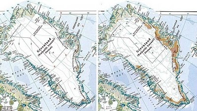
The Map of Greenland by the Times Atlas is a cause of concern left is the 12 year old representation of Greenland, the right is the revised current 2011 representation – side by side can be very clear they are representing less ice than before by a huge margin.

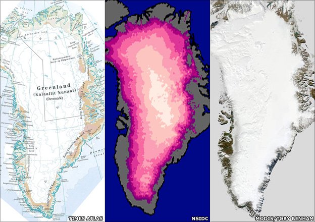
Image from BBC News (updated)

Image against a recent satellite imagery – the out-skirting coastline and more noticeable is the difference in colour representation. (There is also seasonal change that is difficult to represent in one snapshot of the cartographic map.)
Though a lighter (grey) would of be wiser to graduate the contrast.
“Publicity for the latest edition of the atlas, launched last week,
said warming had turned 15% of Greenland’s former ice-covered land
“green and ice-free”.

Via Mapperz