Google Maps Mashups 23

The Red Sox vs Yankees Radio Rivalry Map

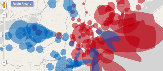
Tim Wallace used to face a huge problem every summer. When he was driving through Maine, New Hampshire or Vermont in the summer he knew a Red Sox game must be on a radio station nearby. His problem was trying to find which station was commentating on the game.

Thanks to the Google Maps API Tim has now solved this problem. His Google Map shows in red the areas where Red Sox games are available on the radio. What’s more you can click on any of the shaded areas and find out the name of the radio station and what frequency it broadcasts on.

Acutely aware of the endless suffering of less fortunate Yankees fans Tim has kindly added their radio coverage to the map as well.

Via: @geoparadigm

Griffith’s Valuation

If you have Irish ancestors then Griffith’s Valuation might be able to help you search for an address or a particular person. This site from Ask About Ireland plots the Griffith’s Valuation on Google Maps.

Griffith’s Valuation was the first full-scale valuation of property in Ireland. It was published between 1847 and 1864 and is one of the most important genealogy sources surviving from 19th century Ireland.

To search the Griffith’s Valuation you can enter an ancestor’s name or a place. The results of your search are then displayed on a Google Map and in list form.

World Family Names

If you have nothing to go on but your surname, when searching your family tree, then you should start with Public Profiler’s World Family Names.

If you enter a surname into World Family Names you are presented with a heat map of the world showing where there are high concentrations of people with that name.

Beneath the map the top countries, regions and cities where your name occur are displayed in list form.

England Jurisdictions 1851

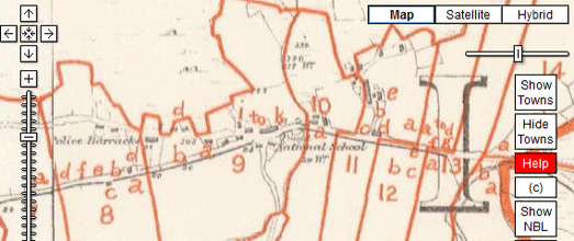
Genealogy website Family Search has created a nice Google Map that lets you search for places by county, parish, hundred and province in England, as they were constituted in 1851. The map should prove to be of great help for anyone who wants to search the geographical origins of ancestors from England in the 19th Century.

You can select to view the different administrative boundaries via a drop-down menu. You can also select an old Ordnance Survey map as the base layer instead of the Google Map. You can search for towns by name and it is also possible to click on the different administrative boundaries on the map to view further details about a location.

Plants at Risk

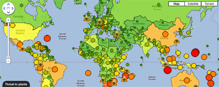
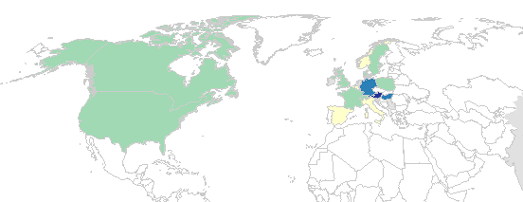
Did you know that with one in five plant species in the world are threatened with extinction?

Kew Royal Britannic Gardens together with the Natural History Museum, London and the International Union for Conservation of Nature (IUCN) has completed a global analysis of the risk of extinction for the world’s plants. The results of this research are presented on four Google Maps.

The first map shows the average threat level of plant life in different countries around the world. The second map shows the percentage of plant species under threat in different countries around the world. A third map shows the proportion of plant species unique to each country.

A fourth map has also been created to give an indication of the level of confidence that the researchers have in the data for each country.

Syria Monday 15/08/2011

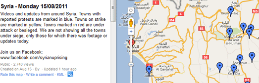
The Syrian Uprising 2011 Information Center has created a Google Map of videos shot by activists during Monday’s protests.

To view a video you need to click on a map marker and click through to watch the video on YouTube. The map markers themselves are colour-coded to show towns with reported protests, towns on strike and towns under attack or besieged.

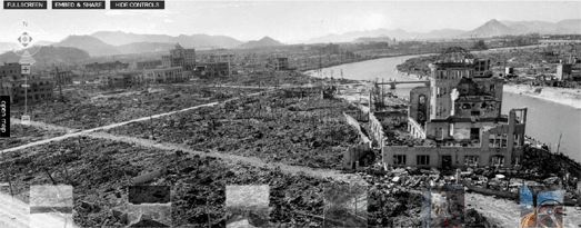
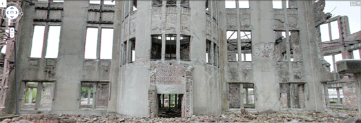
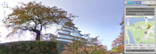
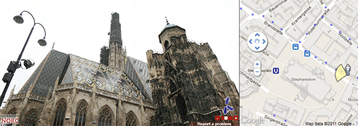
The Iraq Museum on Street View

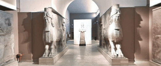
Iraq’s National Museum in Baghdad is now on Street View.

As well as collecting Street Views of the interior of the museum Google also managed to capture close-up 360-degree views of individual artifacts, a selection of which can be seen on the Antiquities page of the Iraq Museum website.

A neat addition to the Street View controls on Google Maps allows allows the user to navigate between the 1st and 2nd floor of the museum. So Street View now goes upstairs as well as to Iraq!

In the UK I think it is now illegal to try and connect the recent rioting with social deprivation or economic inequality. The government and the mainstream media has decided that unless you blame bad parenting, social networking sites or a breakdown of moral order for the riots then you should be publicly castigated as a supporter and excuser of wanton criminality.

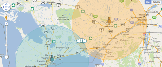
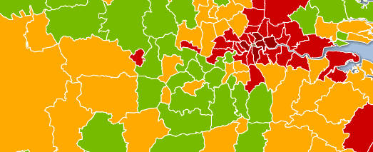
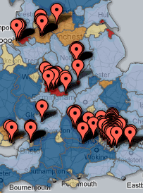
The Centre of Full Employment and Equity seem to be ignoring this new political orthodoxy by creating a Google Map overlaying the location of riot incidents on top of unemployment data.

The British Local Unemployment and the August 2011 Riots Map includes two layers: the local area unemployment rate range and riot incident data from the UK Guardian Open Data Blog.

The dark blue areas on the map show areas with high employment rates. At the risk of encouraging a visit from the UK thought police I have to say that the areas with high employment rates seem to have been largely unaffected by the recent rioting.

The Guardian themselves have used the riot incident data to create a Riots & Poverty Data Map.

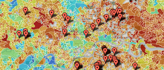
The Guardian says that “The darker reds represent poorer places, the blues are the richer areas. What do you think? Is there a correlation between the two?” I’m going to say it – ‘Yes, there is’.

Someone has also taken a KML from the London Riots – Verified Areas map and displayed it on MapTube Map with the Index of Multiple Deprivation (IMD). The IMD is a method of identifying deprived areas across the UK.

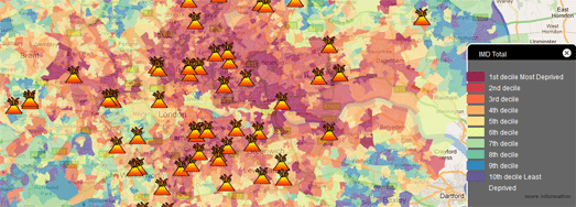
Overlaying the locations of the riots and looting on top of the IMD layer reveals that most of the trouble is occurring more in areas with high deprivation than in more affluent locations.

Whilst we are on the subject of the UK riots Directions Magazine has a good podcast discussion looking at the challenge of using social media as geodata and what journalists, geospatial professionals and the public can learn from these efforts.

The Guardian – Berlin City Guide

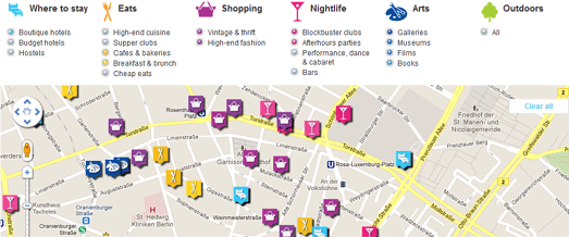
The Guardian’s Google Maps based city guides now includes Berlin.

The Berlin City Guide maps the best places to stay, eat and shop in the German capital and also maps great bars, clubs, museums and galleries to visit. You can select a category to view on the map from the menu above the map. When you select a category as well as dropping the appropriate markers on the map a list of the venues is displayed beneath the map.

If you select an individual venue, by clicking a marker or from the list beneath the map, The Guardian’s review of the location will then be displayed.

NYT Travel Guide to Paris Map

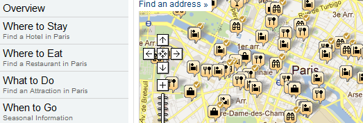
If you want an alternative to The Guardian’s Google Maps city guides then you need look no further than the New York Times. The NYT’s Travel section provides Google Maps based guides for many of the most popular tourist destinations around the world.

Each of the city guide maps allow you to select different categories of markers to view on the map. The categories are hotels, restaurants, attractions, shopping and nightlife.

As well as using the map as a guide to the city you can use the links in the map sidebar to click through to the New York Times’ recommendations in each category.

Brazil’s Cachaças on Google Maps

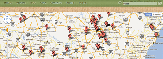
Brazil’s most popular alcoholic drink is cachaça. In fact it is so popular that there are over 4000 cachaça distilleries in Brazil.

Guia Mapa da Cachaça is a crowd-sourced map plotting the location, photos and histories of Brazil’s cachaças and cachaças distilleries. The Google Map of the distilleries allows you to find where each cachaças is made and can help you find your nearest, locally distilled cachaças.

In other news, Google LatLong revealed today that Street View of the Amazon rainforest is currently being captured. So very soon, you’ll be able to float down the Amazon and Rio Negro Rivers of northwest Brazil and experience some of the most remote and biodiverse areas in the world with Google Maps Street View.

Country Explorer

Country Explorer uses Google Maps Styles to create a very simple but effective game with Google Maps. Using the game you can test your knowledge of the countries of the world by guessing the name of a country and clicking on the map to see if your guess is correct.

Using Map Styles a Google Map has been created without country or other administrative labels. When the map user clicks on the map the Google Maps API geocoder is used to determine which country the user clicks on. The map then loads the name of the country and the country’s flag.

The game could be developed a little more by prompting the user to find a particular country and keeping a score of correct guesses. A timer could also be added for each guess to rack up the tension a little.

Google Maps Mashups IIL

Blogabond


Blogabond is a neat application that allows anyone to create their own travel blog with an accompanying Google Map that shows the location of your blog posts and photographs.

Blogabond is very easy to use. After you create an account you can create a new travel blog. This simply involves choosing a location, adding your text and uploading any photographs that you want to share.

When finished your travel blog is presented on its very own page. The blog includes a Google Maps header that displays markers for all of your entries. The map can therefore be used as an index for your blog. You just need to click on a map marker to view the entry for that location.

Discovery Channel – Remembering 9/11


Nearly everybody can remember where they were when they heard that flight 11 had flown into the World Trade Center’s North Tower and that the South Tower had collapsed.

The Discovery Channel has created this Google Map to commemorate the collective presence and kindness of strangers that got many people through the unimaginable horrors they witnessed that day.

On the 10th anniversary of 9/11 the National Geographic Channel is inviting everyone to rebuild this collective history of 9/11 by sharing their personal stories on an interactive Google Map.

The Remembering 9/11 Facebook app allows users to post brief accounts of their 9/11 experiences and mark their stories on the interactive map. Users are also able to explore all posted anecdotes by location and filter stories to see their friends’ stories and share comments.

The app is available worldwide in nine languages.

Opus Dei – Iniciativas Sociales

This Google Map from Spain’s Opus Dei shows some of the social initiatives undertaken by the organisation around the world.

You can filter the initiatives shown on the map by category. The social initiatives are divided into four categories, ‘youth’, ‘health’, ‘education’ and ‘social promotion’.

If you click on a map marker you can read details about the initiative shown. Many of the markers include videos about work being done by Opus Dei at that location. Each information window also contains a link to read further details on Spain’s Opus Dei website.

Amud Anan

Amud Anan is an online travel guide and geographical encyclopaedia for Israel.

The map uses the Google Maps API with topographical map tiles of Israel to display user submitted points of interest. As well as adding points of interest users can add routes and trails to the map.

The map is in Hebrew only and is available as a desktop and as an iPhone and iPad application.

Hiroshima Panoramas

360Cities has posted five amazing and shocking 360 degree panoramas of Hiroshima in Japan, taken just six months after the USA dropped an atomic bomb on the city.

Panning the photos around 360 degrees and viewing the total destruction as far as you can see powerfully conveys the effect that the bomb had on the city. According to Wikipedia ‘4.7 square miles (12 km2) of the city were destroyed (and) Japanese officials determined that 69% of Hiroshima’s buildings were destroyed and another 6–7% damaged.’

The panorama taken by Shigeo Hayashi clearly shows what is now the Hiroshima Peace Memorial. Last week Google released imagery of the Peace Memorial that allows you to view the interior of the memorial on Google Maps Street View.

Localley

Localley is a tool that broadens the functionality of Facebook Places by letting you check-in to places using a date and time in the future. It also allows you to view your check-in history on a Google Map, visualise your friends’ latest check-ins and view the people who are checked in around you.

Localley has now released checkintab for Facebook pages. If your business or venue has a Facebook account you can use checkintab to allow users to check-in directly from your Facebook page.

Once you add checkintab to your Facebook account a ‘check-in now!’ button is added to the right hand menu of your page. When visitors click on the button they can check-in to your business and venue without having to leave your Facebook page.

Your visitors can even create a future check-in and inform their friends that they will be at your venue at a specific time. This is a great way to get users to share and promote your business with their Facebook friends.

Foodspotting

The food sharing app Foodspotting has passed one million downloads. The Foodspotting apps lets you take photos of your favourite dishes and share them with the world. Foodspotting is a great way not just to find a good restaurant nearby but to find the best rated dish in a restaurant.

Don’t worry if you haven’t downloaded the app to your smart phone as you can also browse all the dish photographs and reviews on the Foodspotting website. If you enter a location you can view all the dishes shared near that location on a Google Map.

Click on one of the dish photographs displayed on the map and you can view where the picture was taken and how many people have rated this dish.

The Growth of U.S. Newspapers

For the last few years Paper Cuts has been documenting layoffs and buyouts at U.S. newspapers with the help of Google Maps.

This year’s map from Paper Cuts already shows over 2,500 layoffs at newspapers throughout the country. As newspaper readership and advertising revenues continue to dwindle I suspect Paper Cuts will become busier and busier mapping the loss of newspaper jobs and newspapers.

Whilst Paper Cuts seems to be mapping the decline of American newspapers The Growth of U.S. Newspapers has created a great map visualisation that documents the growth of newspapers in the U.S. over three centuries.

.

The visualisation from Stanford University plots the growth of newspapers since the publication of ‘Publick Occurrences Both Forreign and Domestick’ in Boston in 1690. It is possible to filter the data shown on the map by date, language of publication and by frequency of publication.

Around France

Randonee dans l’Ain is a really nicely designed website promoting hiking, horse riding and bike trails in Ain, an area of the region Rhône-Alpes in France.

Each of the trails can be viewed on Google Maps. The route of each selected trail is displayed on the map and you can select to view restaurants, activities, photos and accommodation along and near the trail.

Each trail also comes with an elevation chart and with information concerning the route’s length and the approximate time it takes to complete.

Metro Vancouver Mapped

The Vancouver Sun has put together a great series of 21 interactive Google Maps looking at all aspects of life in the city based on the 2006 census. Metro Vancouver Mapped uses Google Fusion Tables to create heat maps that explore answers given by residents in the 2006 census.

The maps examine the demographic differences in the city and allow you to see in which areas residents have the best educational attainment, the best commute times and the highest property values etc.

Each map is accompanied by a brief analysis of the census results.

Around London

London is a very large city that can be very confusing to travel around, especially if you are a visitor to the UK capital. CityMapper London can help you navigate the city by providing you with bus, subway, cycling and walking directions. Or, if you want to get a taxi, it can give you an estimated cost for your journey.

To get directions the user just needs to add their starting point and destination, either by text input or by simply clicking on the map, and then selecting the mode of travel.

If the user selects bus or tube directions CityMapper London shows you the route of your journey on Google Maps and in the sidebar explains which stops you need, any transfers you need to make, the estimated time of your journey and the cost.

The biking directions show the user the locations of London bike hire stations near your start point and how many bikes are currently available at each station.

Both the walking and biking directions give the user an estimated time for the journey and an estimation of the number of calories that will be burnt.

Wandercast.TV

Wandercast.TV is a travel video website that aims to allow you to “Watch where you’re going before leaving home.”

If you are planning a trip you can search Wandercast.TV for great places to visit and view a video of the location before travelling. Alternatively you can of course just browse Wandercast.TV to virtually visit places in the world that you may never get a chance to visit for real.

Each video on Wandercast.TV is accompanied by a Google Map showing the location where it was shot. If you have your own travel videos then you can also upload them to the Wandercast.TV map.

via:googlemapsmania

Google Maps Mashups 16

They Draw & Travel – World Map

They Draw & Travel is a collection of wonderful user submitted hand drawn maps.

The World Map lets you browse the maps submitted to They Draw & Travel on Google Maps. You can click on any of the map markers and view the hand drawn map submitted for that location.

One Day on Earth

On 10.10.10 One Day on Earth asked people around the world to create a video of their world. The goal of the project was to “create an open shareable archive and documentary film of the world on 10/10/10.”

You can browse and watch the thousands of videos that were contributed around the world on this Google Map.

#rorschmap

I only found this map yesterday and it has already become a firm favourite.

#rorschmap uses the Google Maps API to create a kaleidoscope for any location on the Earth. Essentially the application displays the Google Maps satellite view of a location and, using the same principle of multiple reflection that you find in kaleidoscopes, creates an animated Rorschach test effect.

Great British Picnics


The Guardian newspaper is increasingly working with partners to produce useful Google Map based guides. The newspaper are collaborating with lastminute.com to create their City Guides. They have also worked with Enjoy England to create a Google Map based guide to great destinations in the UK.

The Guardian has now partnered with Country Life Butter to create a Google Maps guide to great picnic spots in the UK.

The map helps you search for a picnic spot by activity, for example spots that are good for hikers, photographers or wildlife fans. You can also search by environment, such as by beach, riverside or country park.

If you have a favourite picnic spot of your own you can add it to the map.

Maersk Fleet – Live Map


This Google Map allows you to track in real-time the the huge shipping containers of Maersk as they travel around the world.

The position of the ships are displayed live on this Google Map. You can click on any of the ship map markers to view a photograph of the ship and read further details, such as the ship’s destination and current speed.

This map presumably uses the Automatic Identification System (AIS), an automated tracking system used on ships to plot real-time positions.

Integrate Google Maps and Flickr into a Real-Time App


.net magazine has published a great tutorial on how to create a real-time animated Flickr map. The tutorial was written by James Christian and Ben Gannaway the creators of the excellent Net-a-Porter Live Google Map.

The tutorial explains how to create a Google Map that animates in near real-time through images posted on Flickr. The tutorial includes how to work with the Flickr API and how to customise the look of your map.

Alongside the tutorial is a demo map and a link to download the full source code.

Rendezview


Yellow Pages in Canada has released a useful application to help two or more people find the best place to meet.

To find a place to meet you need to enter your address and the address of the person you plan to meet. You can then select the type of venue where you wish to meet, for example a restaurant, a bar or a cafe.

Rendezview will then create a Google Map showing you the most convenient venues that you could meet (based on your selected preferences), roughly half-way between the two locations.

Japanese Castle Explorer


Daniel O’Grady’s excellent Japanese Castle Explorer has been updated to take advantage of all the new wonderful Street View imagery available for Japan.

This year the Street View trike has been very busy in Japan capturing a lot of beautiful new off-road imagery, particular in the grounds of some of Japan’s castles.

The Japanese Castle Explorer is a great map that shows the locations of Japan’s most famous (and plenty of lesser known) castles. The map allows you to view Japan’s castles in Google Maps satellite view. Now it is also possible, where available, to view the castles in Street View.

The map is available in English and Japanese versions. You can view an example of the Street View at Himeji Castle (use the link to ‘Other Castle Panoramas’ in the sidebar to navigate to view other castles in Street View).

The Bath Schools Map


The Bath Schools Map is designed to help parents choosing schools in Bath, in the UK, by displaying local schools and admissions and performance data on Google Maps.

In Bath parents are only allowed to indicate 3 schools as a preference for their children. Using the map it is possible to find the nearest ten schools and compare their academic mini-league tables on a range of metrics with a sidebar. This helps parents make school choices from a broad base of information rather than gearing towards a single metric.

GeoBus
Geobus is a nice little app that can find the nearest bus-stops for any location in the UK. Just enter a postcode or use the ‘locate me’ button and the nearest bus-stops to your current location will be displayed on a Google Map.

The application was developed as part of the recent Young Rewired State initiative.

England’s Health Data Map


The Guardian has used Fusion Tables to map the latest Health Profiles data from the Department of Health and the Public Health Observatories.

Using the Google Map it is possible to compare a number of health indicators for regions in the UK. For example, it is possible to view child obesity throughout the UK or view where the most people die from smoking.

There are still quite a lot of gaps in Street View’s coverage around the world. Luckily a number of other providers have created their own Google Maps based Street View applications to try and plug these gaps.

China – with City8


In China City8 have created extensive interactive 360 degree panoramas in 45 of the country’s biggest cities.

MapJack


As well as providing Street View type imagery in the USA, Canada, Singapore and Sweden Mapjack has also ventured where Google Street View has so far feared to tread. MapJack has great coverage in Malaysia, Thailand and Puerto Rico.

Norc


Norc has great coverage in central and eastern Europe, including in Poland and Austria, where Google’s Street View cars have yet to drive.

via:goglemapsmania